User interfaces
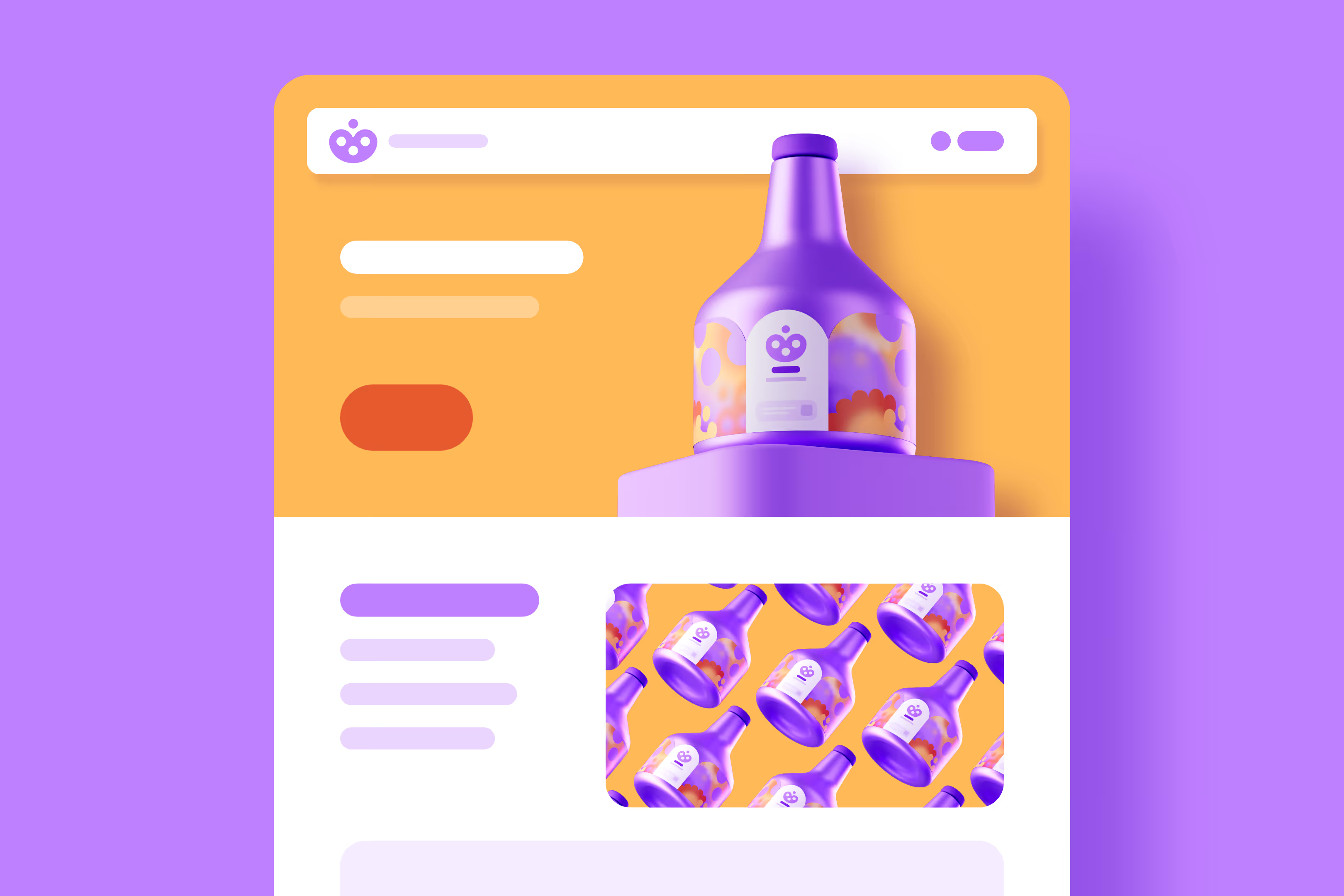
We have an exceptional amount of experience in user interface design: over the past 20 years, we have designed countless responsive websites, e-learning courses, mobile game user interfaces – even for Apple Vision Pro. In addition to visual design, we can also build websites from scratch using Webflow. This way, you get a fully customised, modern, and user-friendly website that you can easily update yourself 24/7.
Projects on this page

Websites

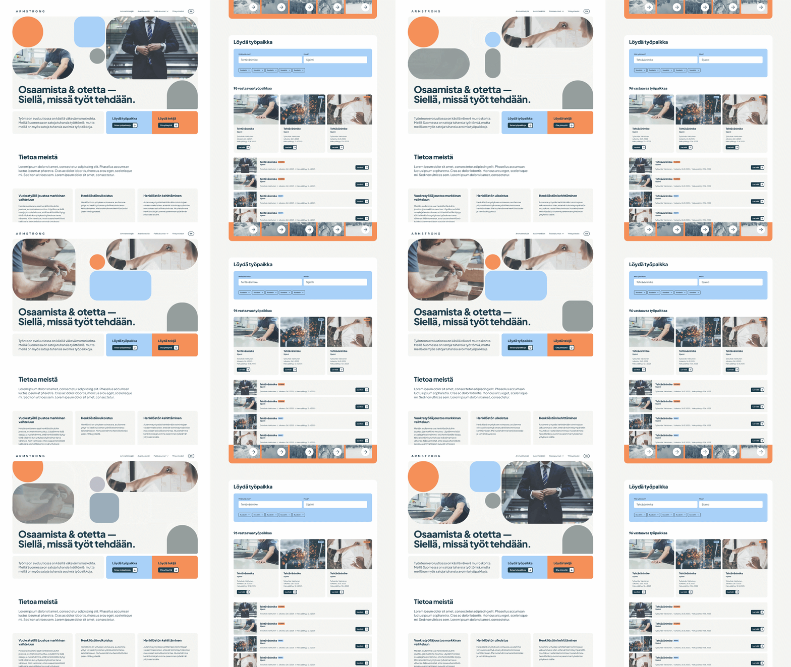
Recruitment company Armstrong's website with an animated hero section.
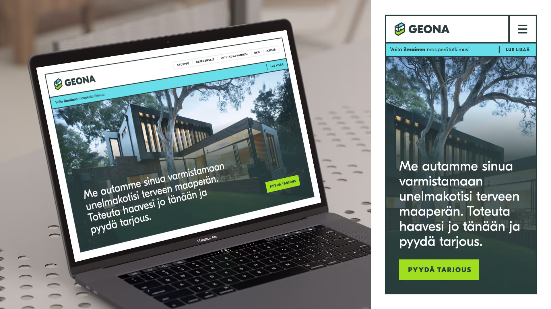
Desktop and mobile views of the website proposal made for Geona.
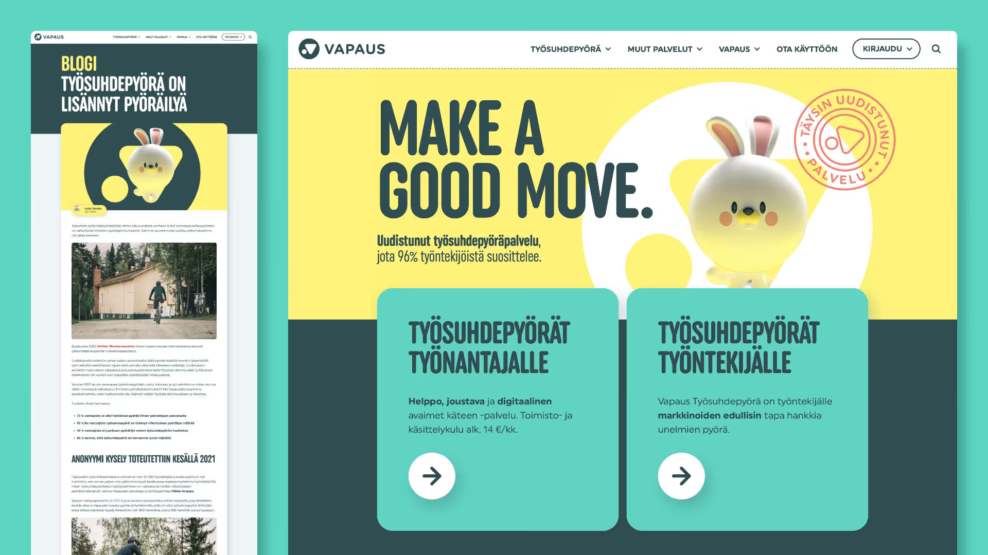
We designed Vapaus's original website, blog, and online store using Webflow.
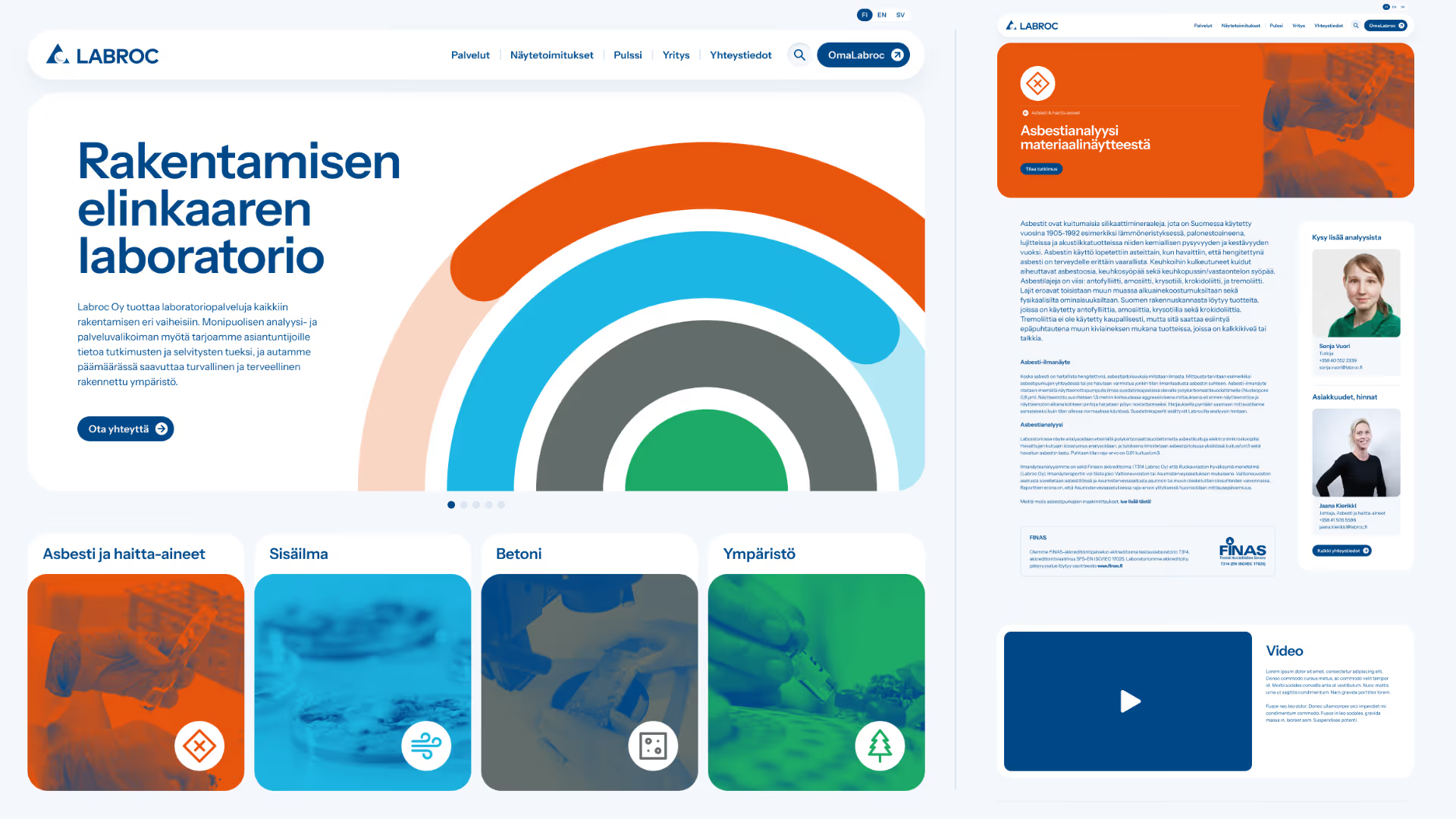
Visual design of the website for the laboratory Labroc.
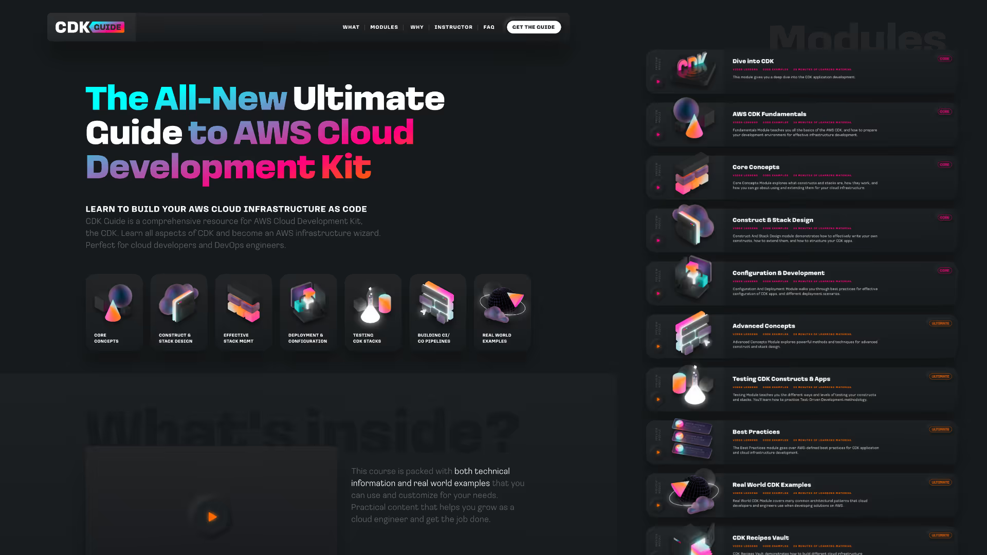
Visual design of the CDK Guide website.
Projects
Lehtipiste

Starting point
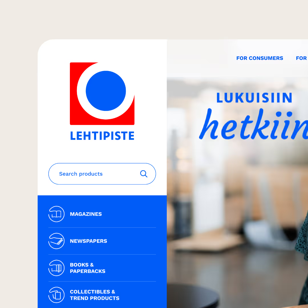
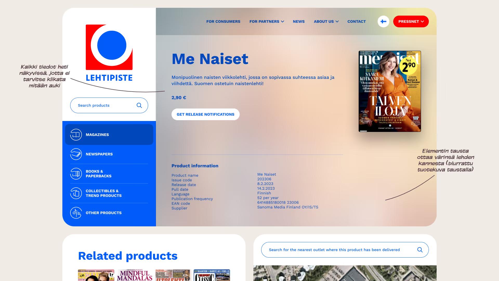
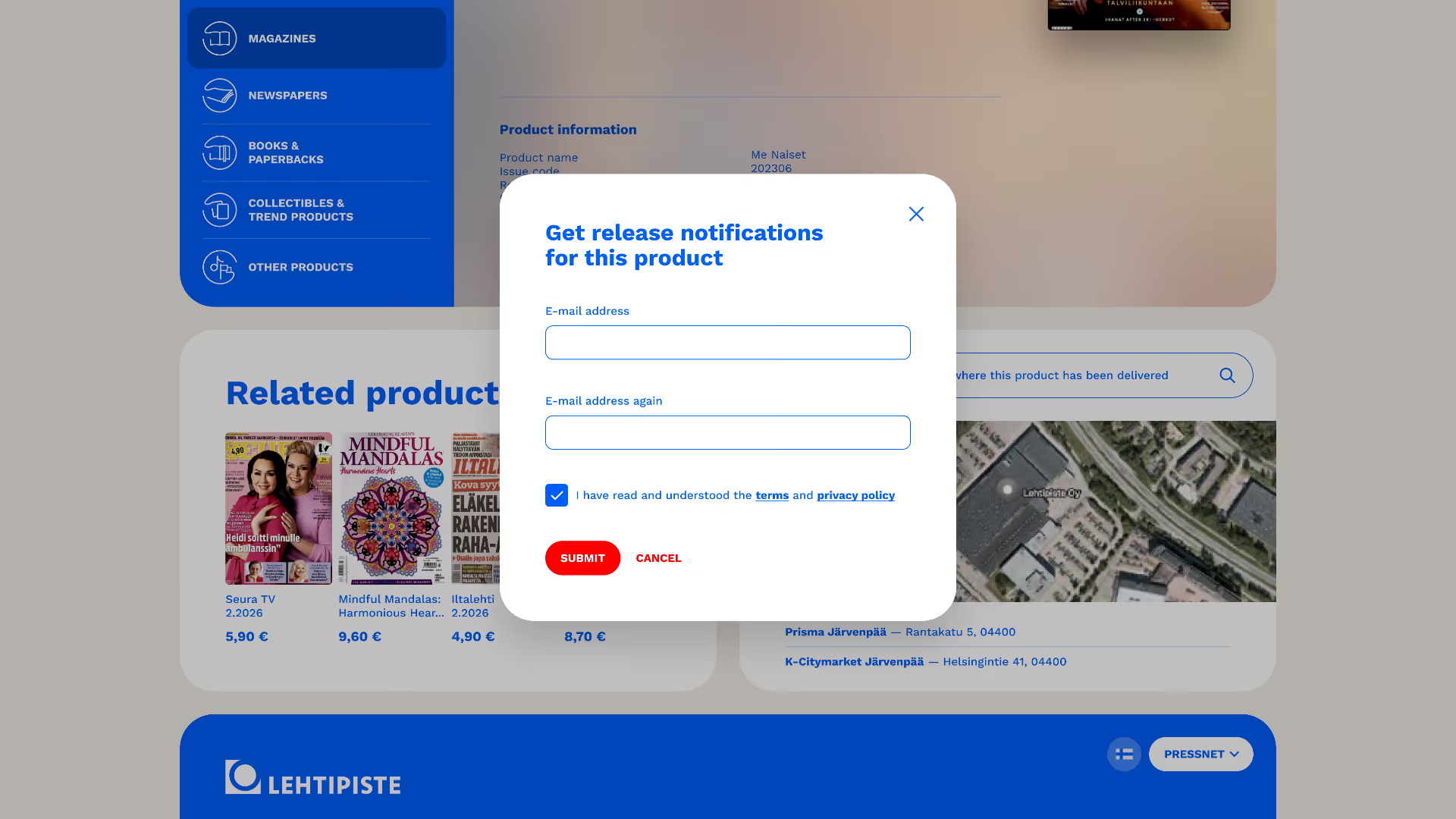
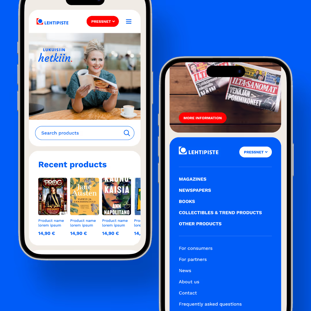
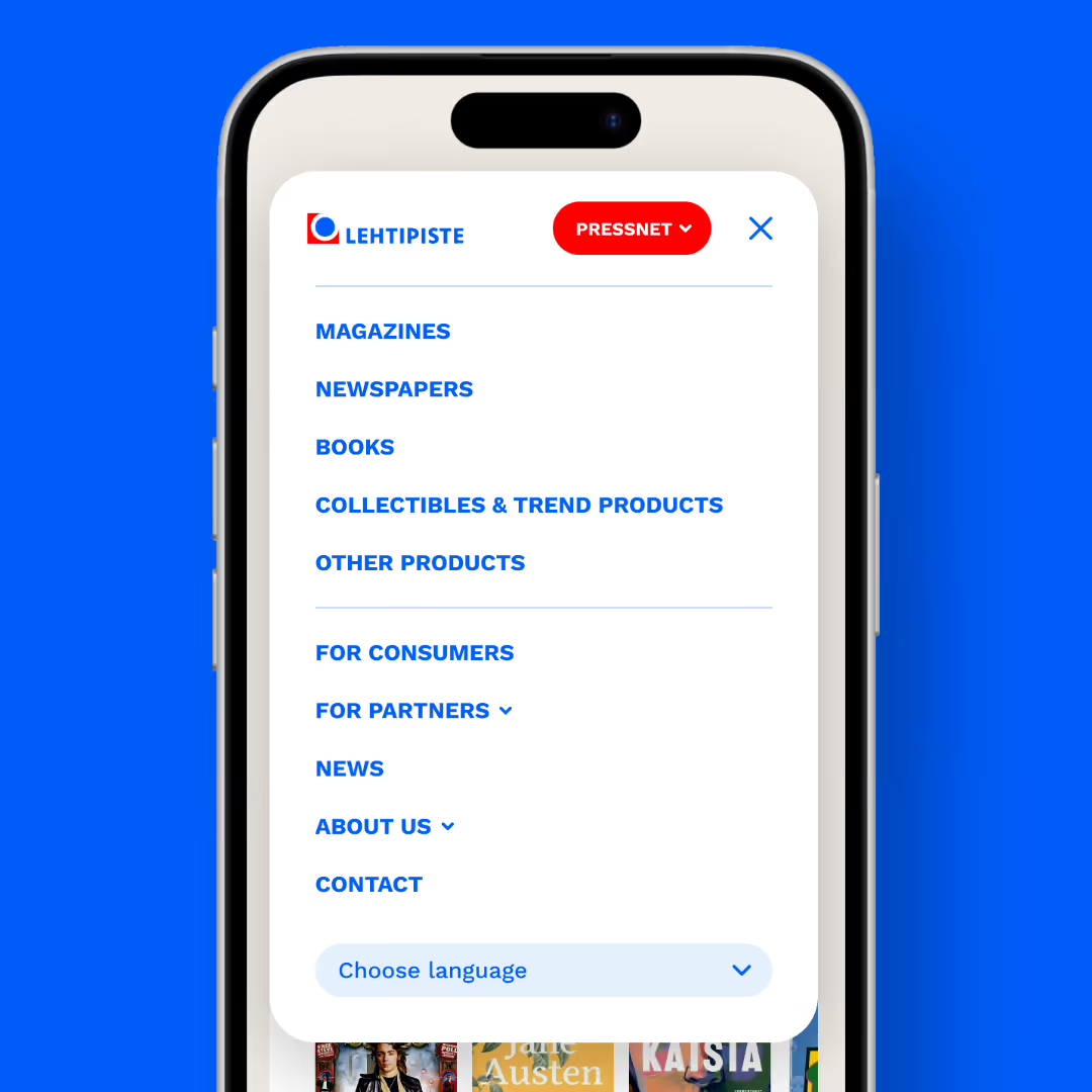
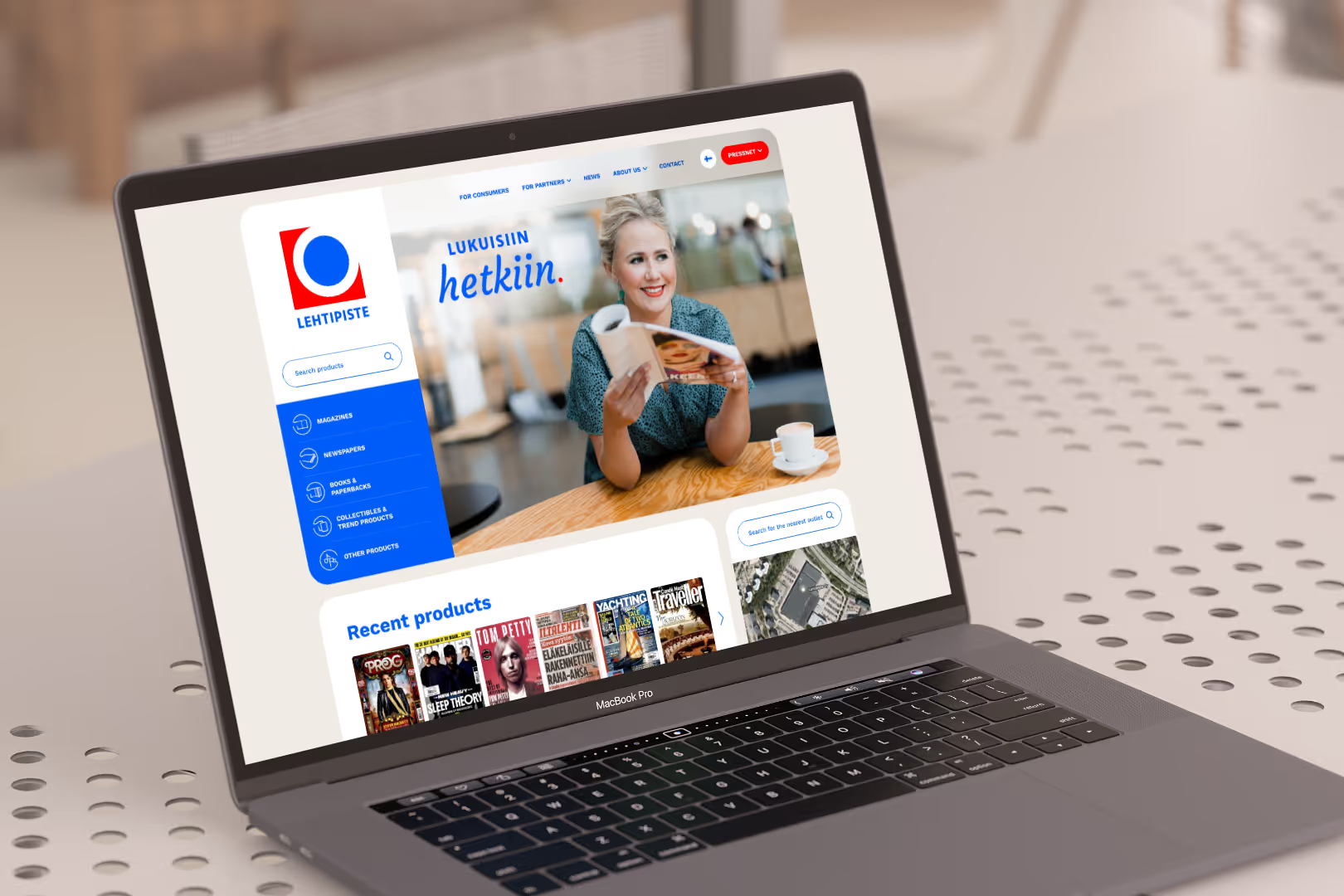
Riesen Design was pleased to participate in the redesign of Lehtipiste's website in collaboration with Pinto. We designed the user interface for the new online service based on Lehtipiste's recently updated visual identity.
The functionalities of the previous website, designed in 2016, were still up-to-date, but the user experience was perceived as rigid and cumbersome. The platform also needed to be updated to make content management smoother.
Solution
We designed high-quality and clearly navigable pages that delight and serve all user groups equally.
Our part
- User interface design
- Wireframes/user journeys
Project planning: Pinto
Technical implementation: Coredo
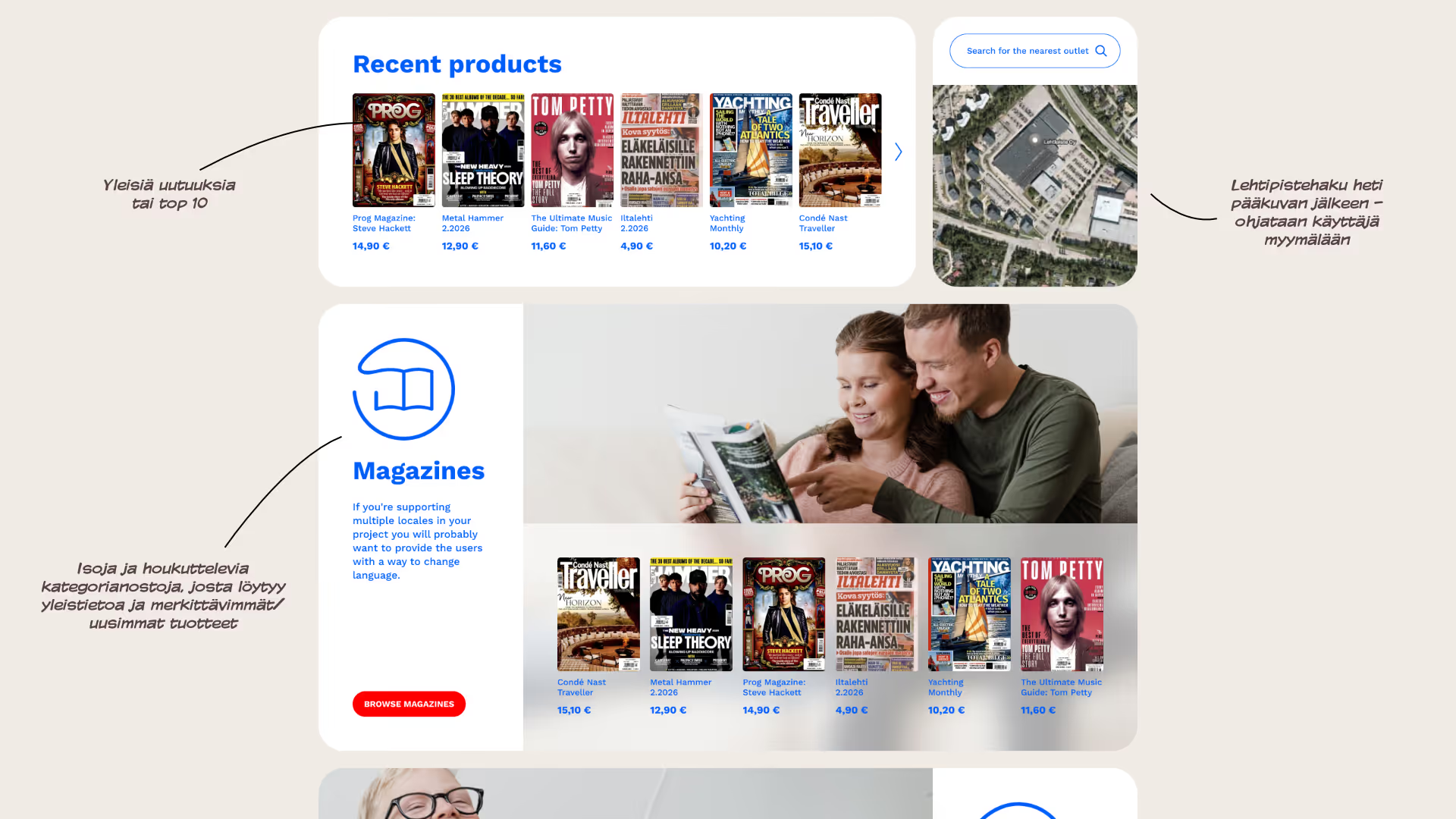
Challenge
No sense of experience or inspiration – a catalog-like appearance.
Solution
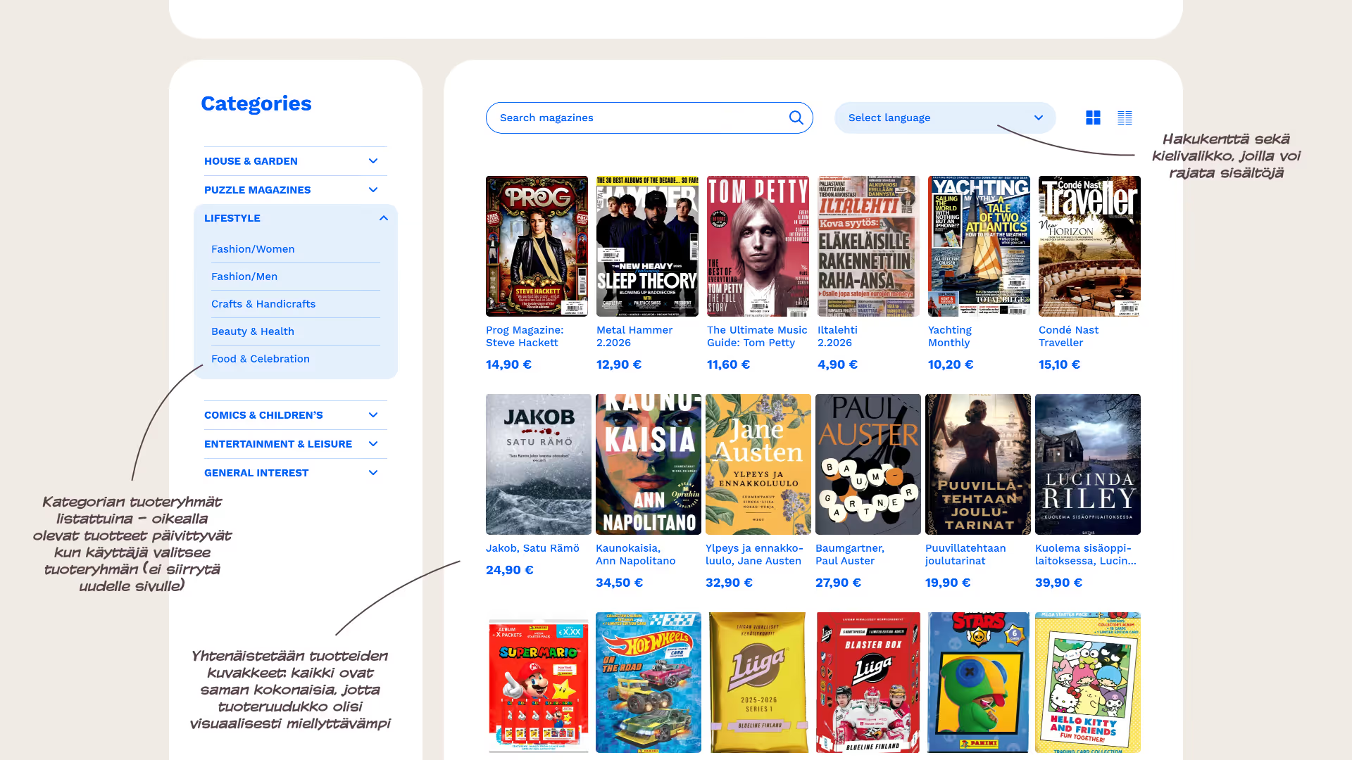
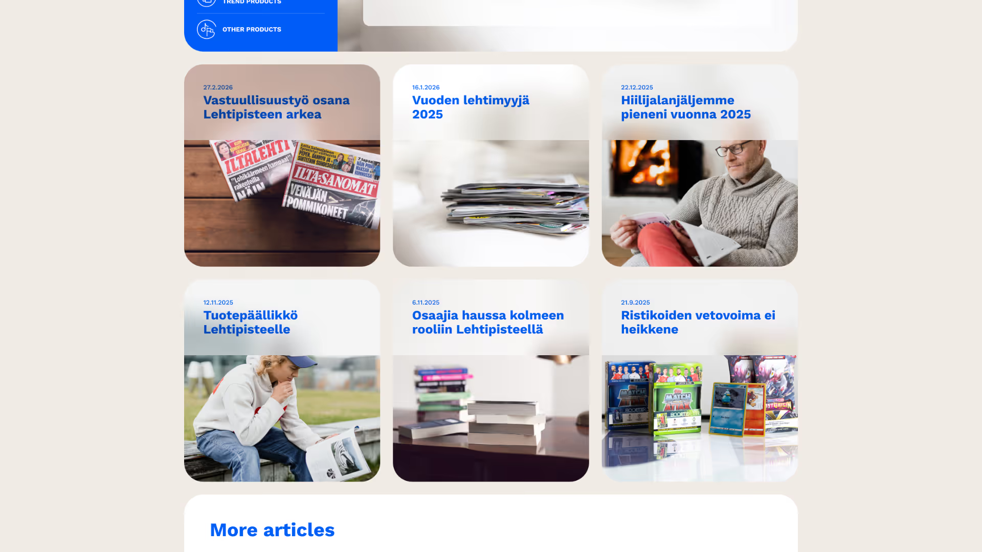
We broke the product grid by bringing attractive, photographic product highlights to the homepage.
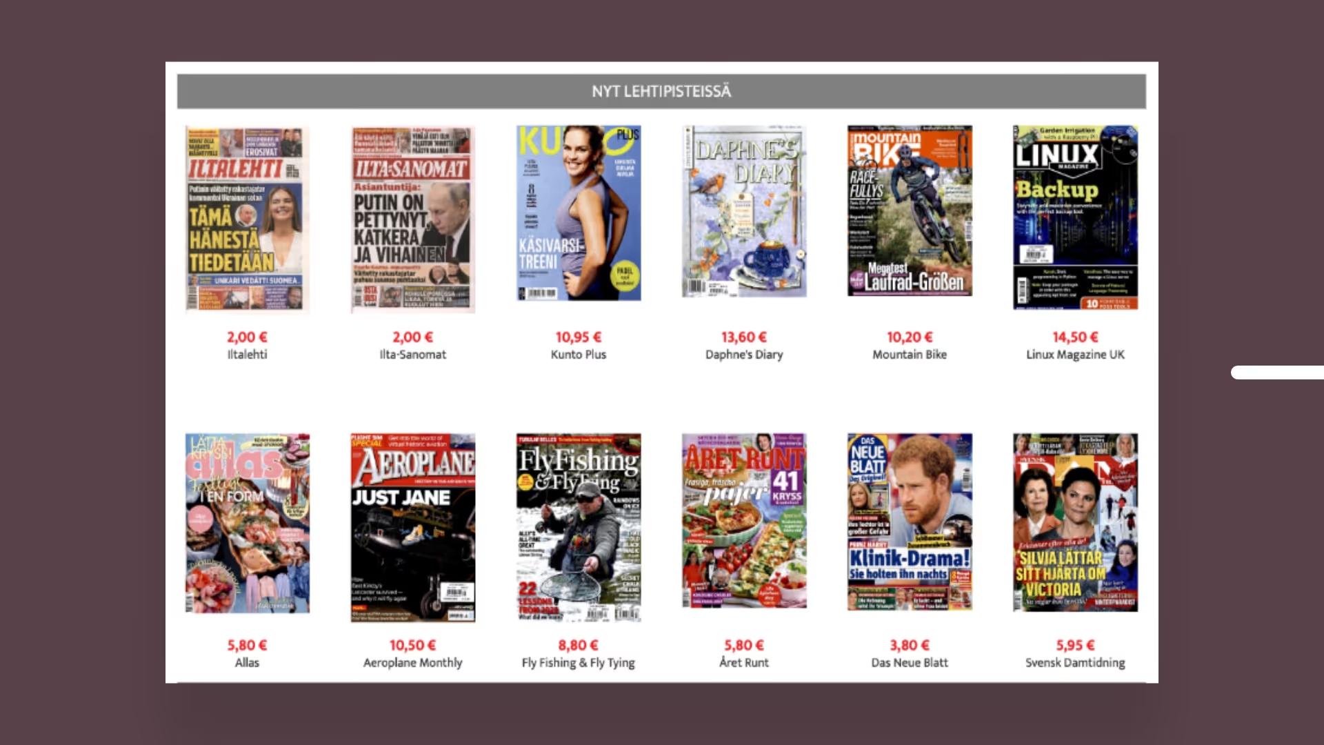
Challenge: Lack of experiential quality or inspiration, catalog-like appearance
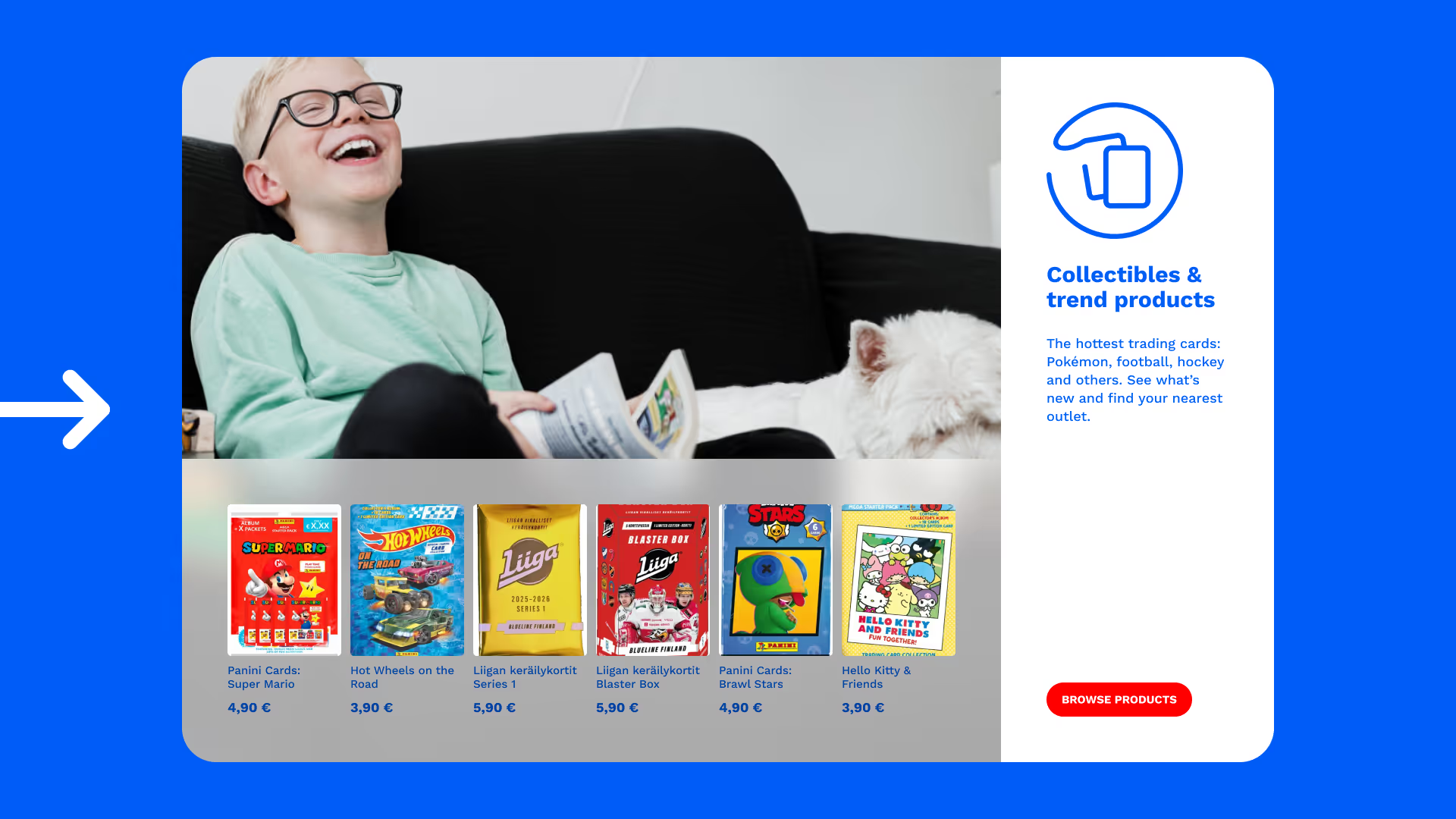
Solution: We broke the product grid by bringing attractive,
photographic product highlights to the homepage
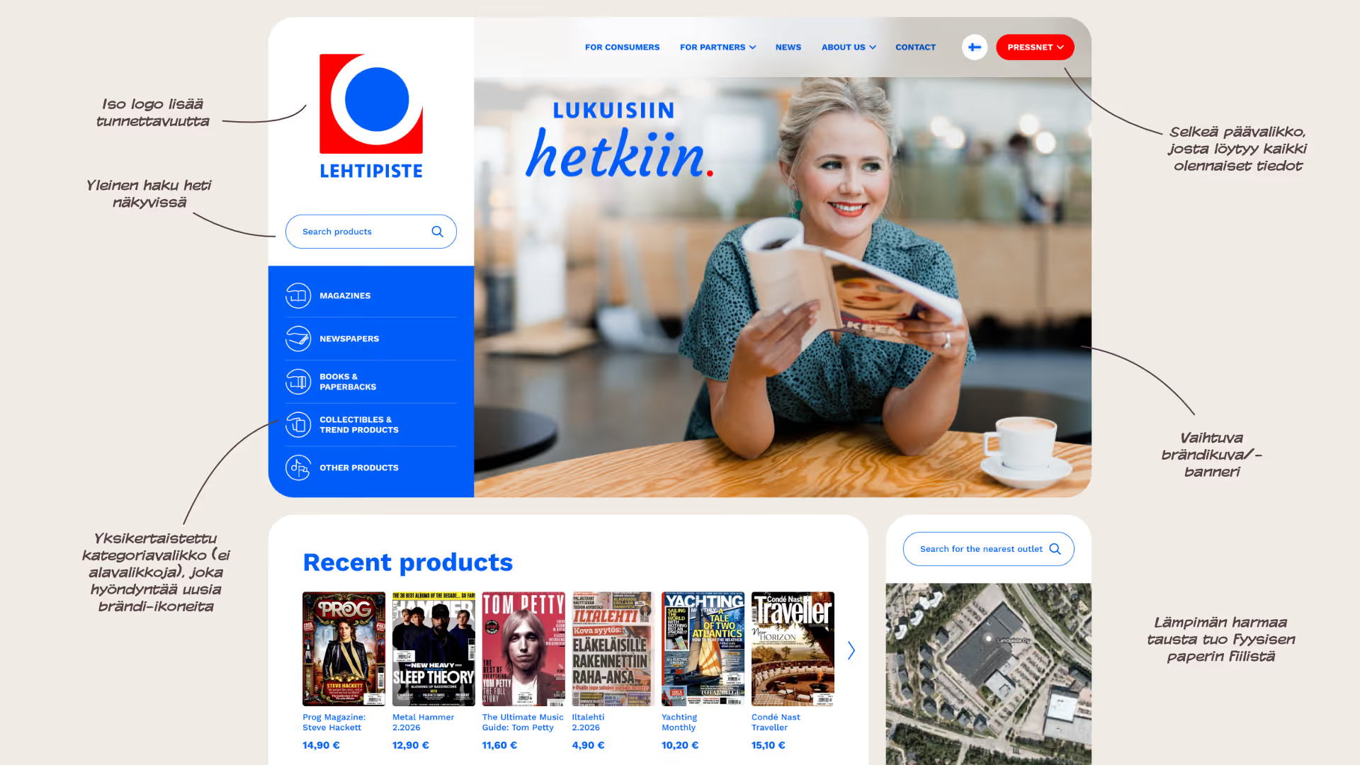
Challenge
Difficult navigation, cumbersome search and sorting.
Solution
We simplified the navigation: product listings are filtered in real-time by product group, search, and language.
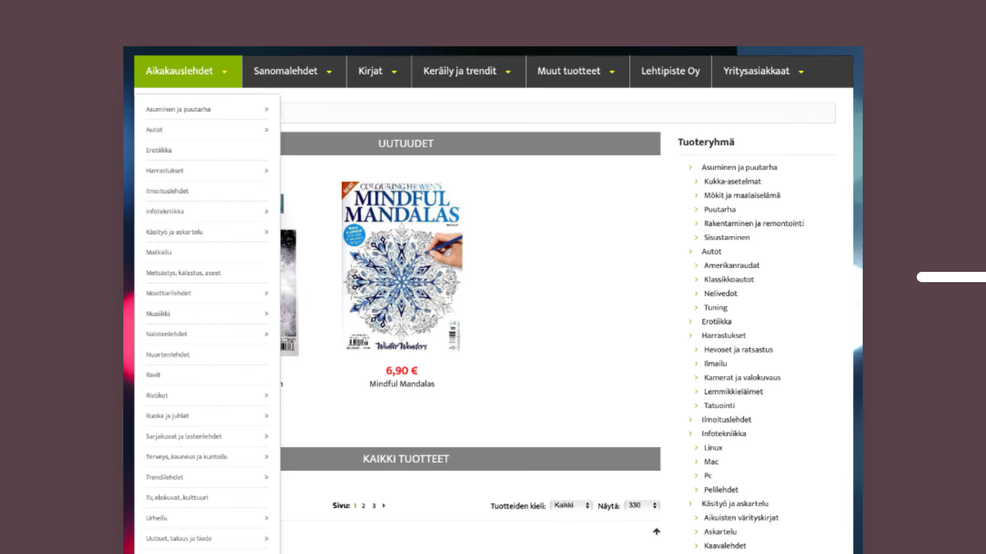
Challenge: difficult navigation, cumbersome search and sorting
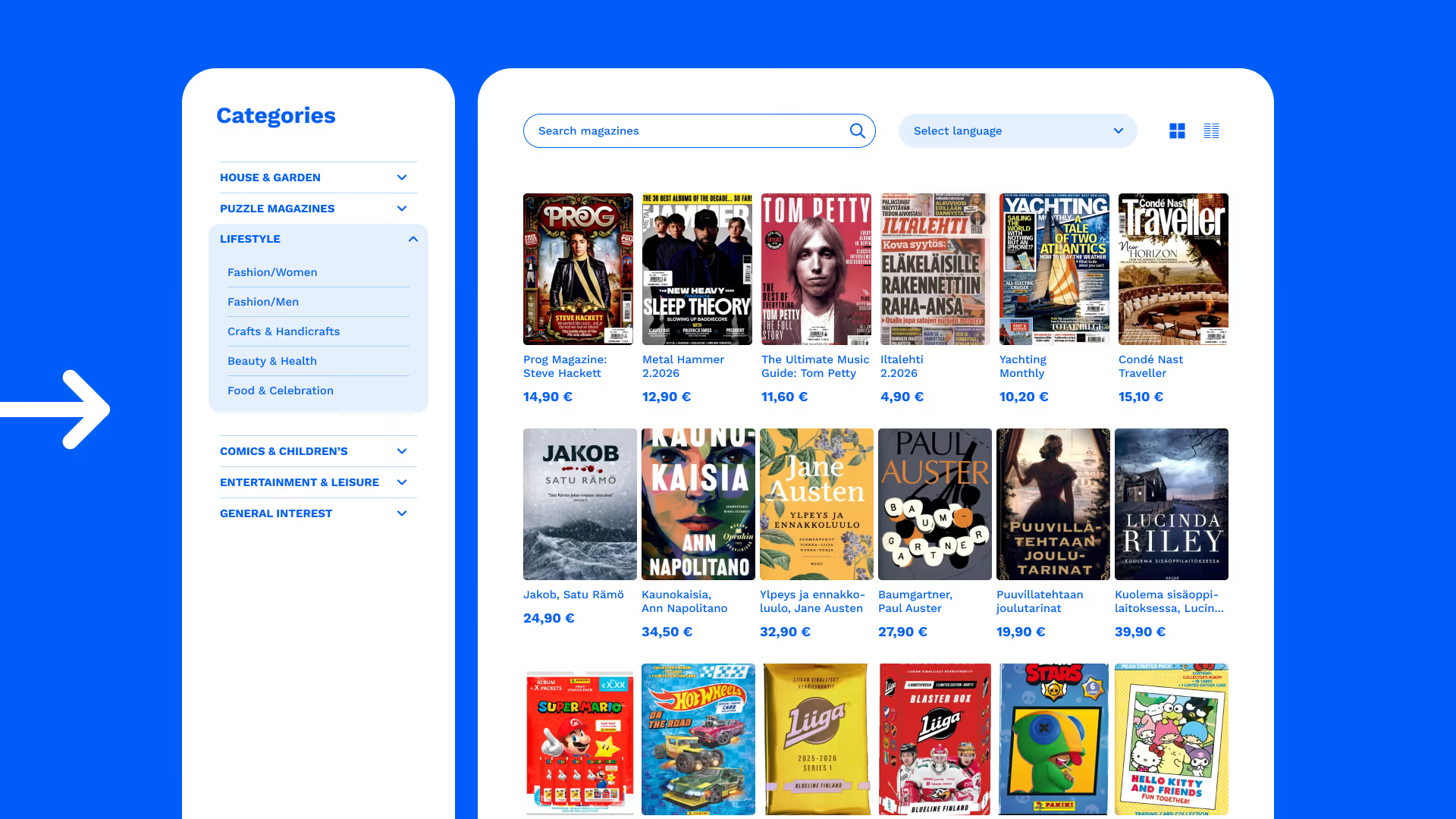
Solution: simplify navigation: product listings are filtered
in real-time by product group menu, search, and language
Challenge
Outdated look that does not represent Lehtipiste.
Solution
We created a fresh and appealing layout that aligned perfectly with the new brand.
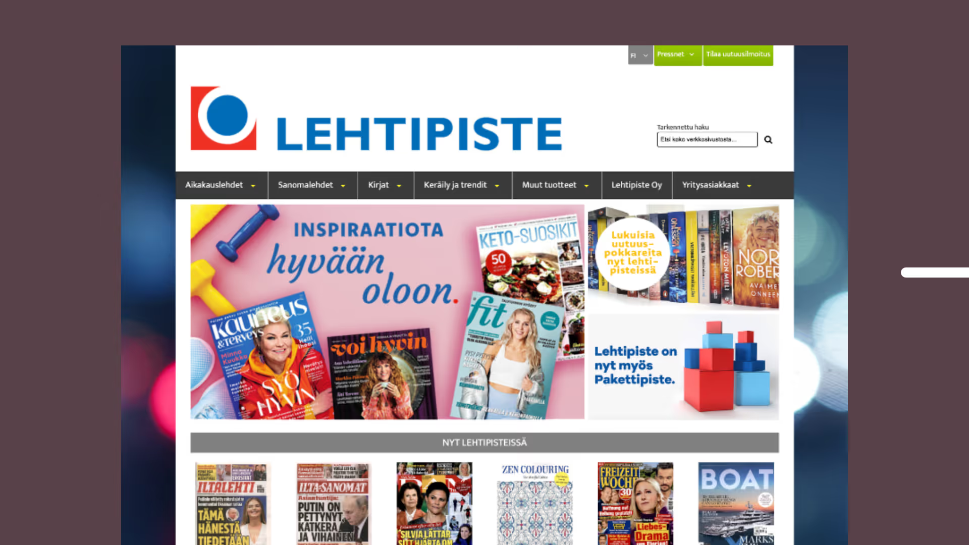
Challenge: Outdated look that does not represent Lehtipiste
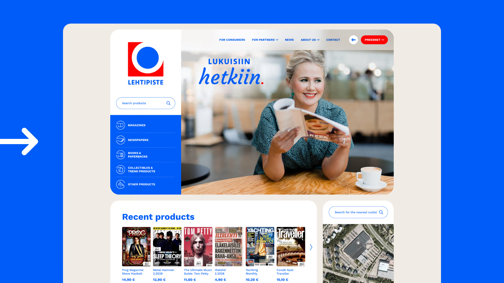
Solution: We created impressive and fresh pages that align with the new brand.
App concept
App concept
App concept
App concept
App concept
App concept
App concept
App concept
App concept
"Riesen Design designed the visual identity for Lehtipiste's website, and the collaboration was smooth from the start. The unique characteristics and needs of our business were well understood, and we successfully created a fresh, timeless look for the pages that perfectly supports our brand. The pages flexibly serve us in customer communication and make information presentation clear and easily accessible."

Anna-Leena Raita
Selection director, Lehtipiste
Napa School
Starting point
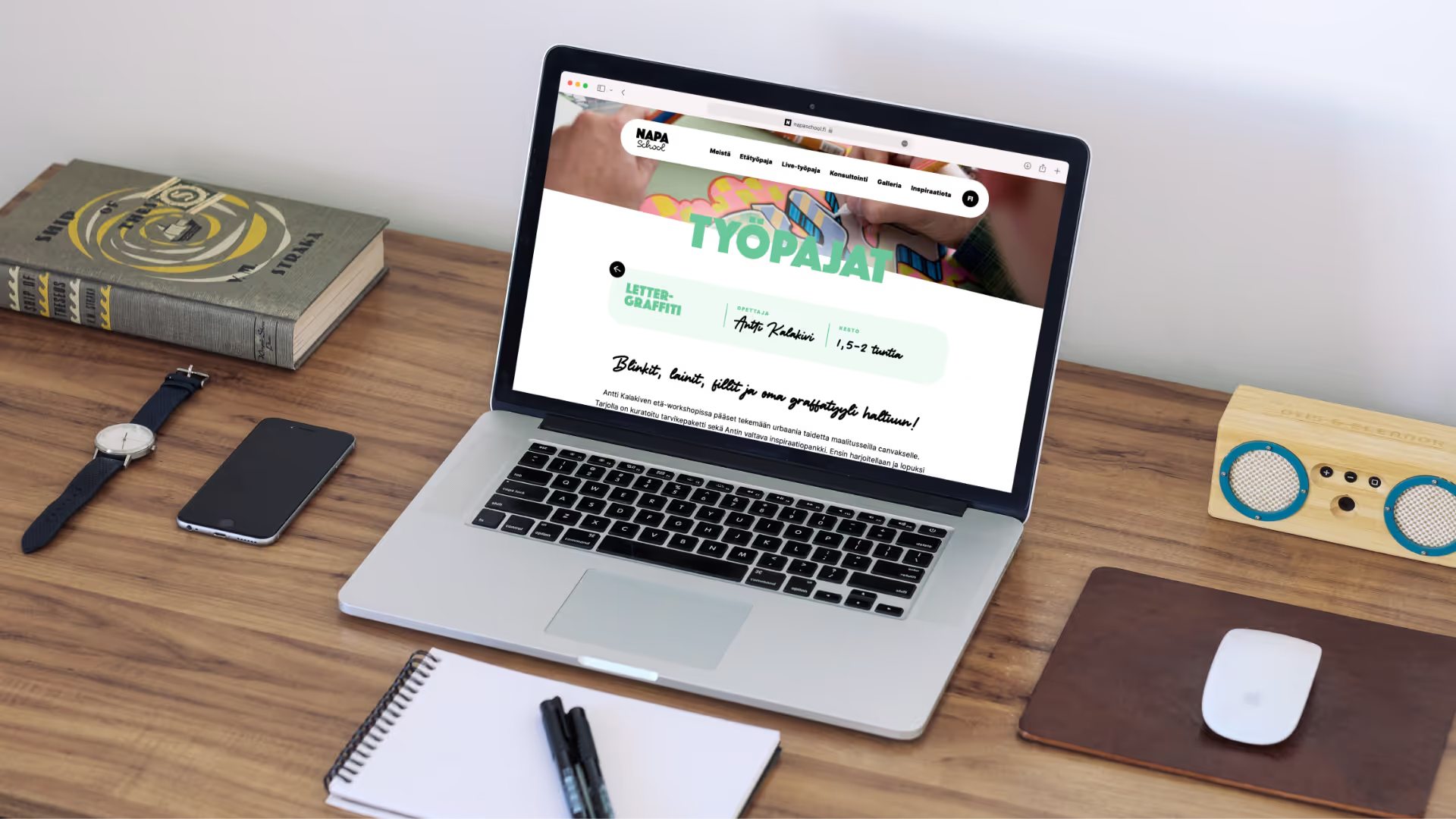
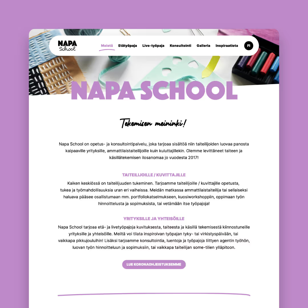
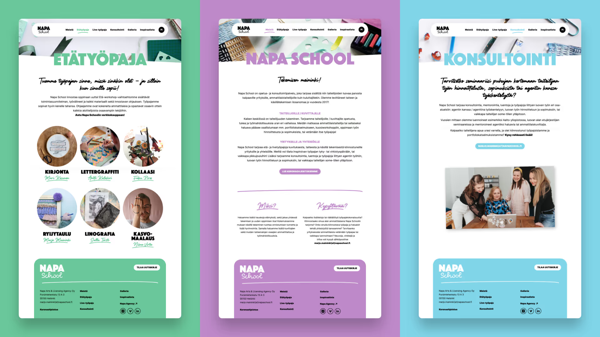
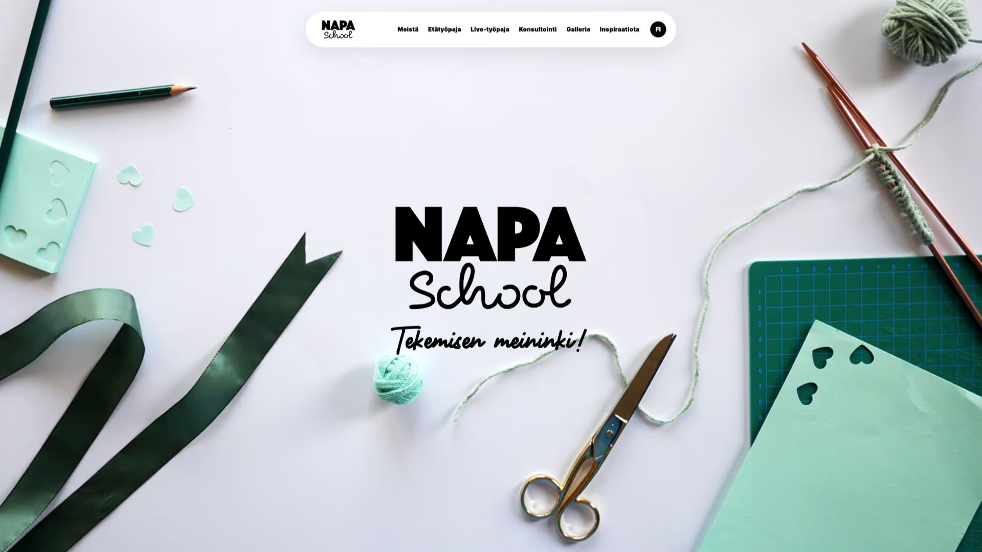
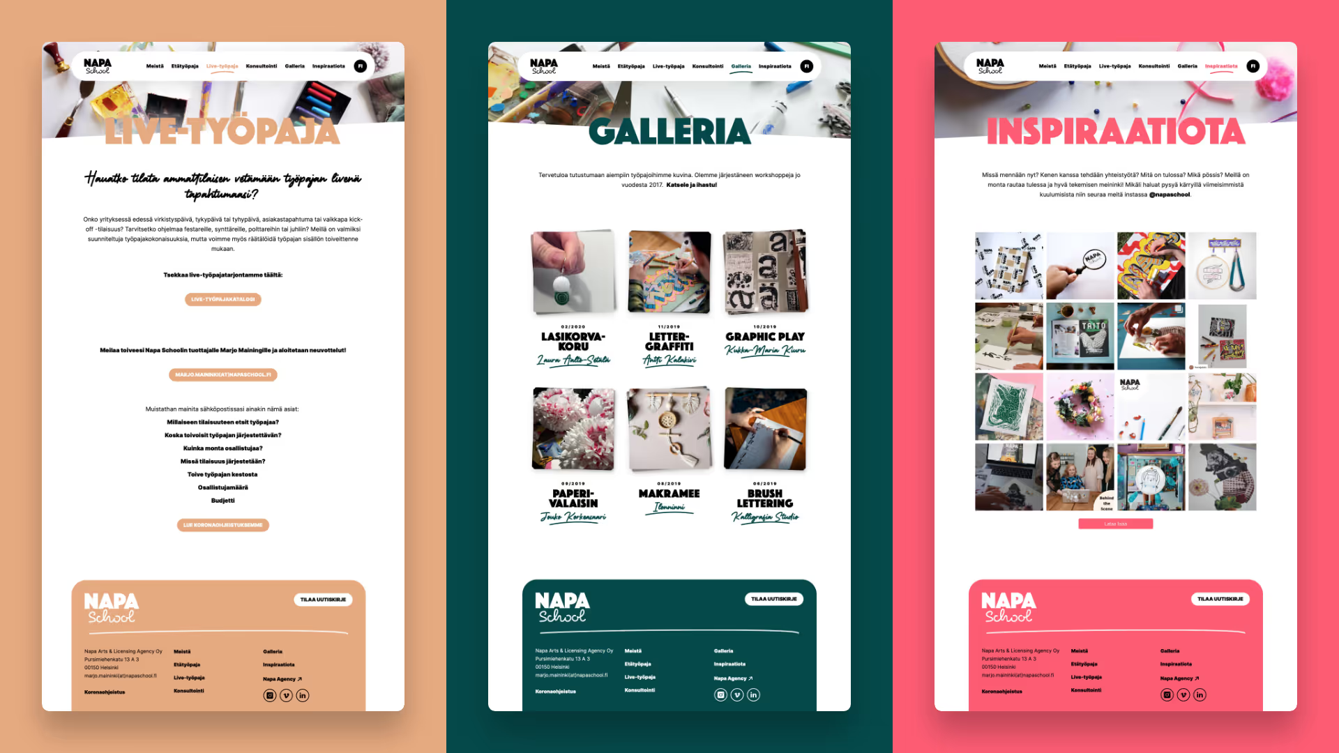
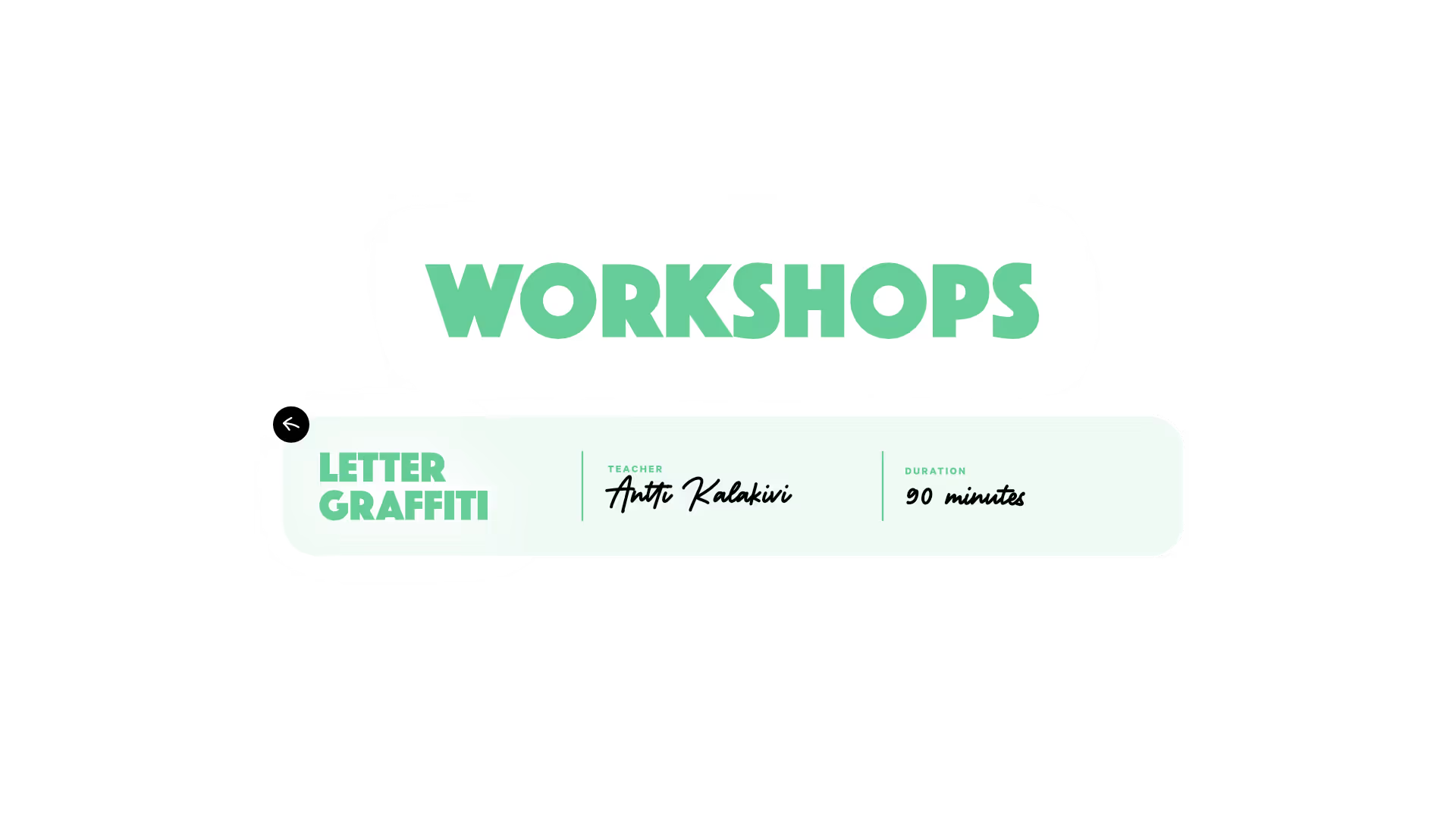
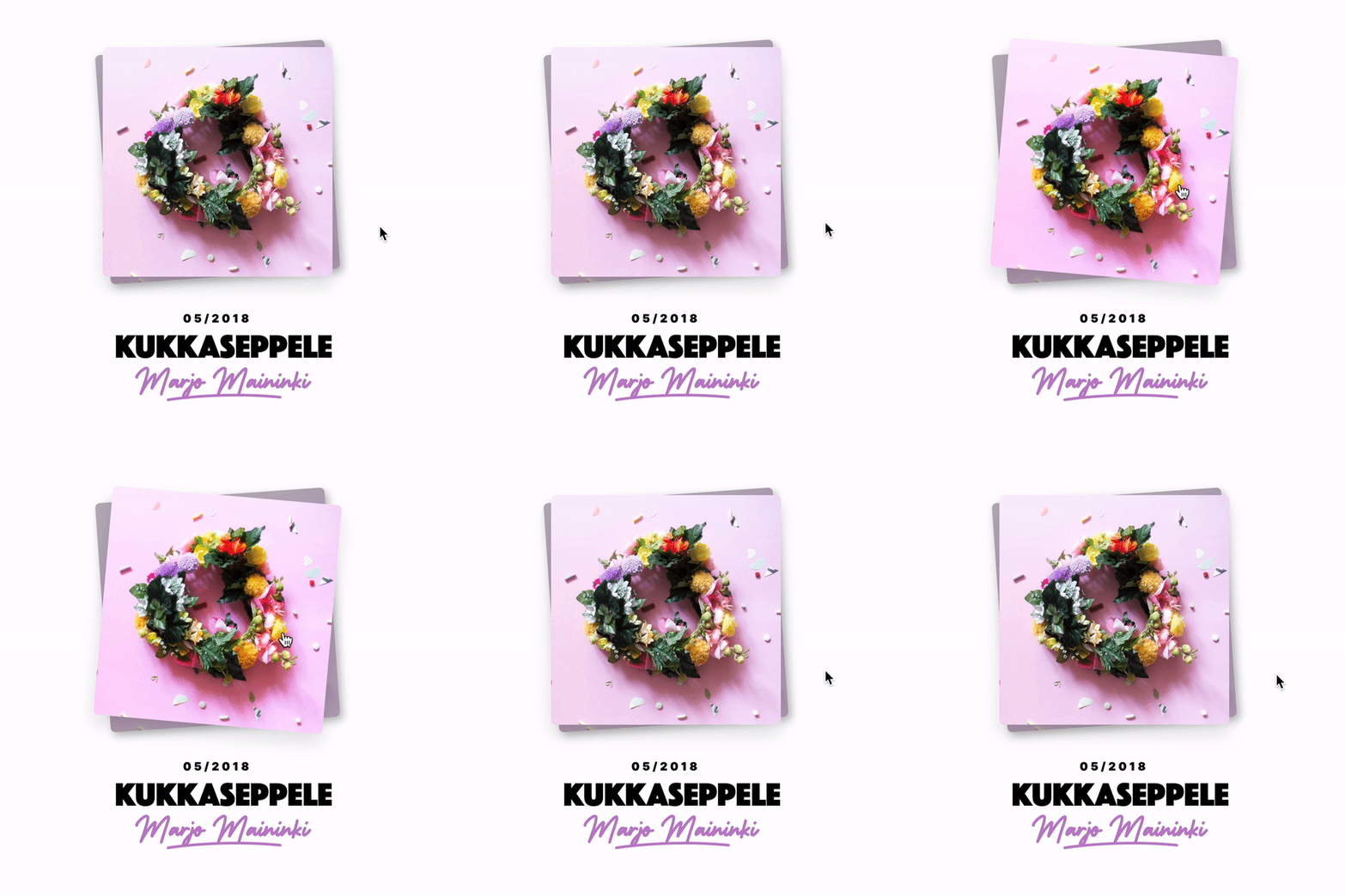
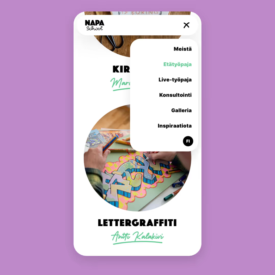
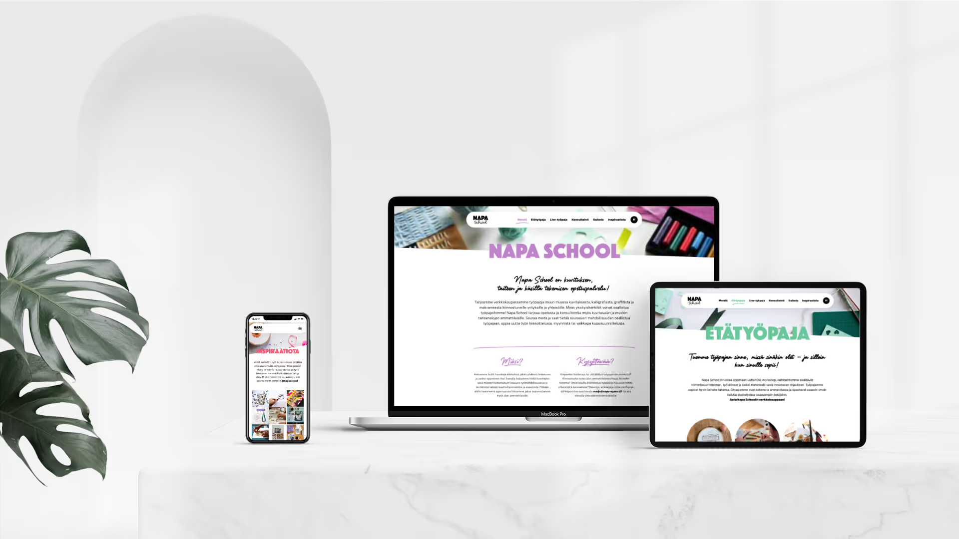
Riesen Design had the pleasure of implementing Napa School's own website with the pleasant team at Napa Agency. Napa School is an education and consulting service that provides content for businesses seeking artists' creative input, professional artists, and consumers alike. Through the new website, it is easy to book live or remote workshops on topics such as embroidery, collage, or even face painting. Inspiration can also be found in the extensive image gallery and Napa School's Instagram posts.
Solution
The pages were implemented with Webflow – a tool that enables the creation of fully customized websites without coding. Webflow still generates very clean code in the background, and custom code can be added to the pages if needed. This gives the designer full control from the layout phase to the final result, and updating content is easy for the client.
Our part
- User interface design
- Technical implementation
App concept
App concept
App concept
App concept
App concept
App concept
App concept
App concept
"Lorem ipsum dolor sit amet, consectetur adipiscing elit. Suspendisse varius enim in eros elementum tristique. Duis cursus, mi quis viverra ornare, eros dolor interdum nulla, ut commodo diam libero vitae erat. Aenean faucibus nibh et justo cursus id rutrum lorem imperdiet. Nunc ut sem vitae risus tristique posuere."
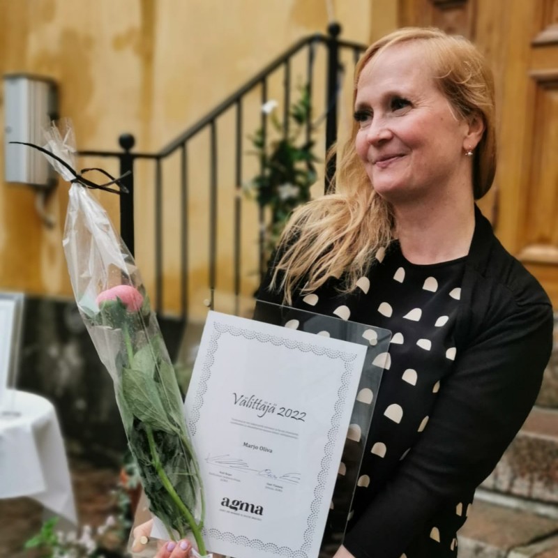
Marjo Oliva
Founder, Napa Arts & Licensing Agency
We do that too
Logos & visual identities

Illustrations & characters

Packaging & product images
Animations