Logos & visual identities

On this page, you’ll find examples of numerous logos and complete visual identities we’ve designed for both small and large companies. The process of designing a new visual identity always begins with a workshop, where we work with the client to define the company’s true character. After that, we begin designing the agreed-upon elements: the logo, colour palette, typography, and any other graphic elements, such as illustration and photography. The goal is always to clearly stand out from the competition, so we also review the marketing styles of similar companies during the workshop. We do not strictly limit the number of feedback rounds – instead, we continue refining the various elements until our client falls in love with the new look and feels that it perfectly represents their company.

Logos
Visual identities

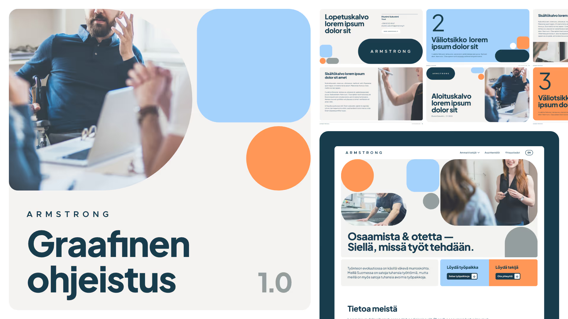
Visual identity, website and presentation template for the recruitment firm Armstrong.
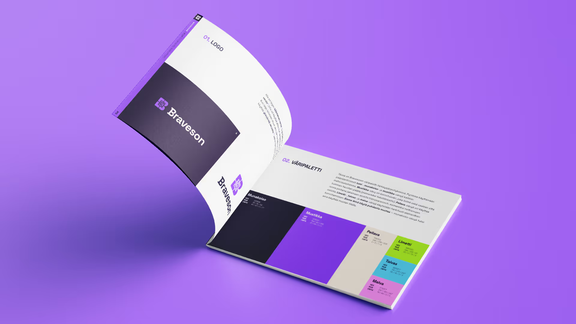
Braveson's brand book.
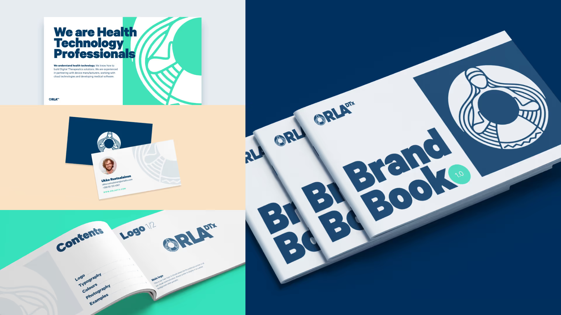
The visual identity of Orla DTx, which develops digital therapeutic solutions.
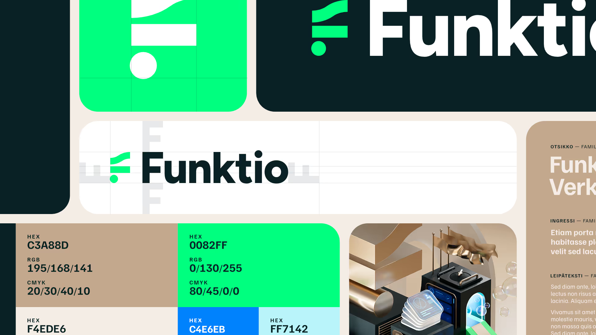
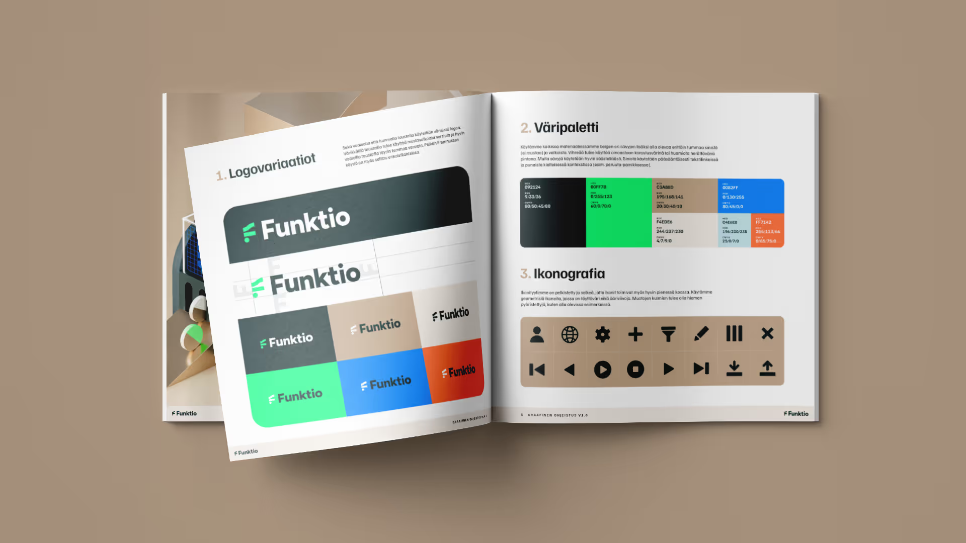
Details of the visual identity for the technology company Funktio.
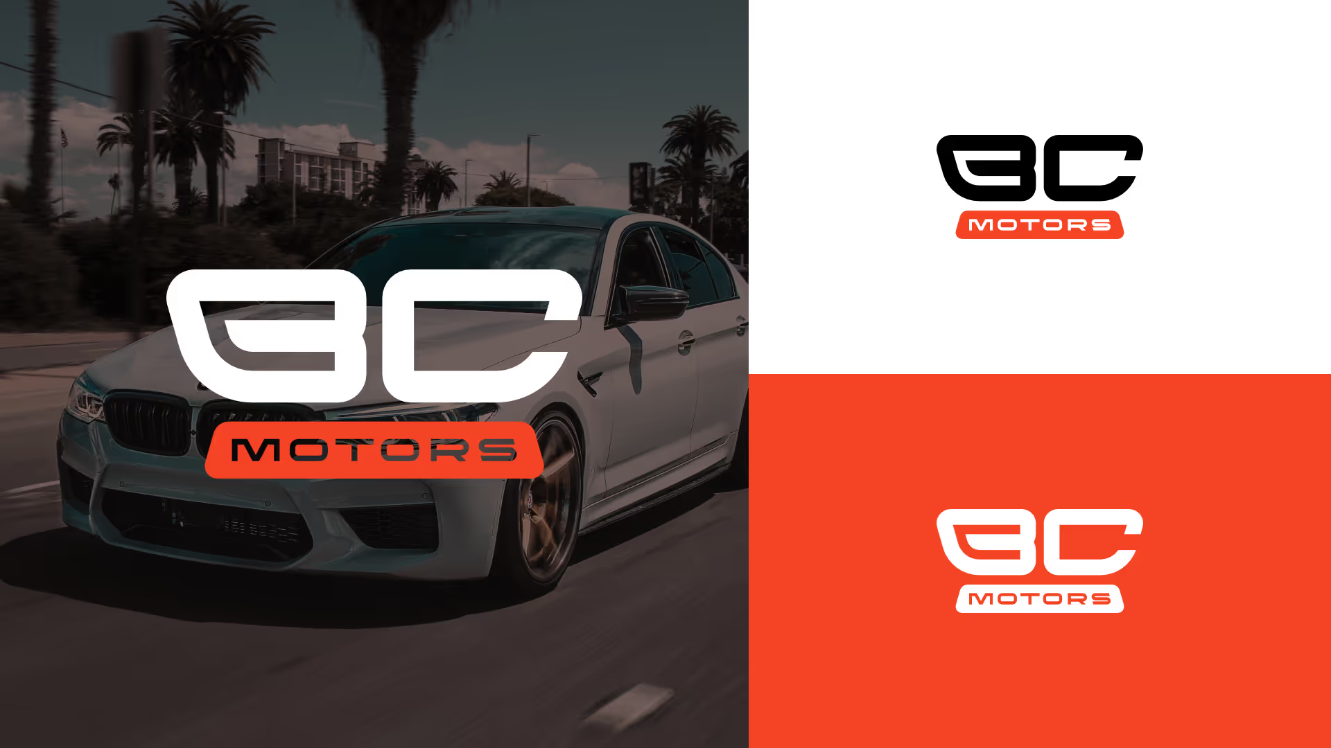
The logo of BC Motors, a repair shop specialising in BMW vehicles.
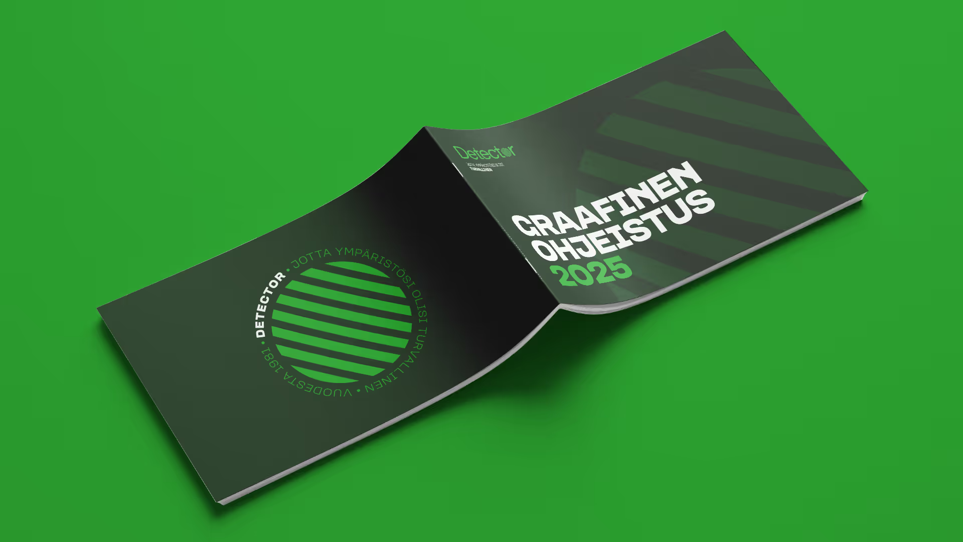
Brand book for Detector, a company specialising in gas monitoring.
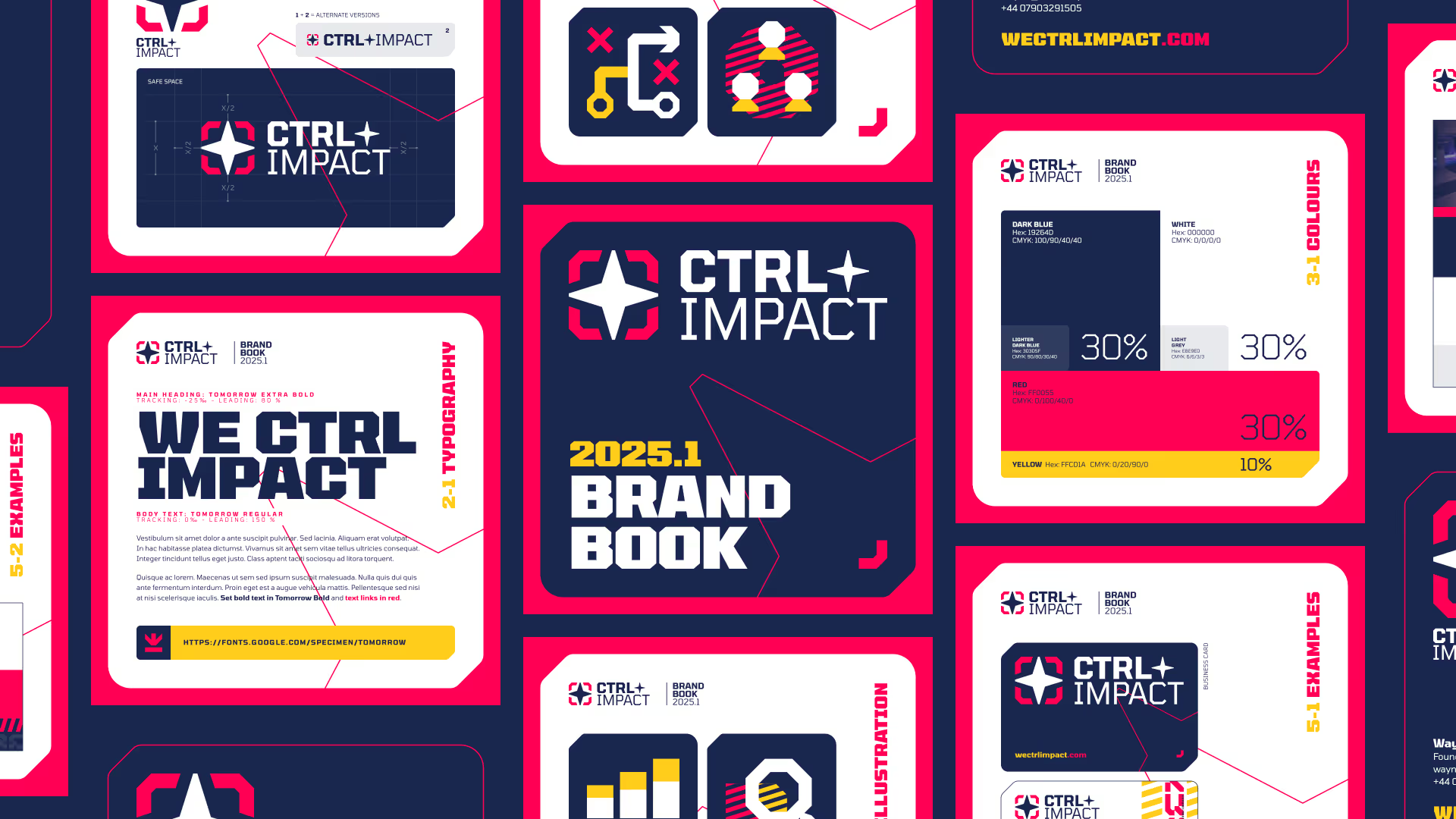
Overview of the visual identity of CTRL+IMPACT, a consulting firm realting to the gaming industry.
Projects
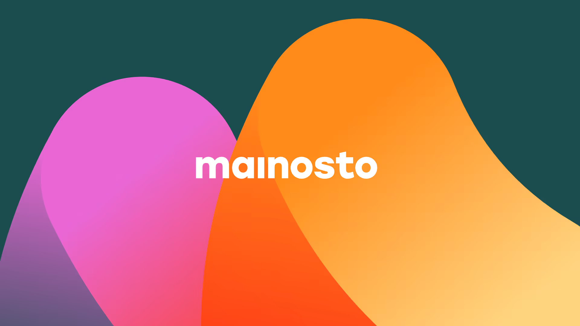
Mainosto

Starting point
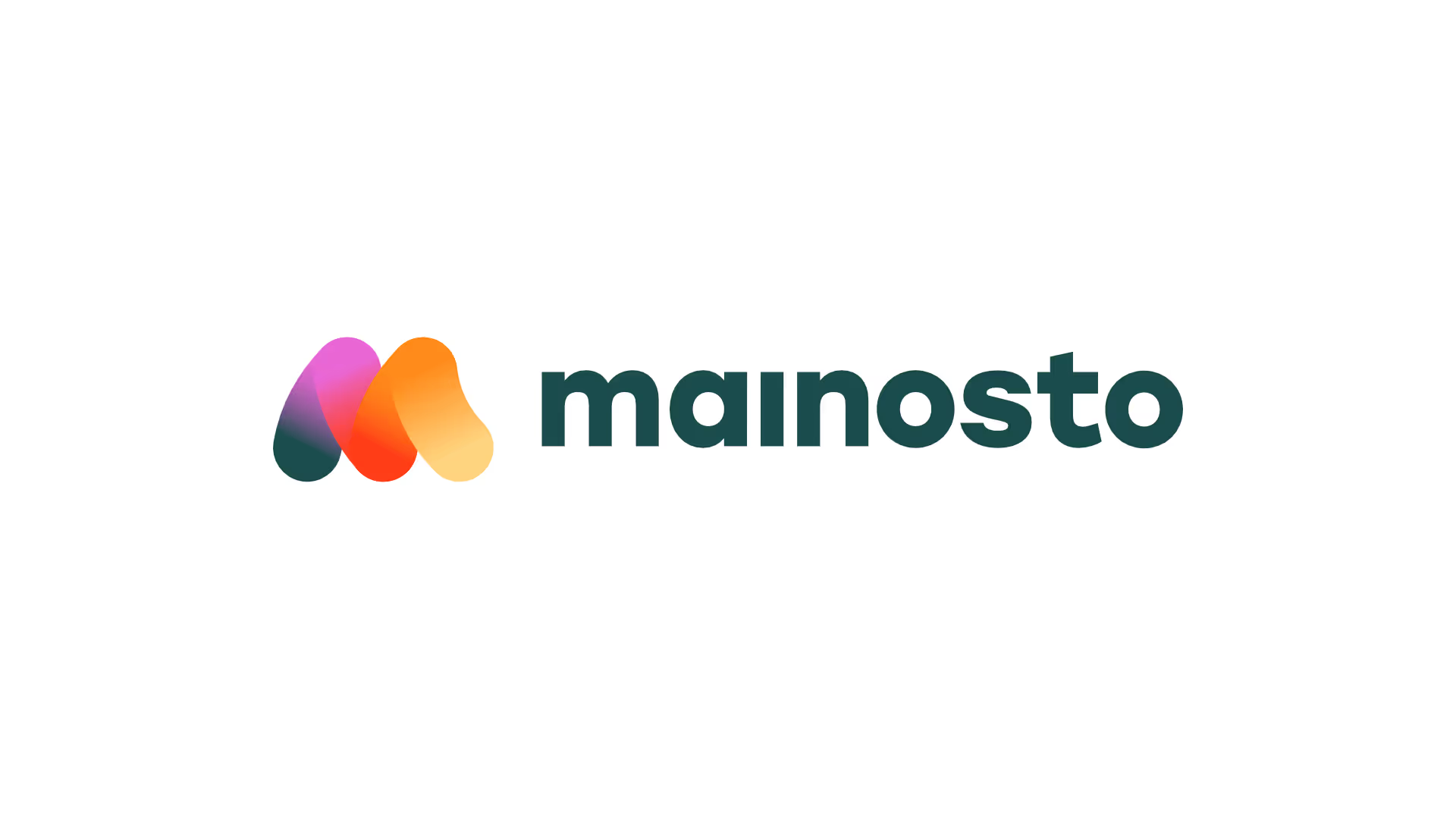
A young and ambitious visual design company named Mainosto needed a logo, a visual identity and a website. We started working together to create a cheerful and approachable visual identity that delighted them.
Solution
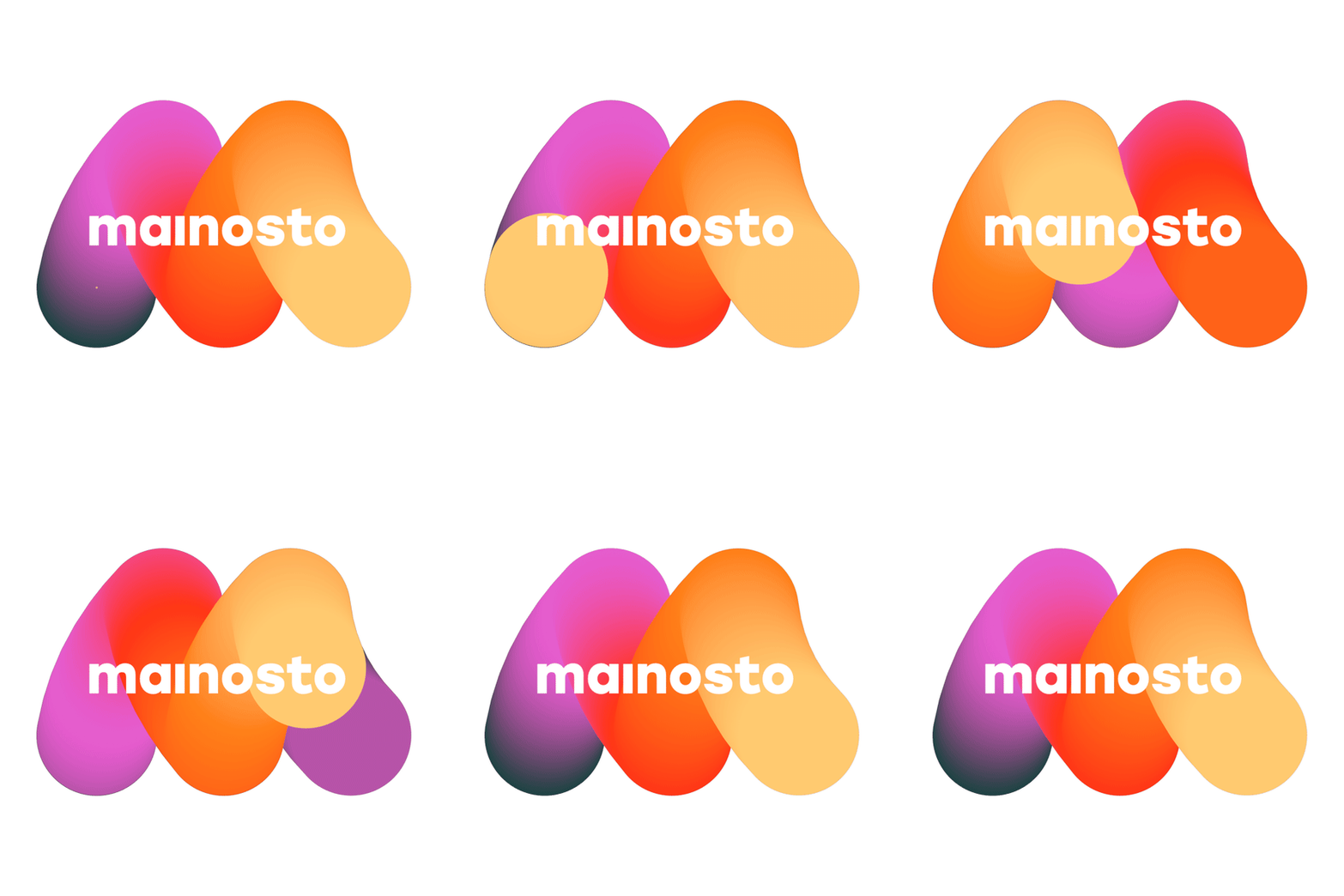
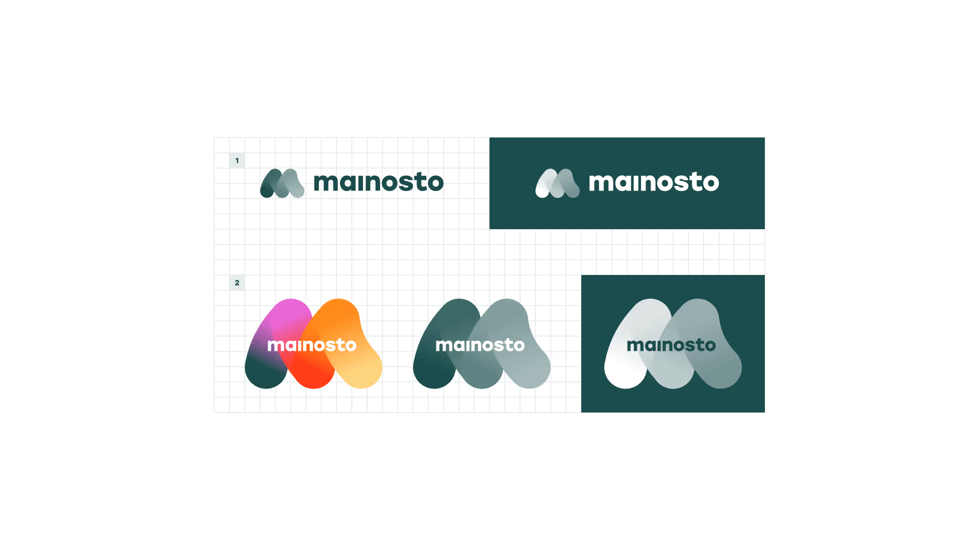
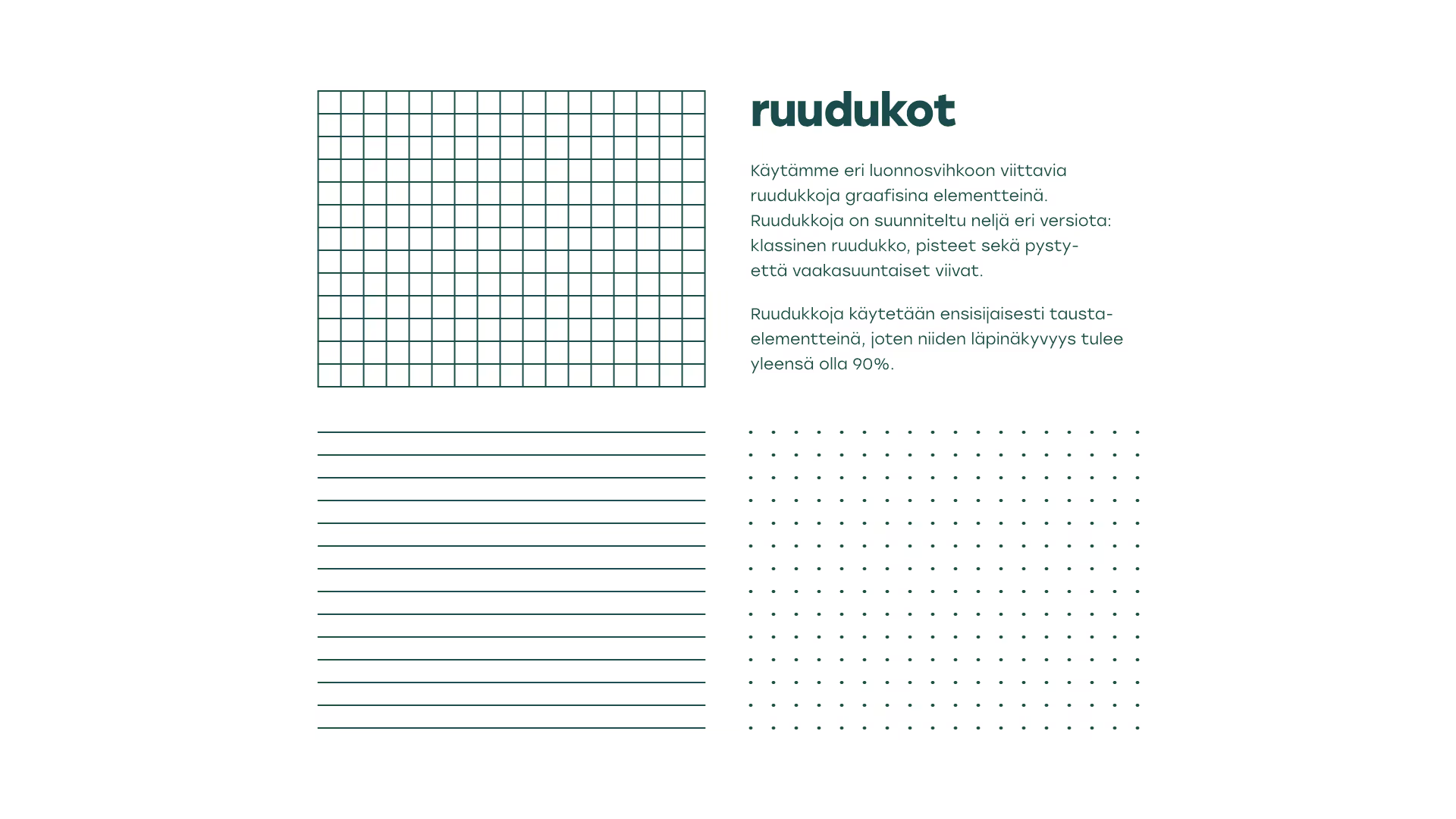
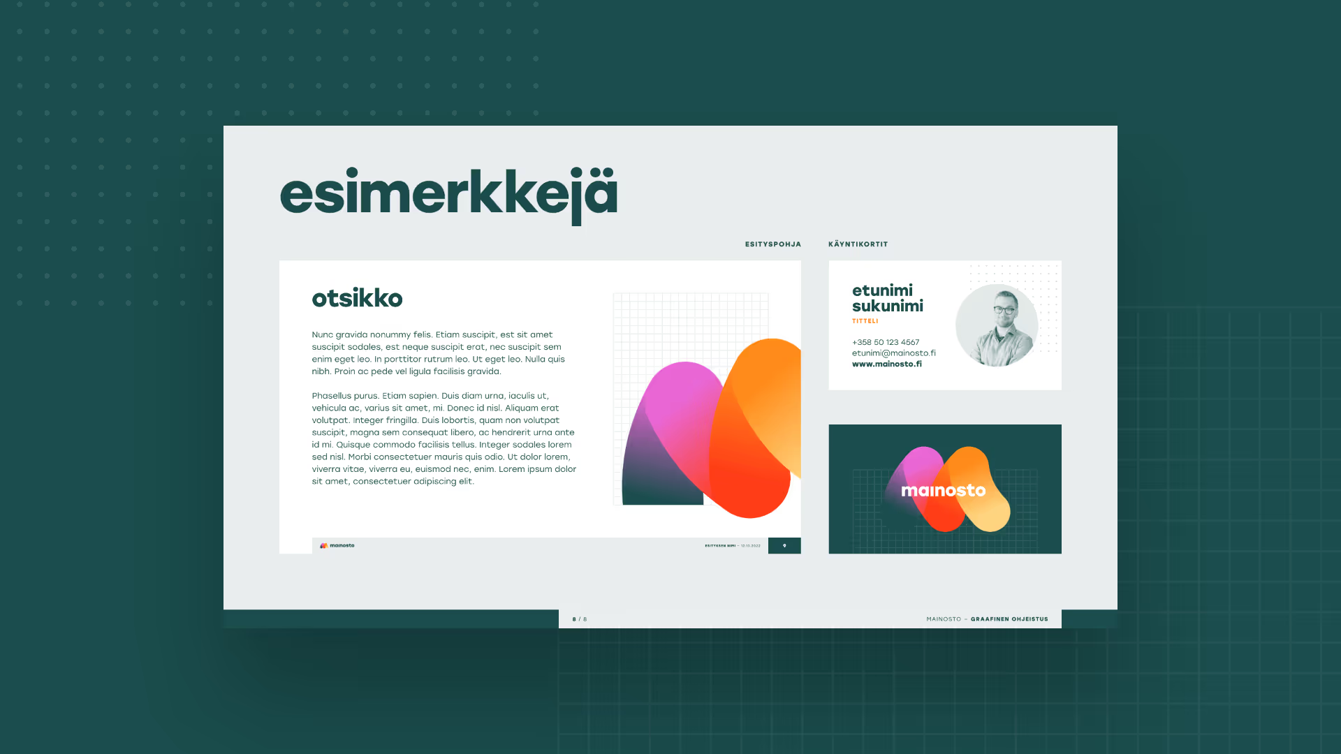
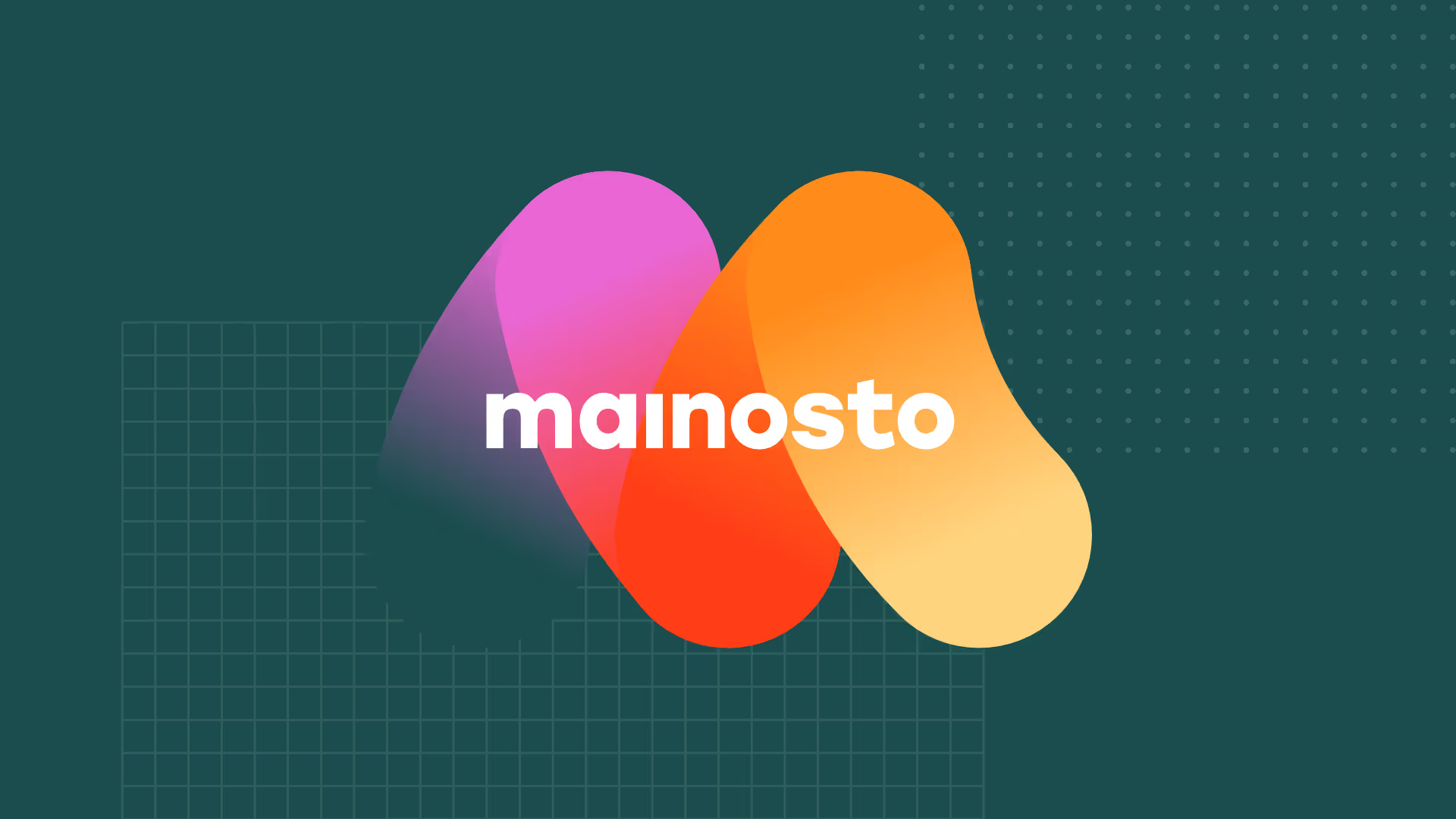
The M icon resembles the colourful stroke of a paintbrush, and the grids are a nod to the sketchbooks often used by logo designers and illustrators. In addition to the website, the collaboration resulted in a comprehensive brand book that defines the use of the logo, typography, colours and grids, as well as the style of photography and illustration.
Our part
- Logo
- Visual identity
- Brand book
- Visual design of website

App concept
App concept
Brand book
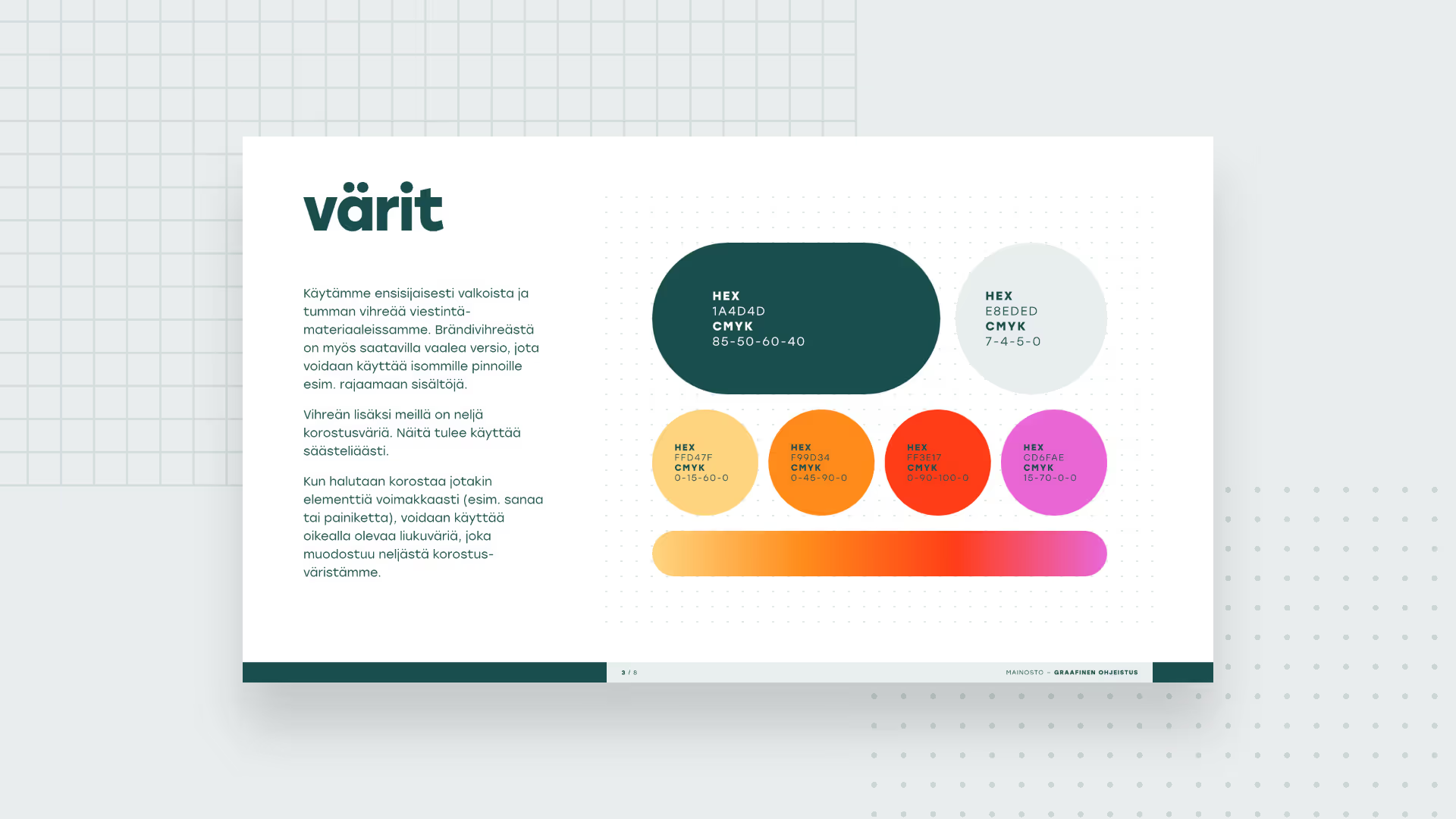
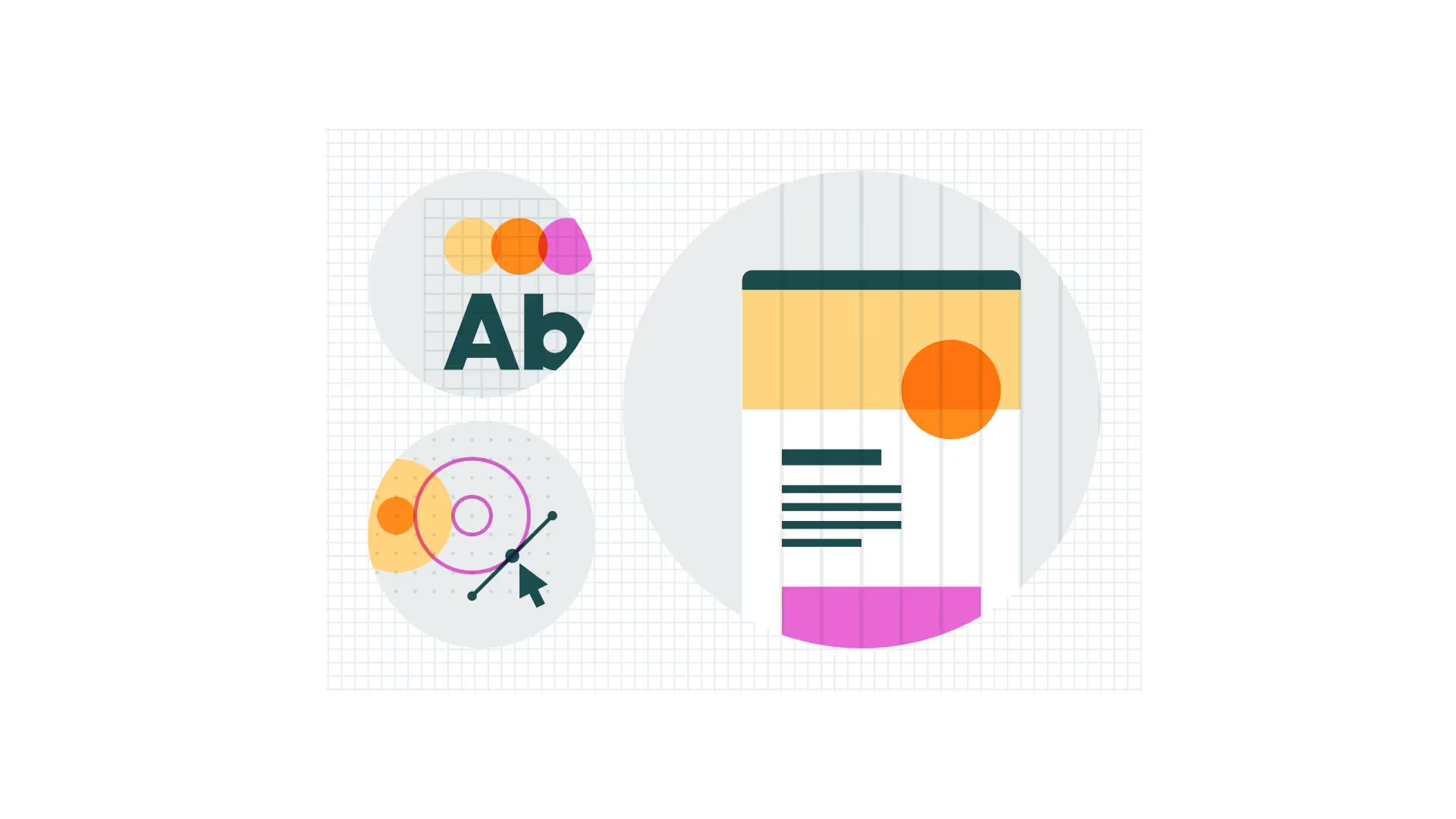
A new brand identity always requires a style guide to ensure that the brand’s various elements are used consistently and appropriately. This concise yet comprehensive brand book we designed covered the use of all of Mainosto’s essential visual elements: the logo, colour palette, typography, photography and illustration styles, complete with numerous examples.
App concept
App concept
App concept
App concept
App concept
App concept
Website
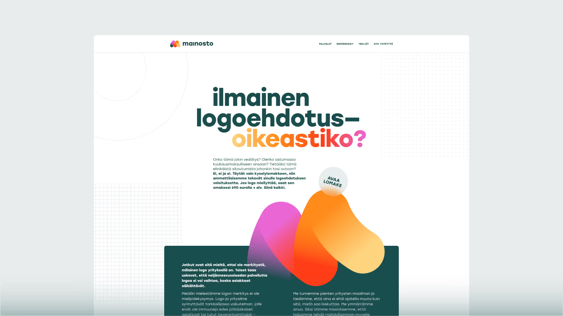
We also designed a clean and modern website that seamlessly integrate with the new visual identity.
App concept
Marketing materials
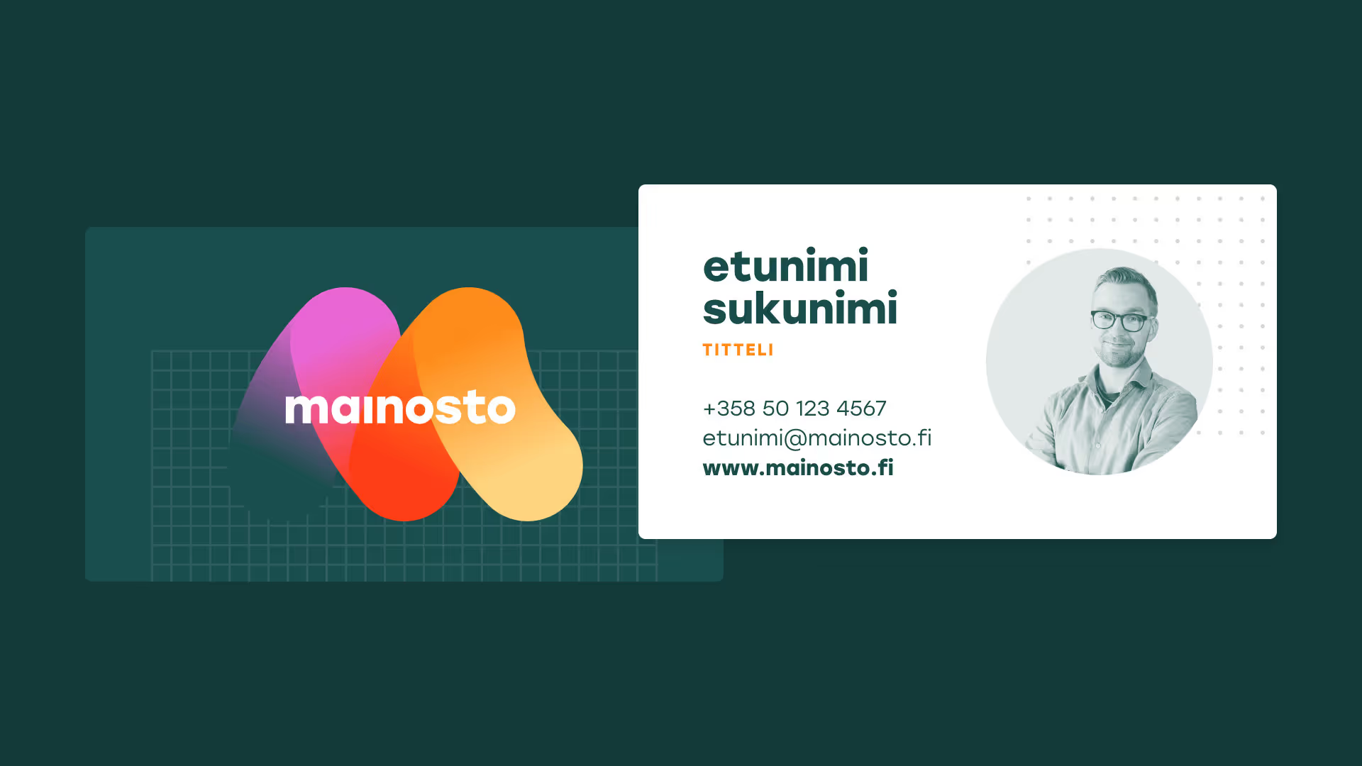
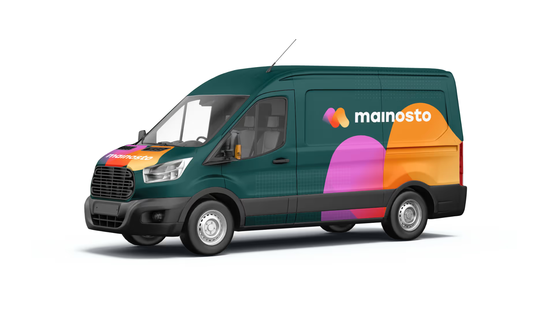
In addition to the materials mentioned above, we also designed Mainosto’s new business cards and an eye-catching van design.
App concept
App concept
App concept
"Lorem ipsum dolor sit amet, consectetur adipiscing elit. Suspendisse varius enim in eros elementum tristique. Duis cursus, mi quis viverra ornare, eros dolor interdum nulla, ut commodo diam libero vitae erat. Aenean faucibus nibh et justo cursus id rutrum lorem imperdiet. Nunc ut sem vitae risus tristique posuere."

First Name Last Name
Title, Company
Vapaus
Starting point
Vapaus is a company founded in 2018 that promotes sustainable mobility solutions, including by providing company bicycles and related services. Riesen Design was commissioned to conceptualise and implement the redesign of Vapaus’s visual identity.
Solution
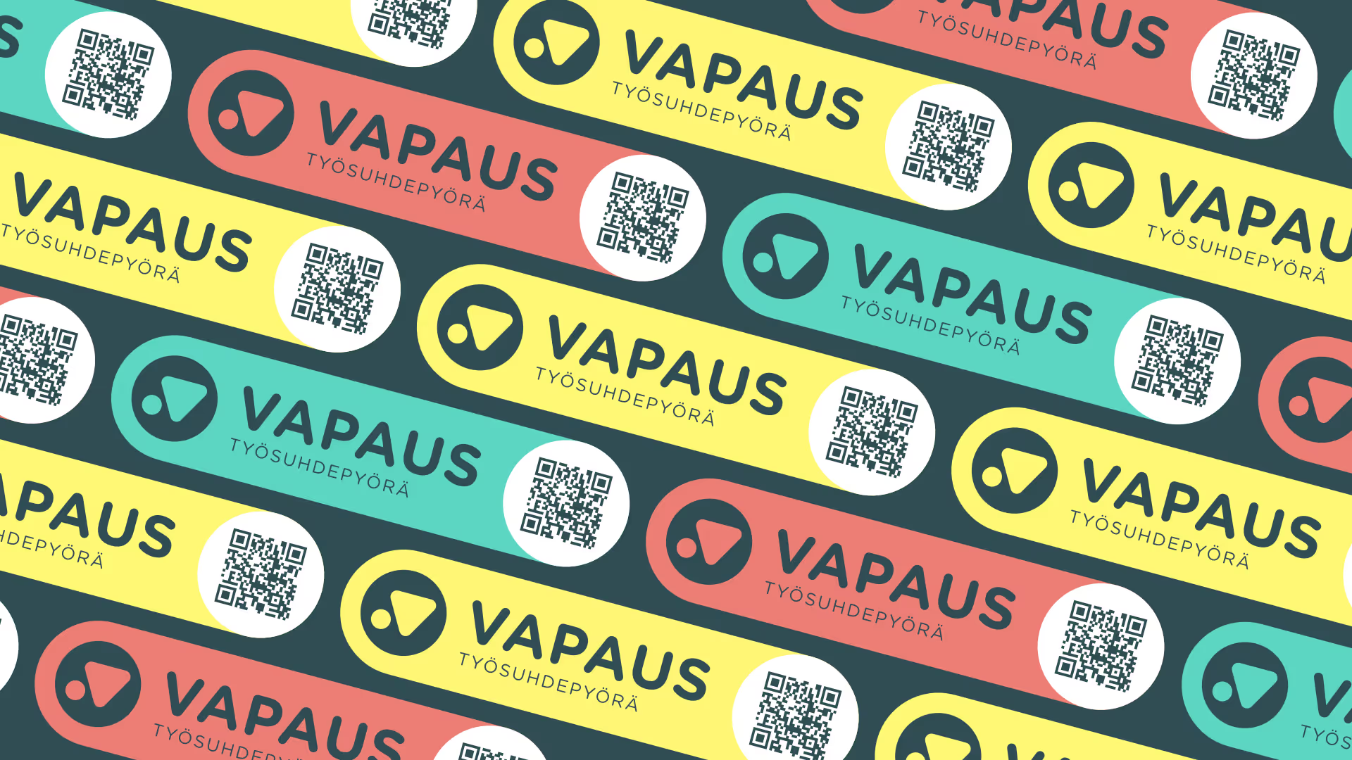
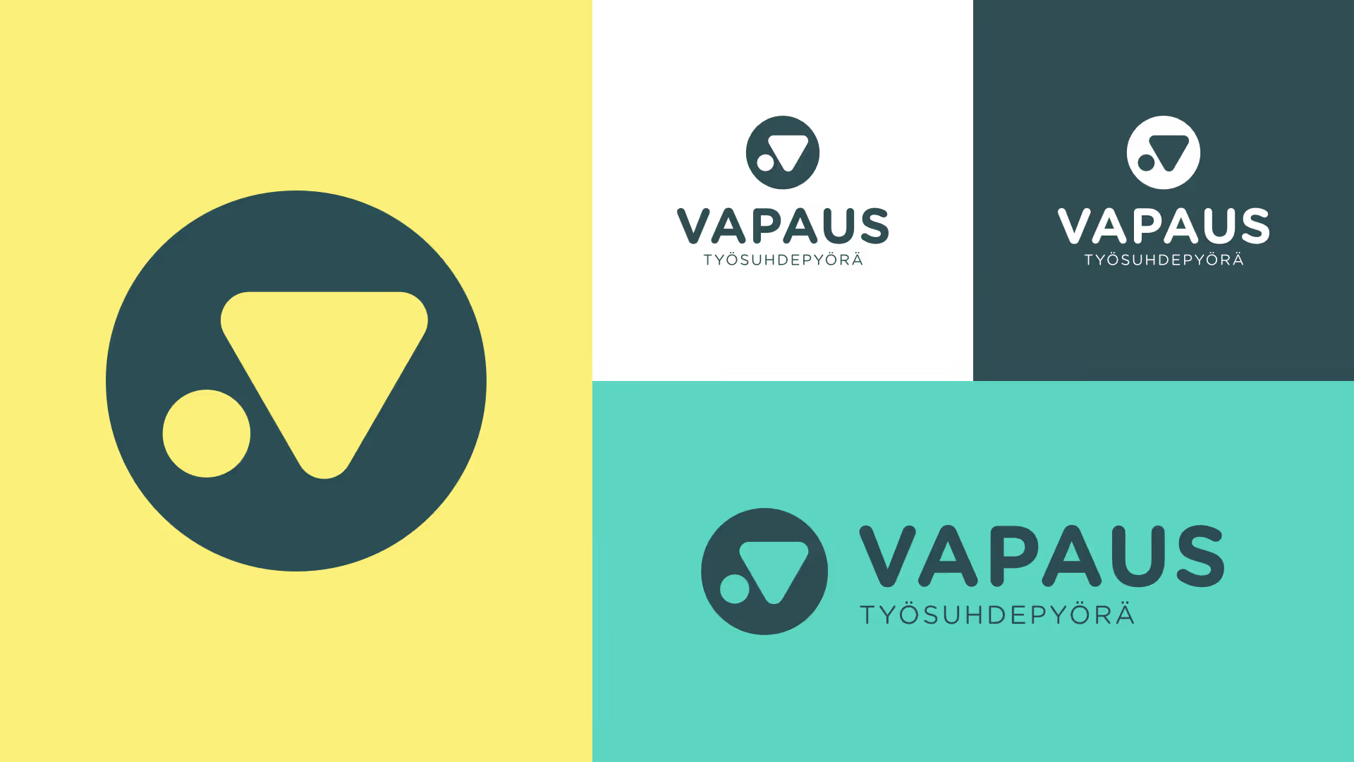
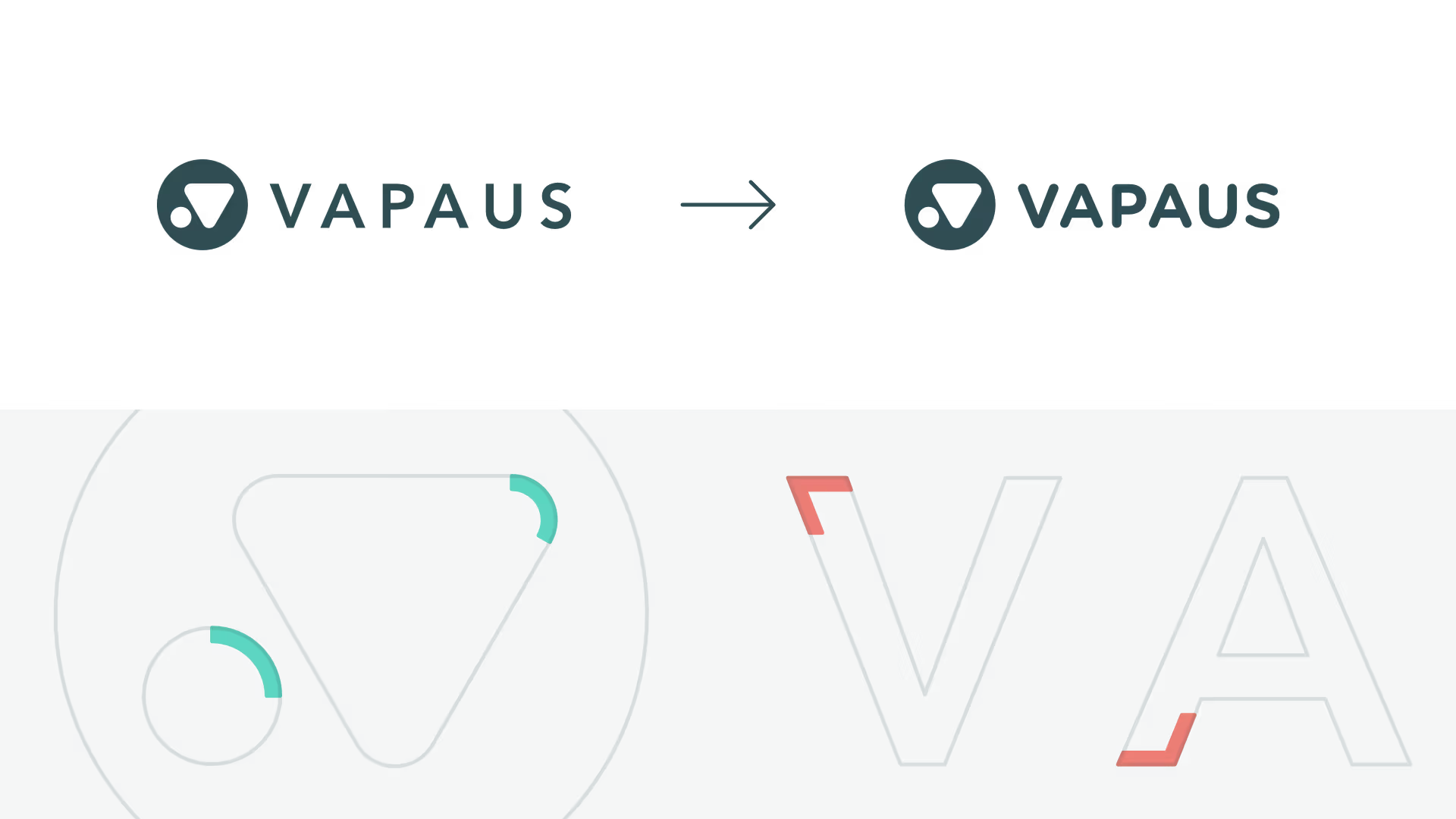
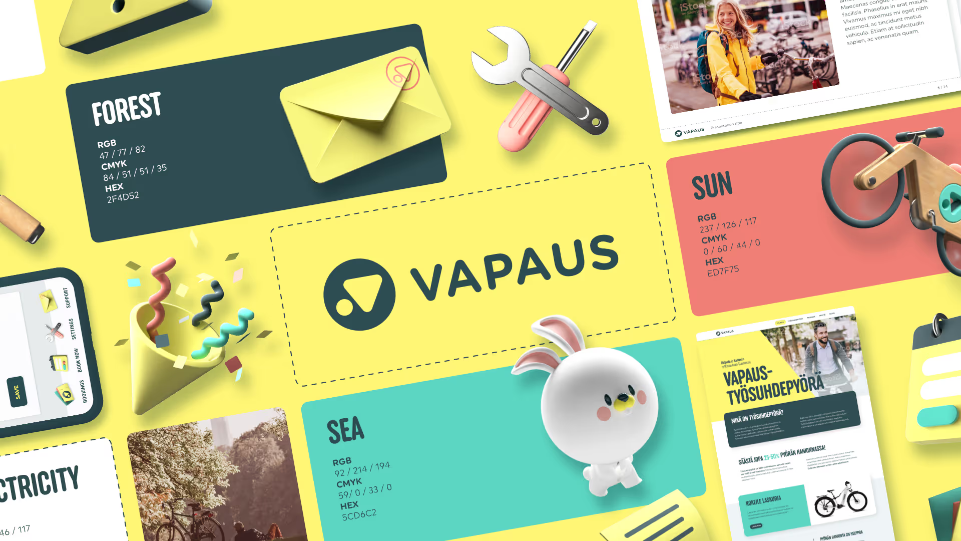
We translated the company’s brand attributes into a visual language by updating the graphic guidelines, mascot, website, and app interface. We also created new icons and an illustration style, a presentation template and promotional materials. We retained the original logo, which we deemed to still be relevant and effective, but paired the logo with a typeface family that worked better with its rounded shapes. We also completely redesigned the colour palette so that the tones would better reflect Vapaus’s attributes: a bold, energetic, and attention-grabbing brand that leaves no one indifferent.
Our collaboration with Vapaus continues, and we are constantly producing new materials to strengthen the brand.
Our part
- Visual identity
- Brand book
- 3D illustrations and animations
- Character design
- Visual design and technical implementation of websites, blog and online store
- Design of promotional materials
- Presentation template
Braveson's brand book.
Braveson's brand book.
Brand book
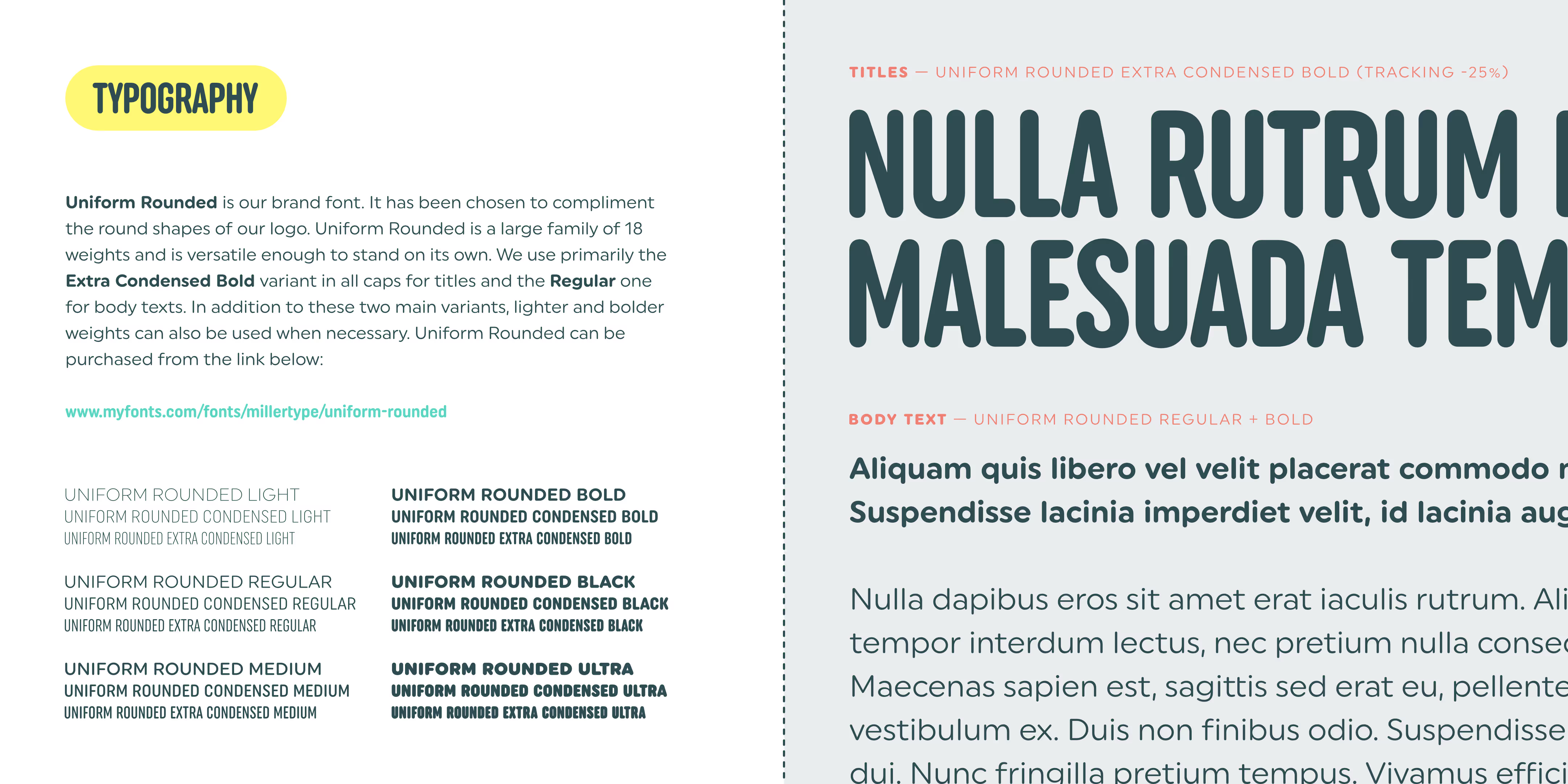
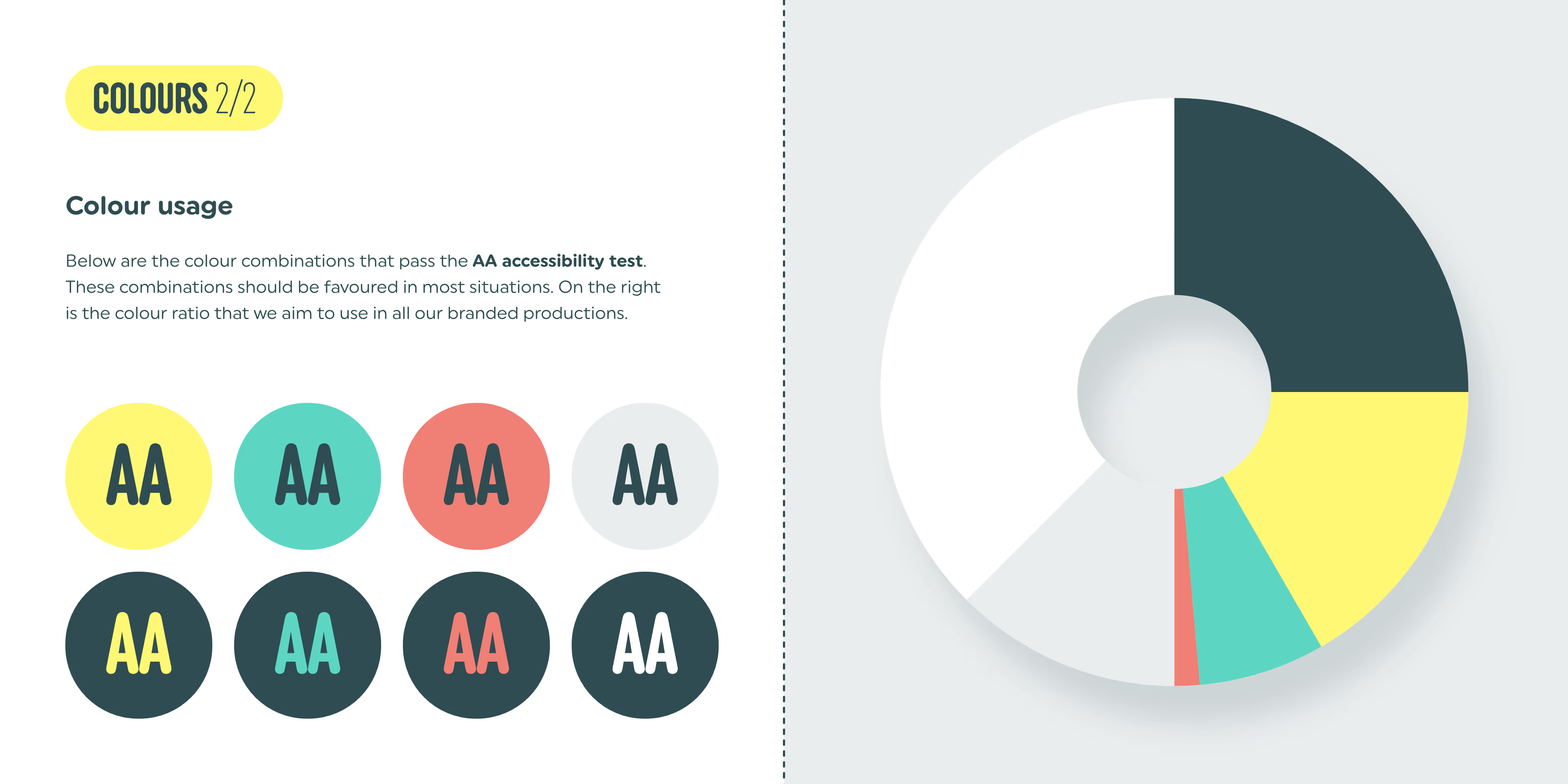
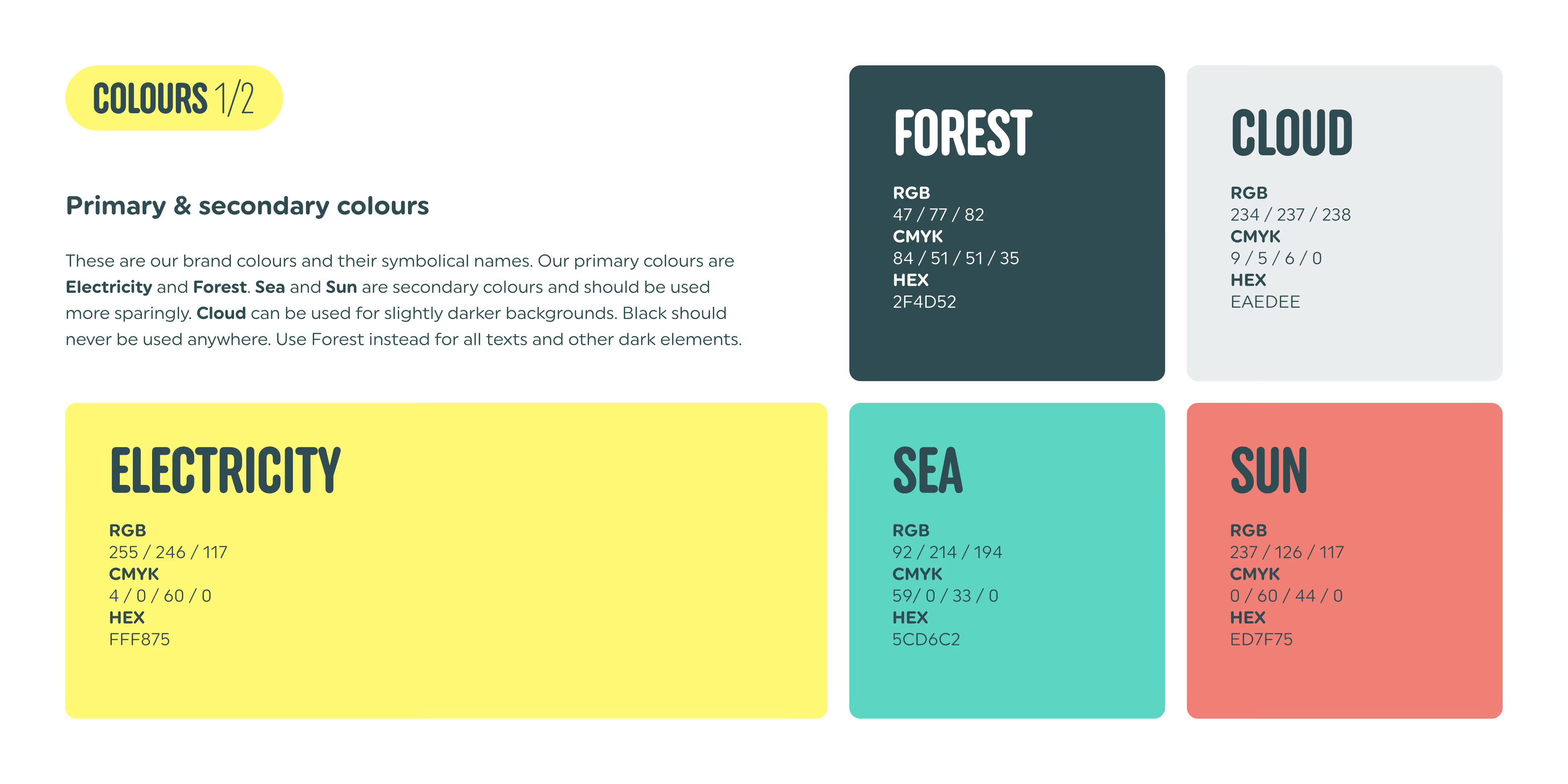
To ensure consistency in Vapaus’s new visual identity, we developed a comprehensive brand book that specify how the various versions of the logo, typography, colour palette (including from an accessibility perspective), icons and illustrations should be used.
Braveson's brand book.
Braveson's brand book.
Text
Braveson's brand book.
Icon set
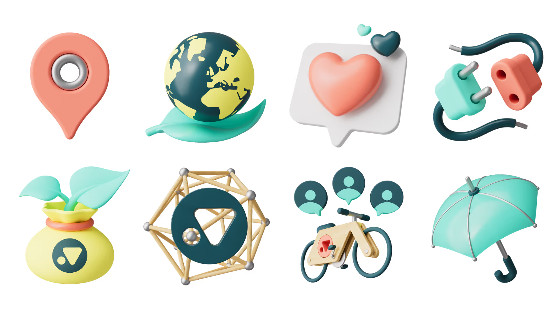
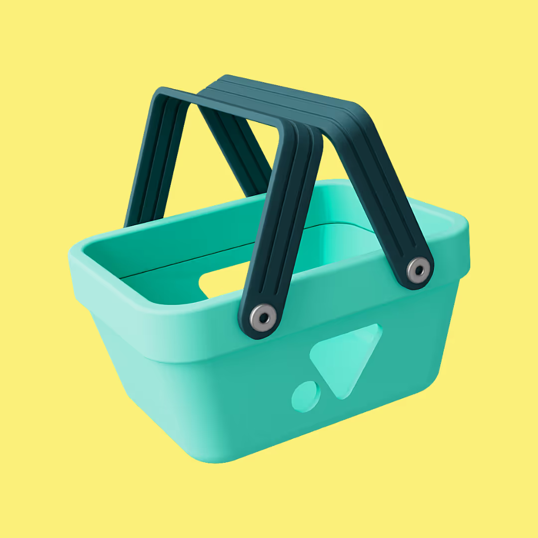
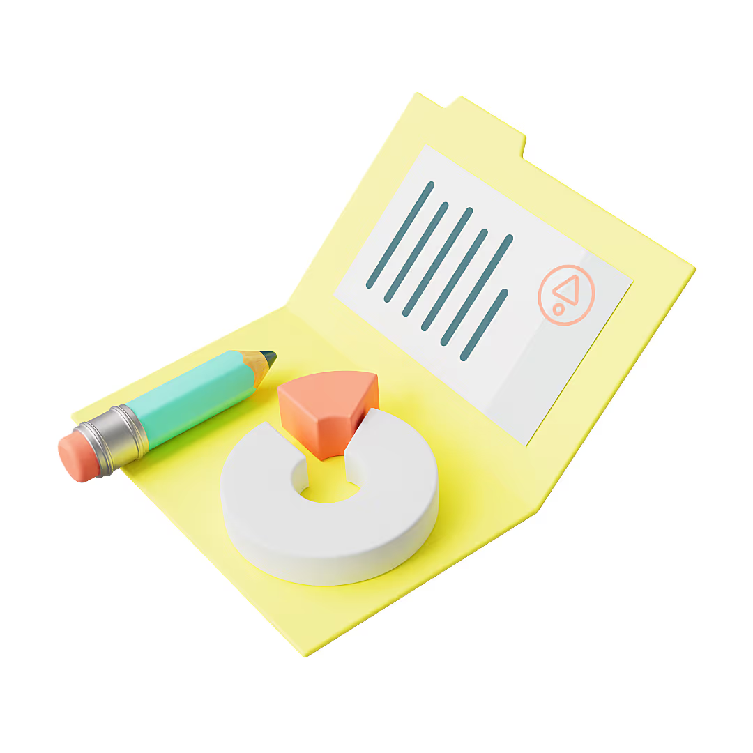
A company needs more than just pretty stock images. We enriched Vapaus's look and feel by creating numerous, fully customised 3D illustrations that the client can use in a variety of ways: for example, in advertisements, presentations, infographics and on their website. These illustrations reinforce Vapaus's brand by making it even more cohesive and distinctive.

Braveson's brand book.
Braveson's brand book.

Braveson's brand book.
Braveson's brand book.
Braveson's brand book.
Pupu
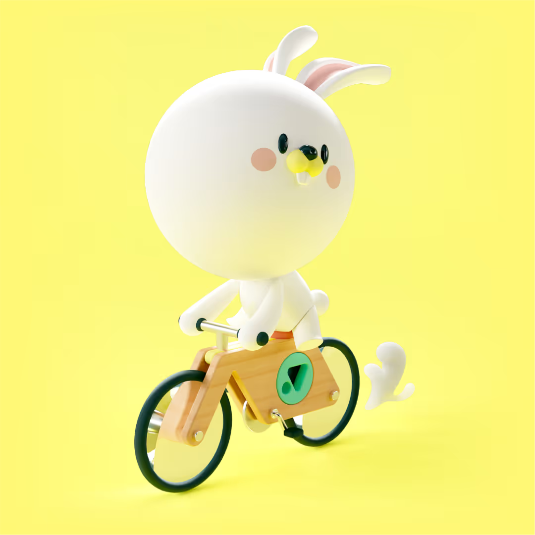
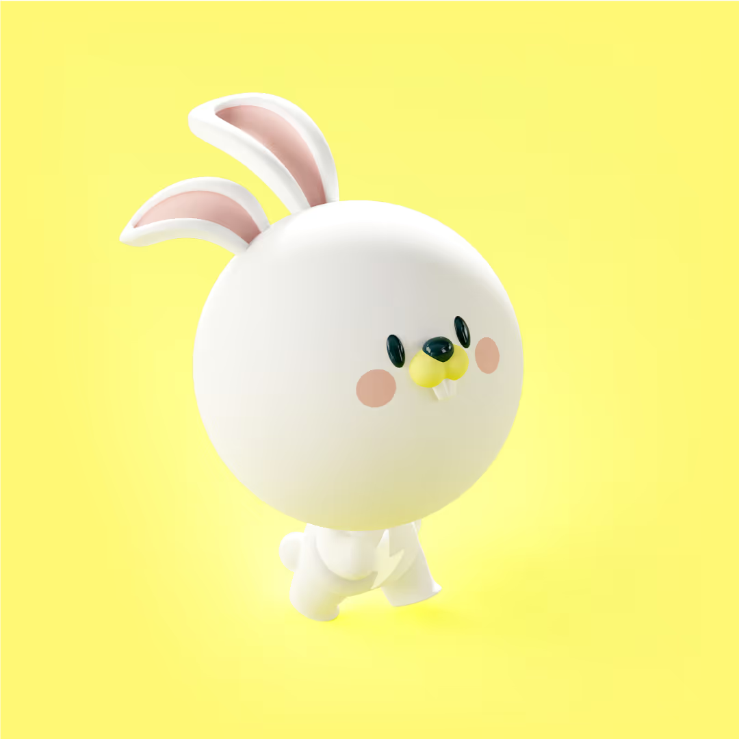
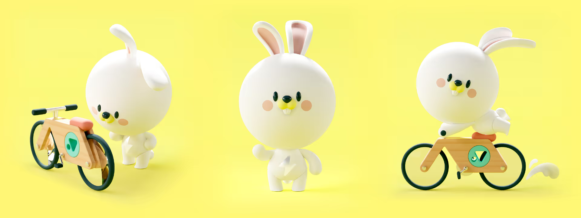
Vapaus has had a mascot named Pupu since its inception. Riesen Design modernised it by designing a fun and approachable 3D character that appears in various Vapaus materials and works seamlessly with other illustrations.
Braveson's brand book.
Braveson's brand book.
Braveson's brand book.
Website & app
Riesen Design also designed Vapaus’s original, fully customised and responsive website, their blog, as well as their online store using Webflow.
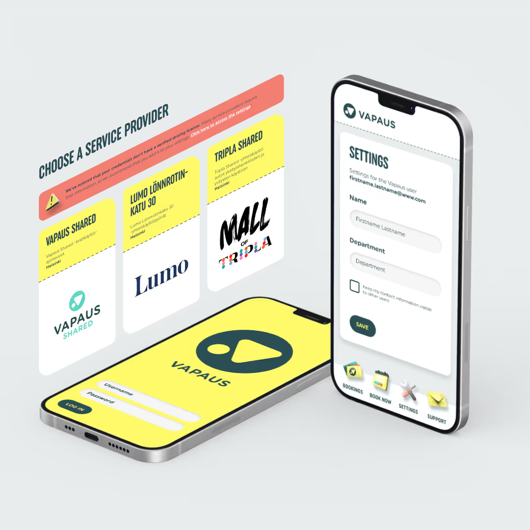
App concept
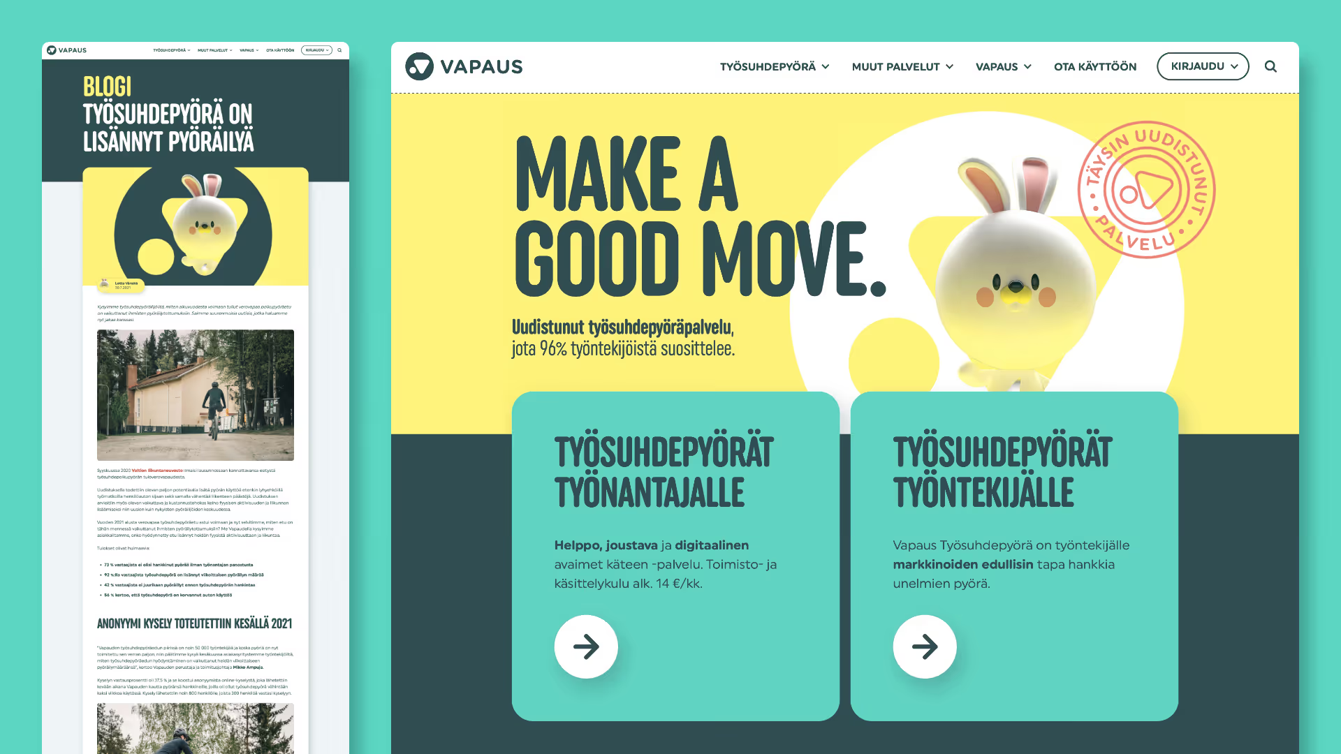
Vapaus's original website and blog
Marketing material
The partnership between Riesen Design and Vapaus continues, and in addition to everything mentioned above, we are constantly designing new marketing materials, such as roll-up banners, patches, presentations and trade show materials.
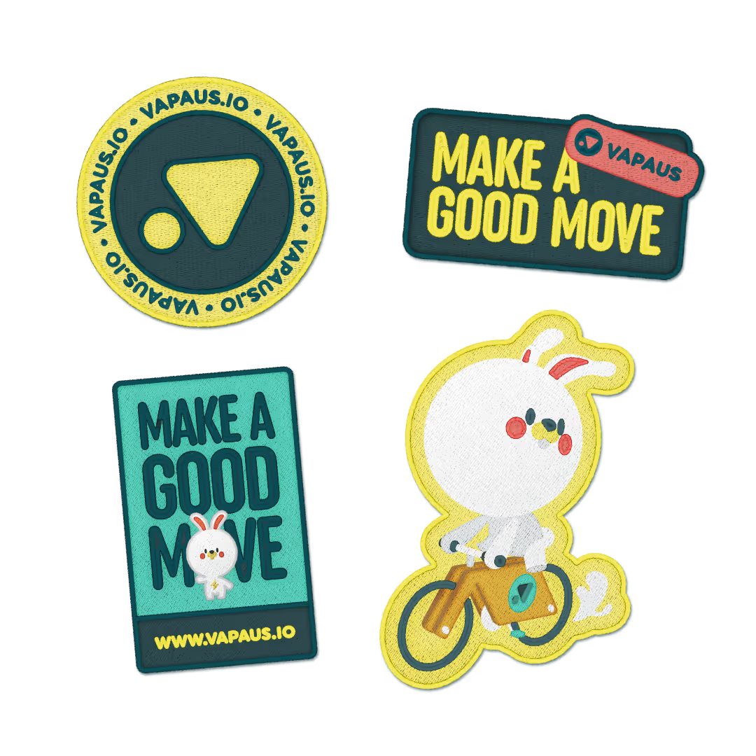
App concept
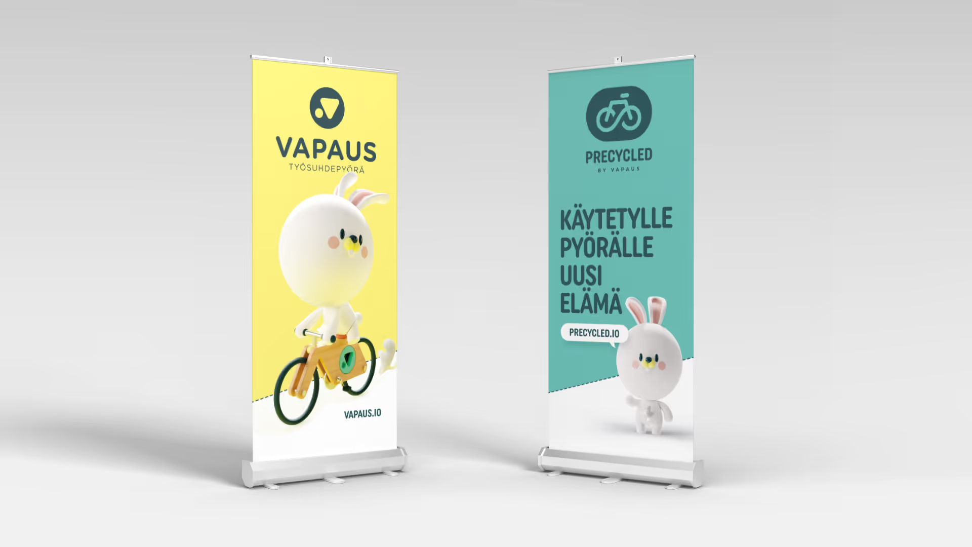
App concept
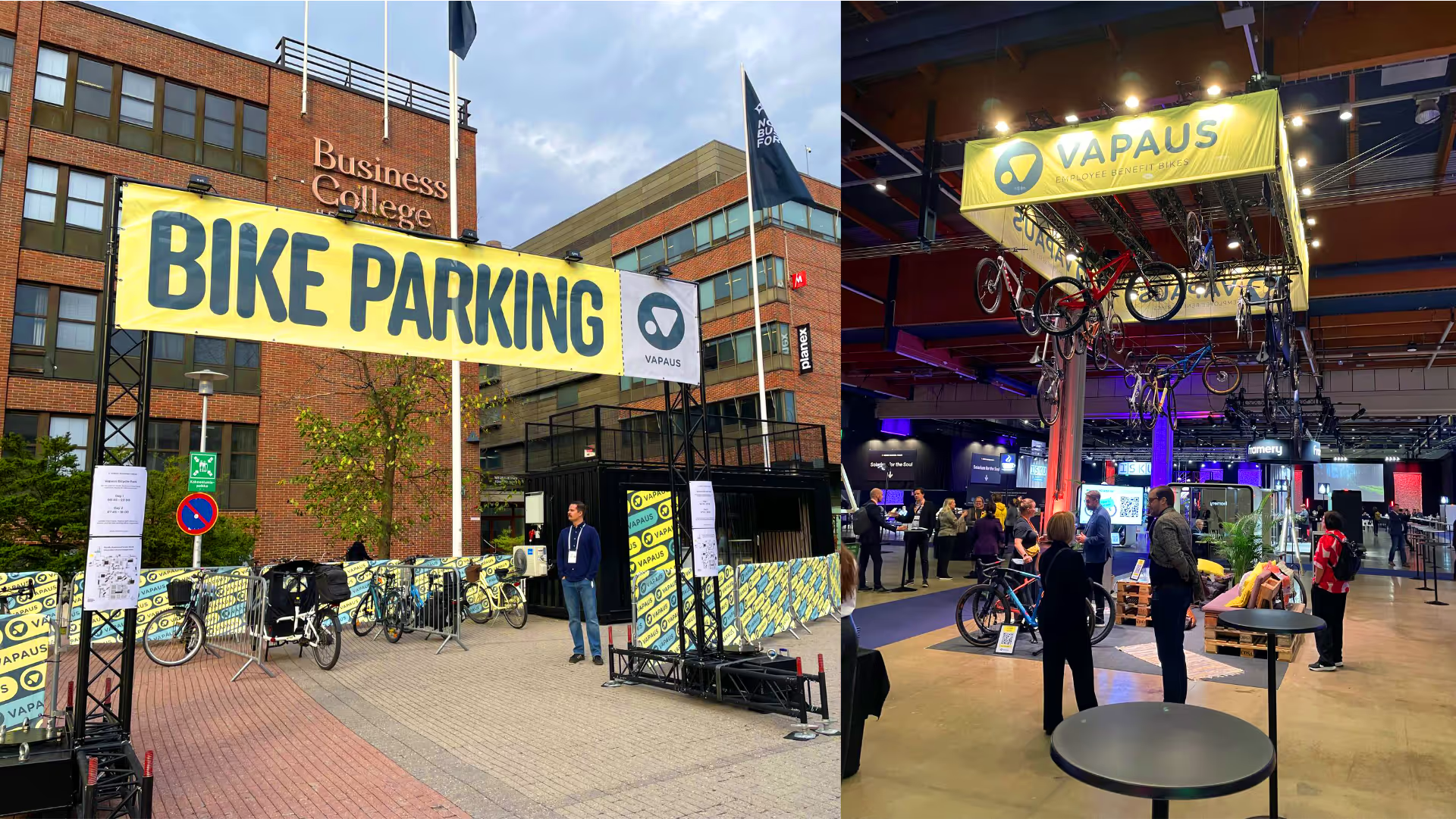
Bicycle parking and exhibition space at Nordic Business Forum
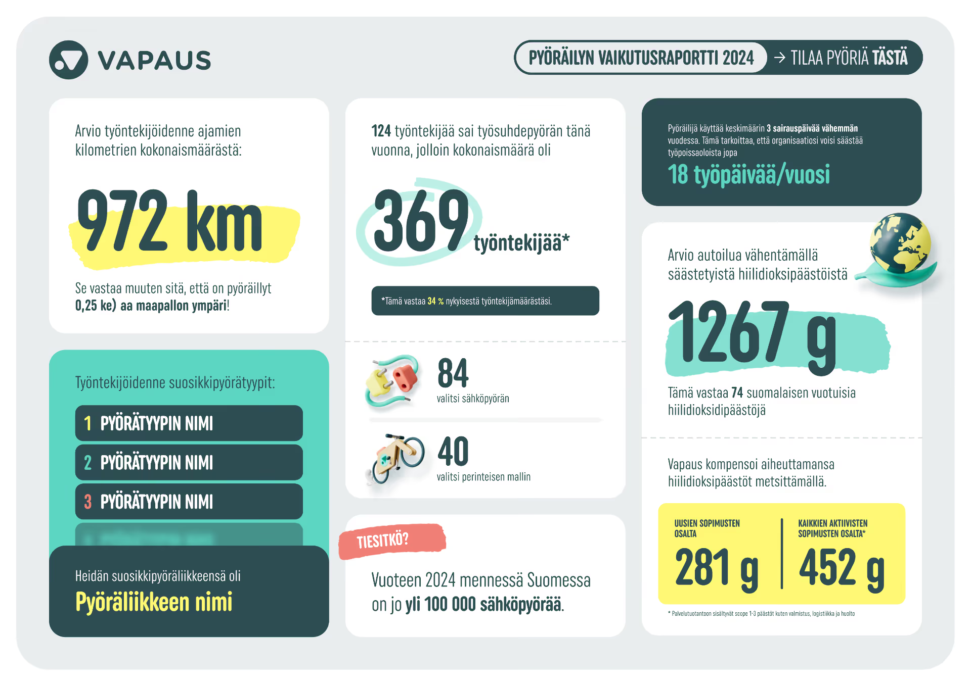
App concept
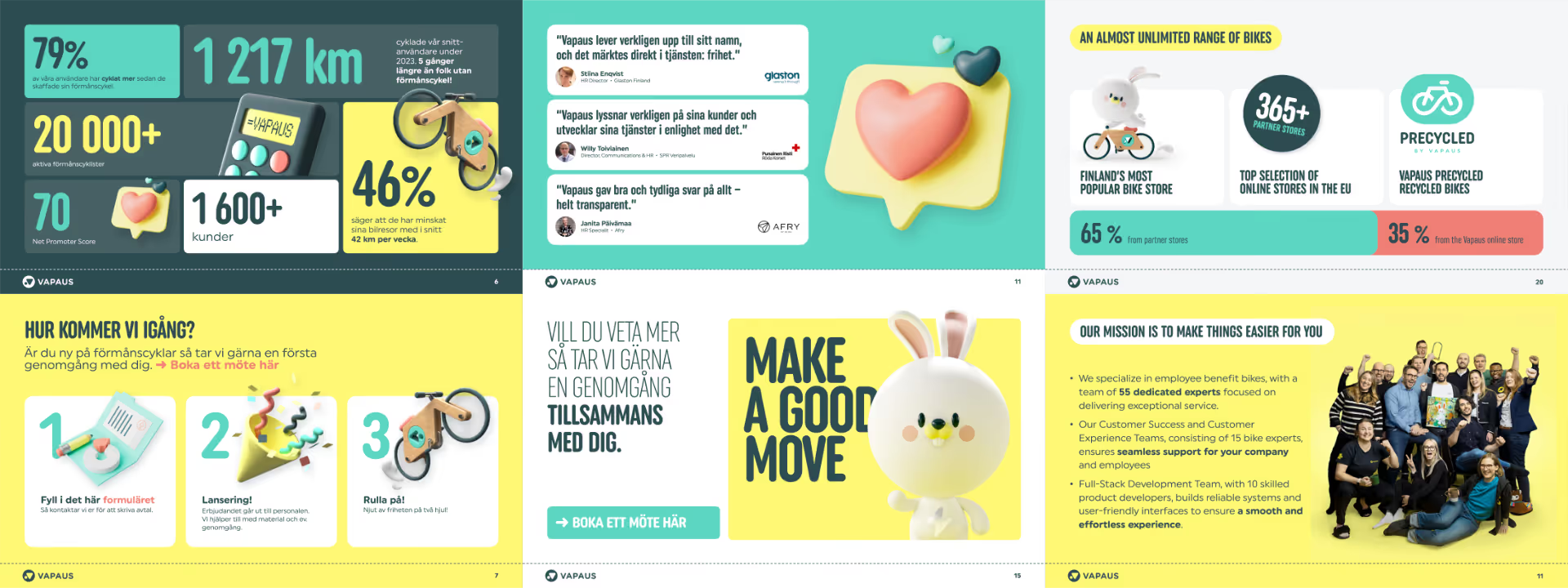
App concept
"We've been working with Julien for over five years. He has been involved in developing Vapaus's visual identity from the very beginning: the brand guide, logos, our Pupu mascot, icons, and various print materials are largely his work. Most recently, Julien has been involved in building the Northride brand for our new market in New Zealand.
Working with Julien is easy. He listens, sticks to the schedule, and the end result is exactly what was agreed upon and always in line with our brand identity. When necessary, he also knows how to suggest a better solution. We recommend Riesen Design to anyone looking for a reliable, long-term graphic design partner."

Lotta Vänskä
Growth lead, Vapaus
Genano
Starting point
Genano is a Finnish company that manufactures air purifiers. "Brand therapist" Anssi Järvinen refined Genano’s brand persona and Riesen Design created an airy, fresh and cohesive visual identity based on Anssi’s groundwork.
Solution
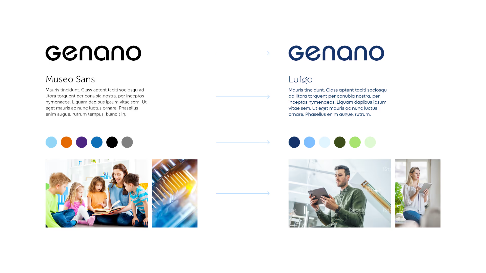
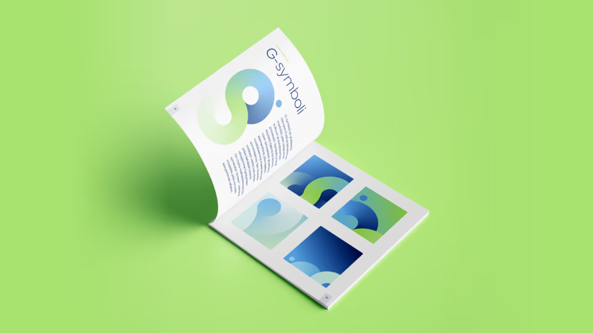
We created a comprehensive brand book that covers everything related to Genano’s new brand: from the brand story and customer promises to the colour palette and graphic design language. As the main visual element, we developed the so-called G-symbol – a combination of the letter G and the infinity symbol. The symbol represents the air purification process, which is at the heart of Genano’s business.
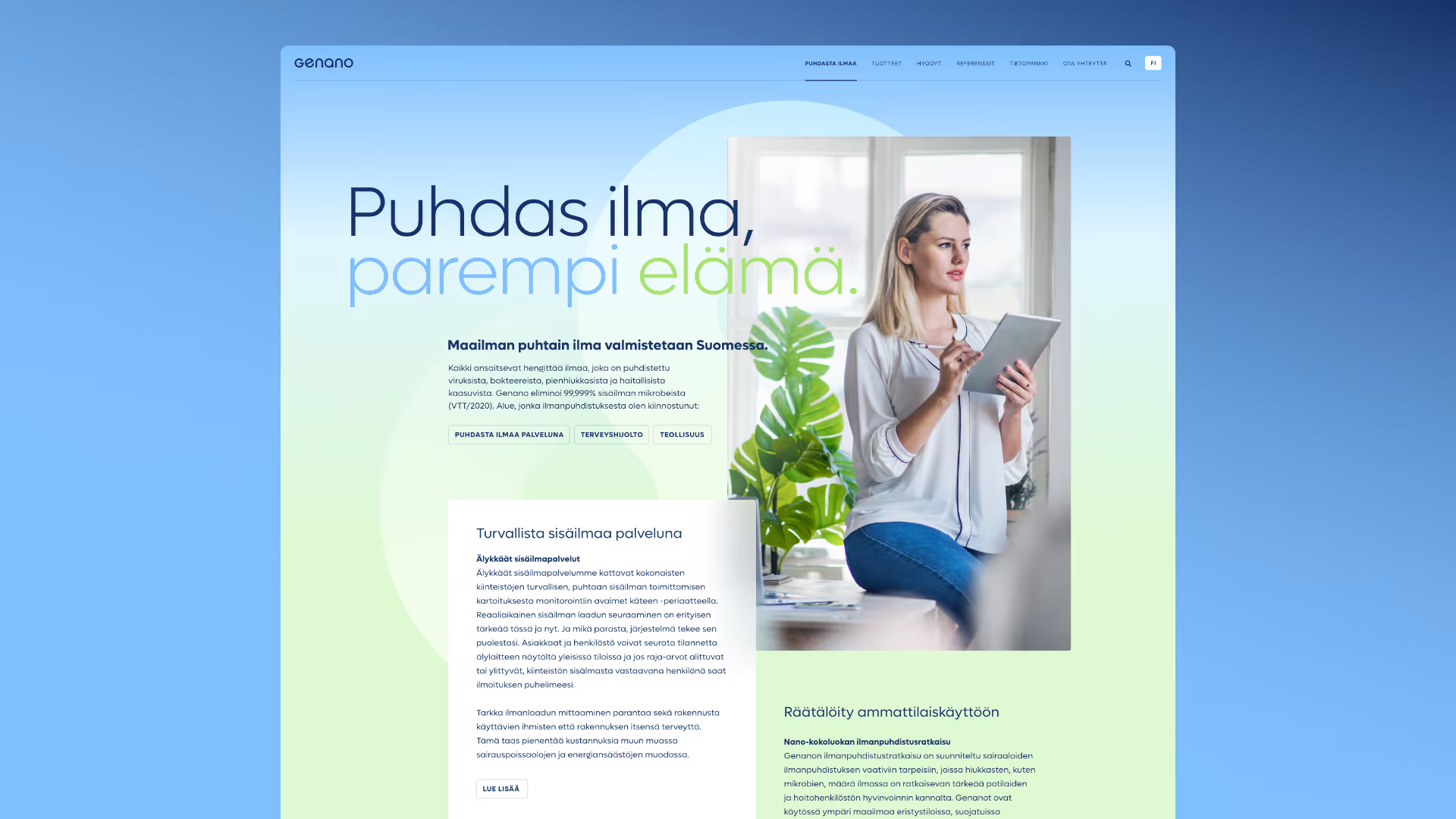
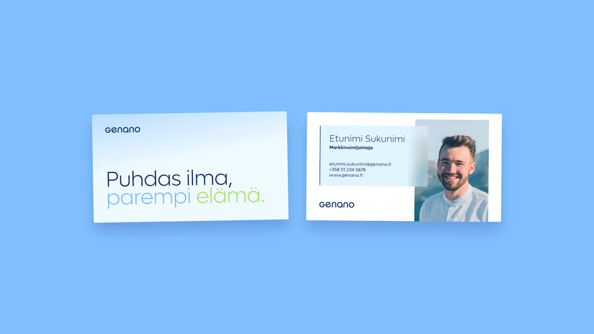
We also created numerous design examples, such as a striking new homepage, a presentation template and business cards. Although the plan was to keep the logo as is, we also refined it so that it would look better even at smaller sizes.
Our part
- Visual identity
- Brand book
- Ad templates
- Usage examples
Brand concept: Anssi Järvinen
Brand book
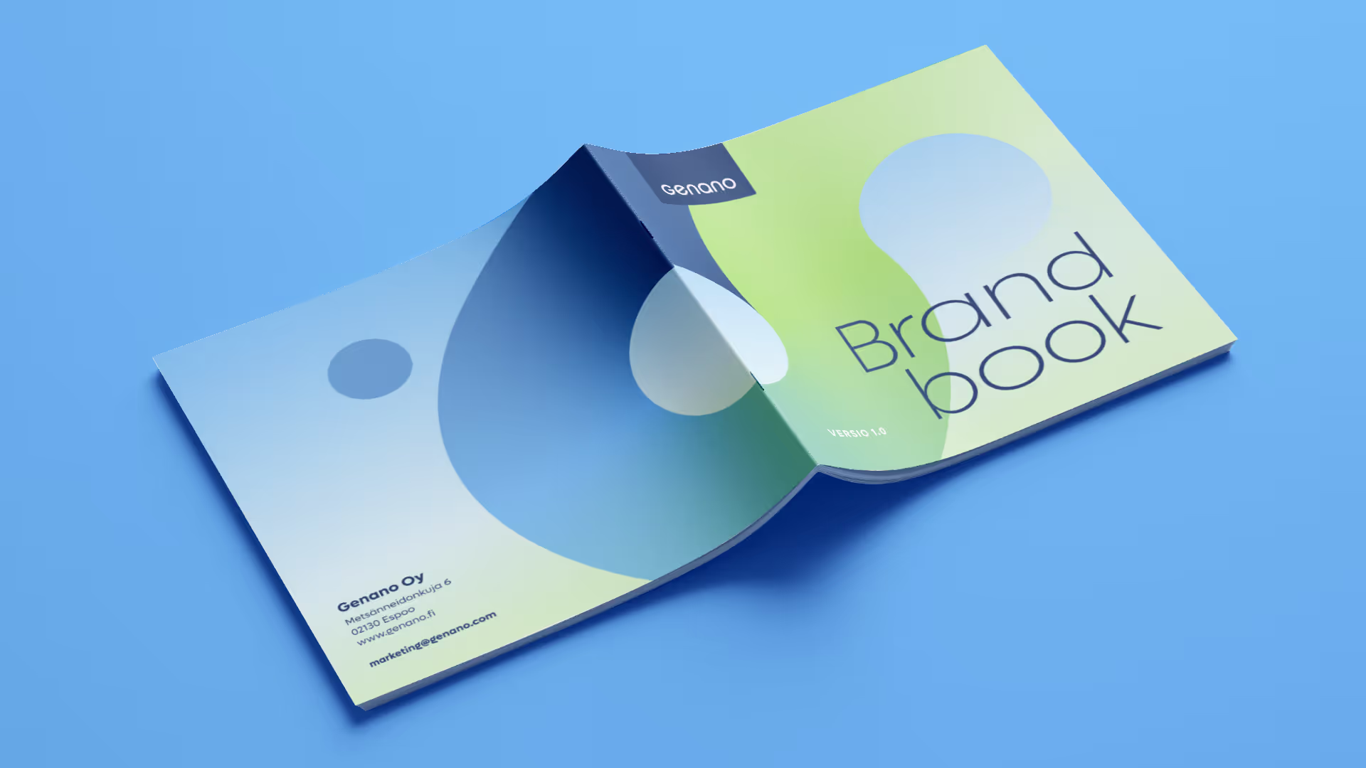
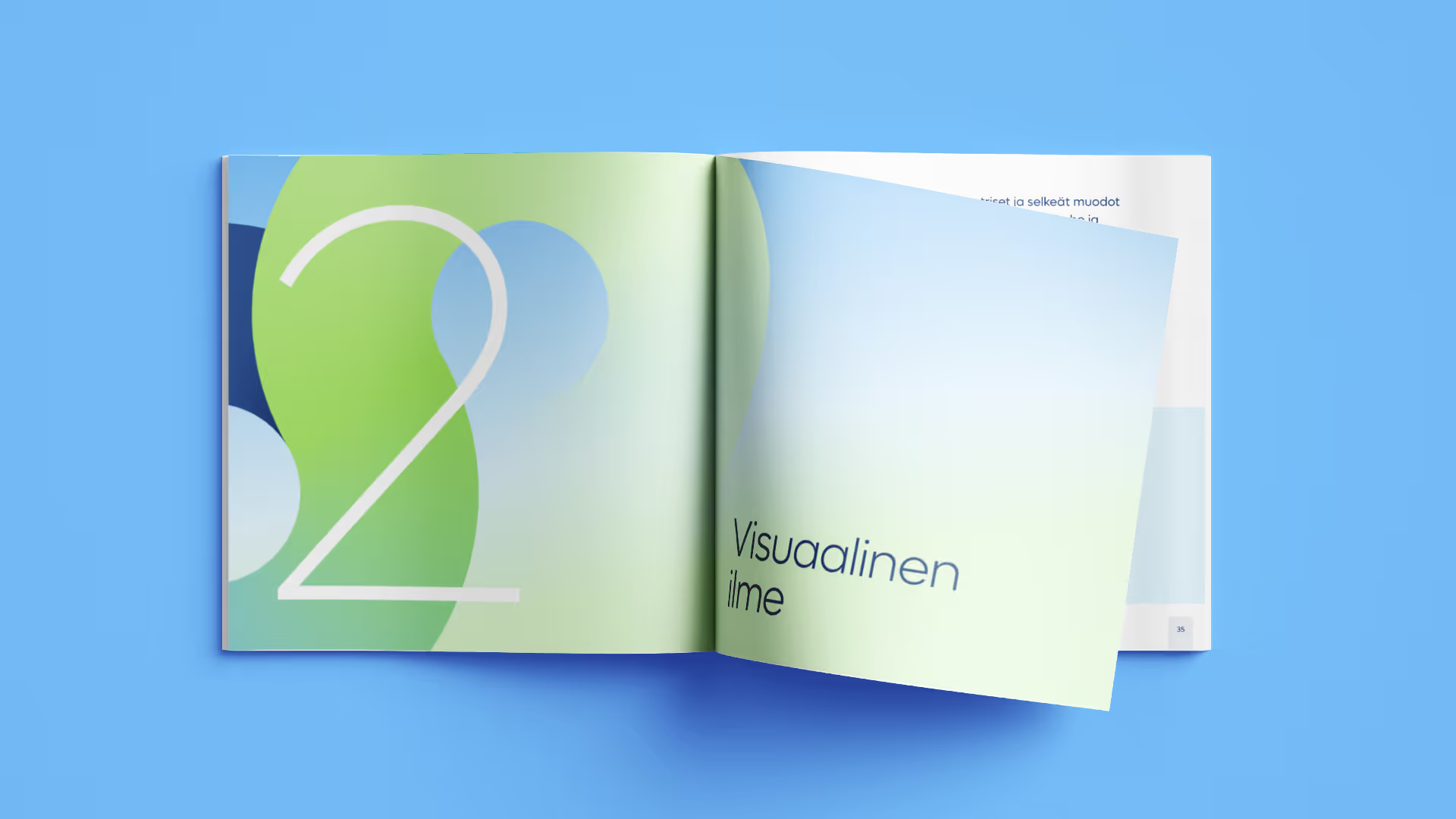
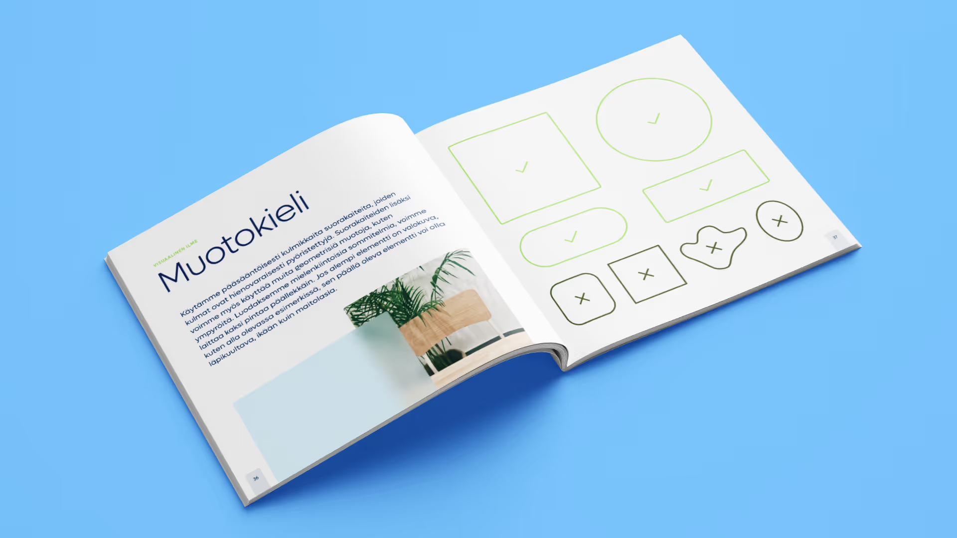
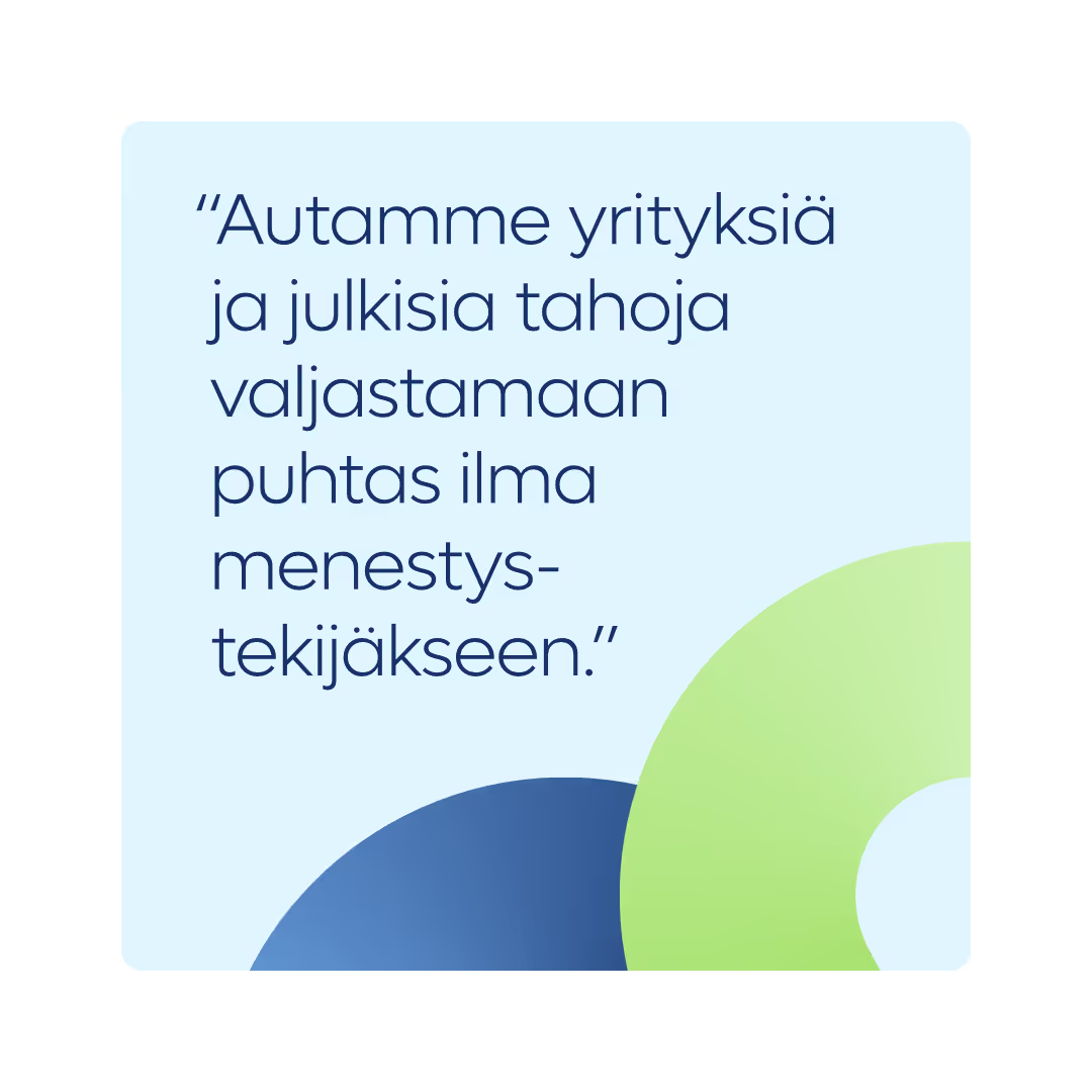
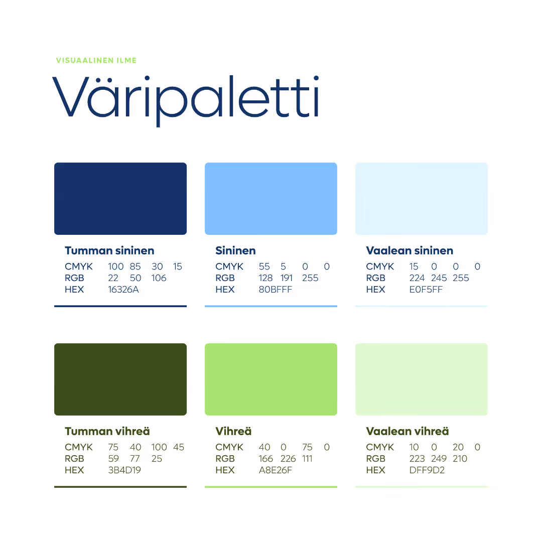
We designed a beautiful and comprehensive brand book that precisely guides the client on how to correctly use the elements of the new visual identity. This guide also includes the results of the brand work led by Anssi Järvinen: Genano's story, customer promise, key messages, etc.
App concept
Presentation template
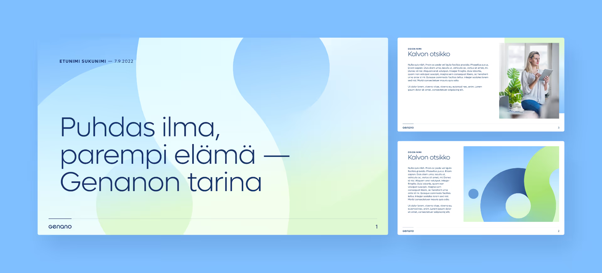
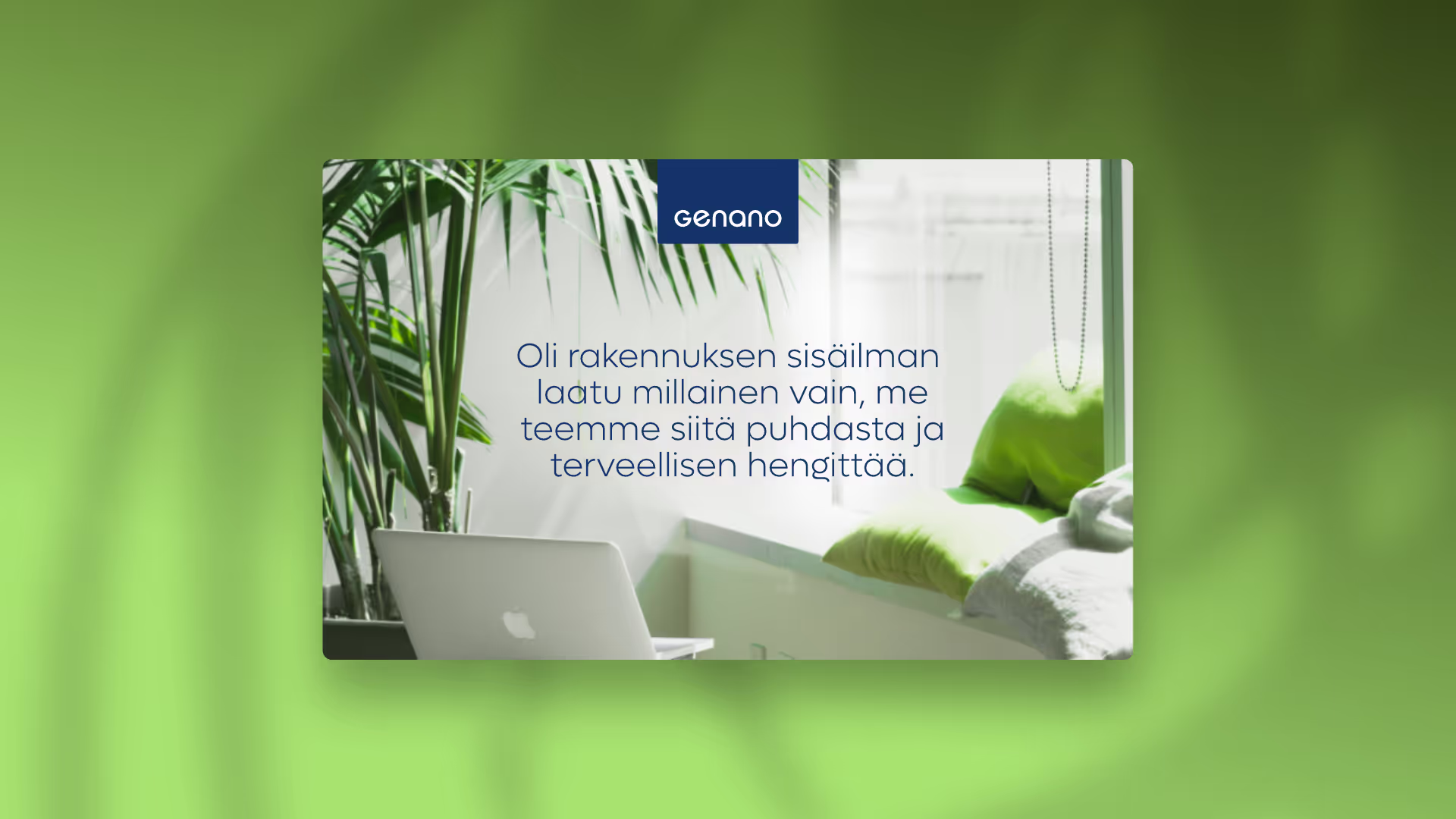
Riesen Design also created a completely customised, fresh presentation template consisting of versatile slide templates.
Website
What would a brand refresh be without new, stunning websites? We designed a website example with the new look, along with other marketing materials.
"I've worked with Julien on two challenging brand rebranding projects – one of which is this Genano project. In each case, we defined the brand's core, established its brand personality and moved on to updating the visual identity, including the logo and fonts. Our collaboration has been seamless and efficient. It’s even been fun – just like work at its best. Hopefully we’ll find a new project to work on together again soon!"
Anssi Järvinen
Creative Director, copywriter, author
We do that too
Illustrations & characters

Packaging & product images
Animations

User interfaces