Packaging & product images
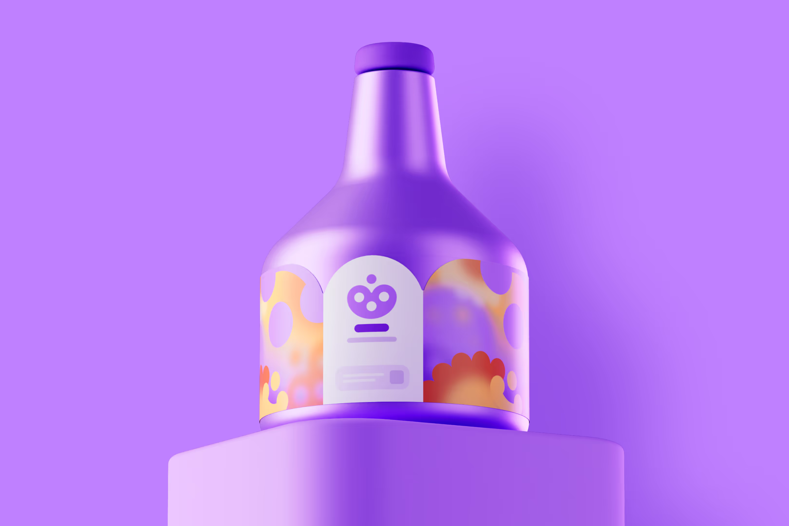
We can design packaging for your products and create attractive 3D product images for use in online stores or TV commercials, for example. With 3D, photo shoots never end, and the background of the image can be easily edited. It’s easy to adjust product colours, and creating different versions is quick. We’ve designed a wide variety of packaging, from beer bottles to containers. In addition, we also design physical point-of-sale materials that help your product stand out from the competition.
Projects on this page

Packaging

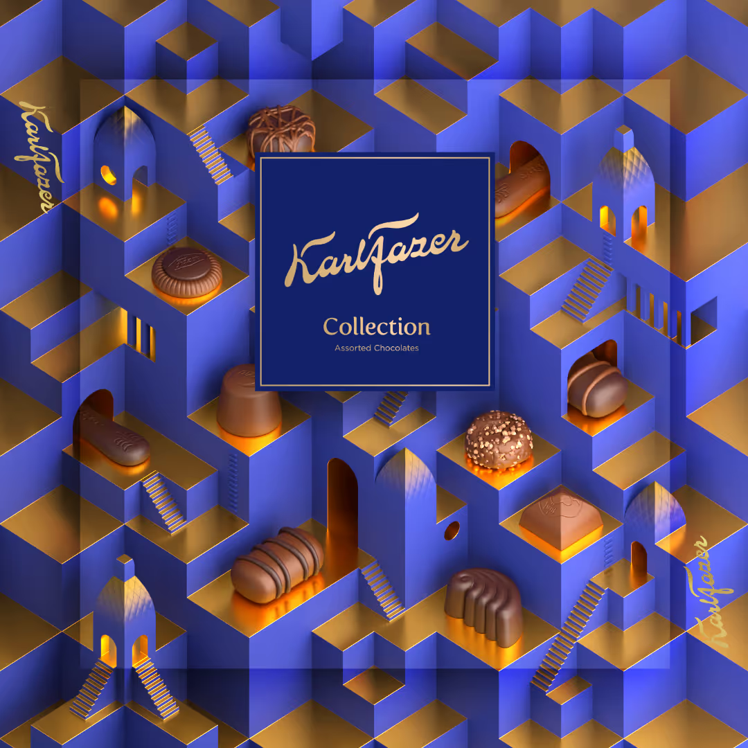
Our proposal for Fazer's packaging competition.
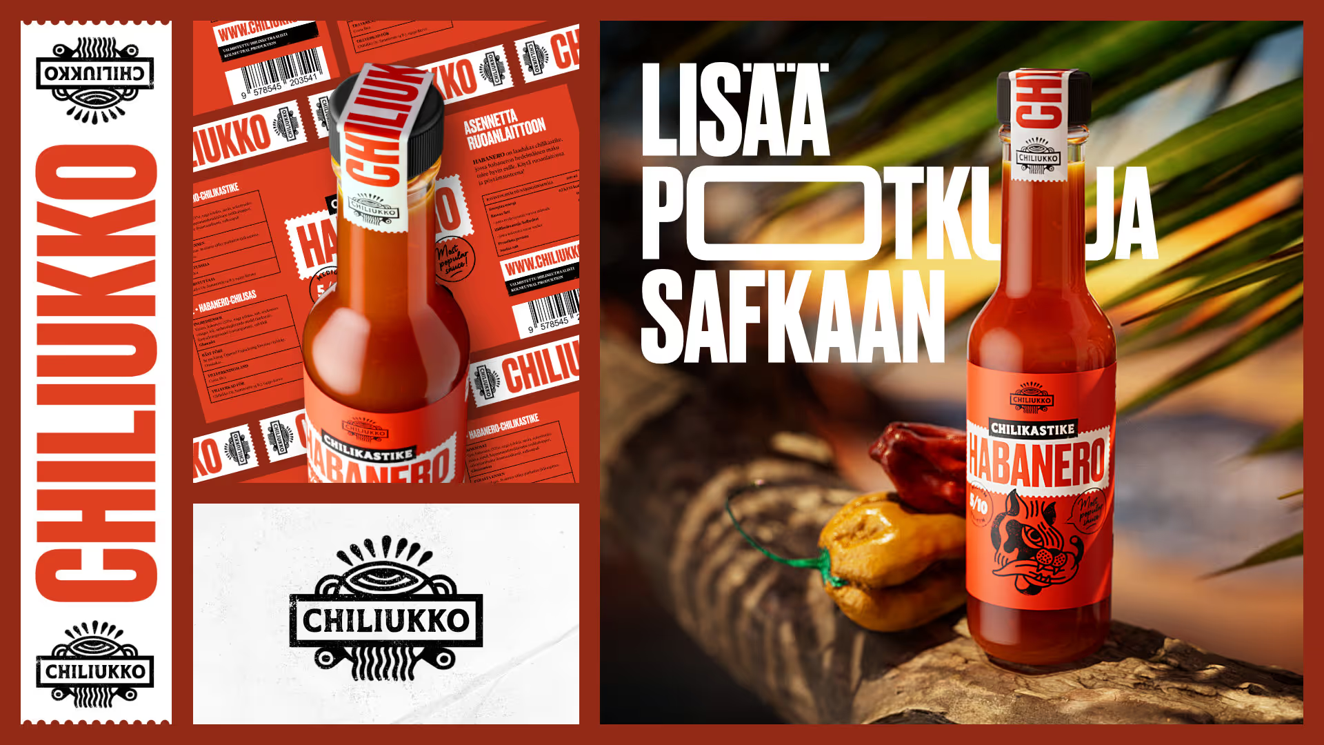
Brand and packaging concept for Chiliukko, a fictional chili sauce manufacturer.
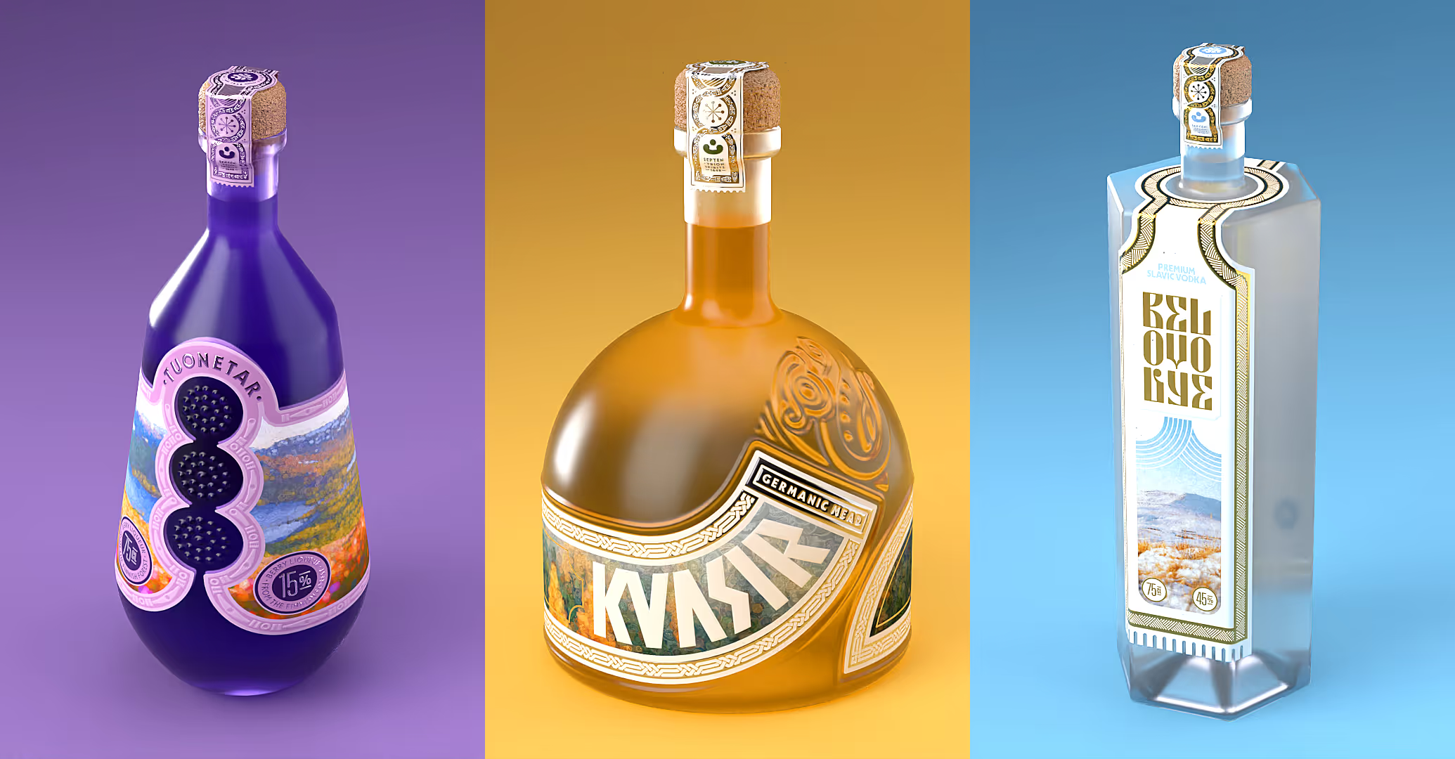
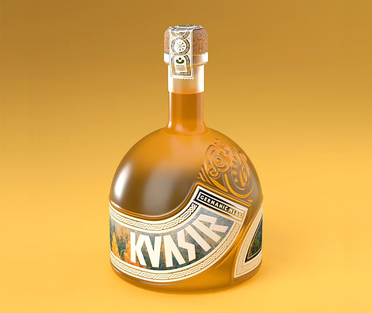
A packaging concept called Septentrion Spirits (work in progress).
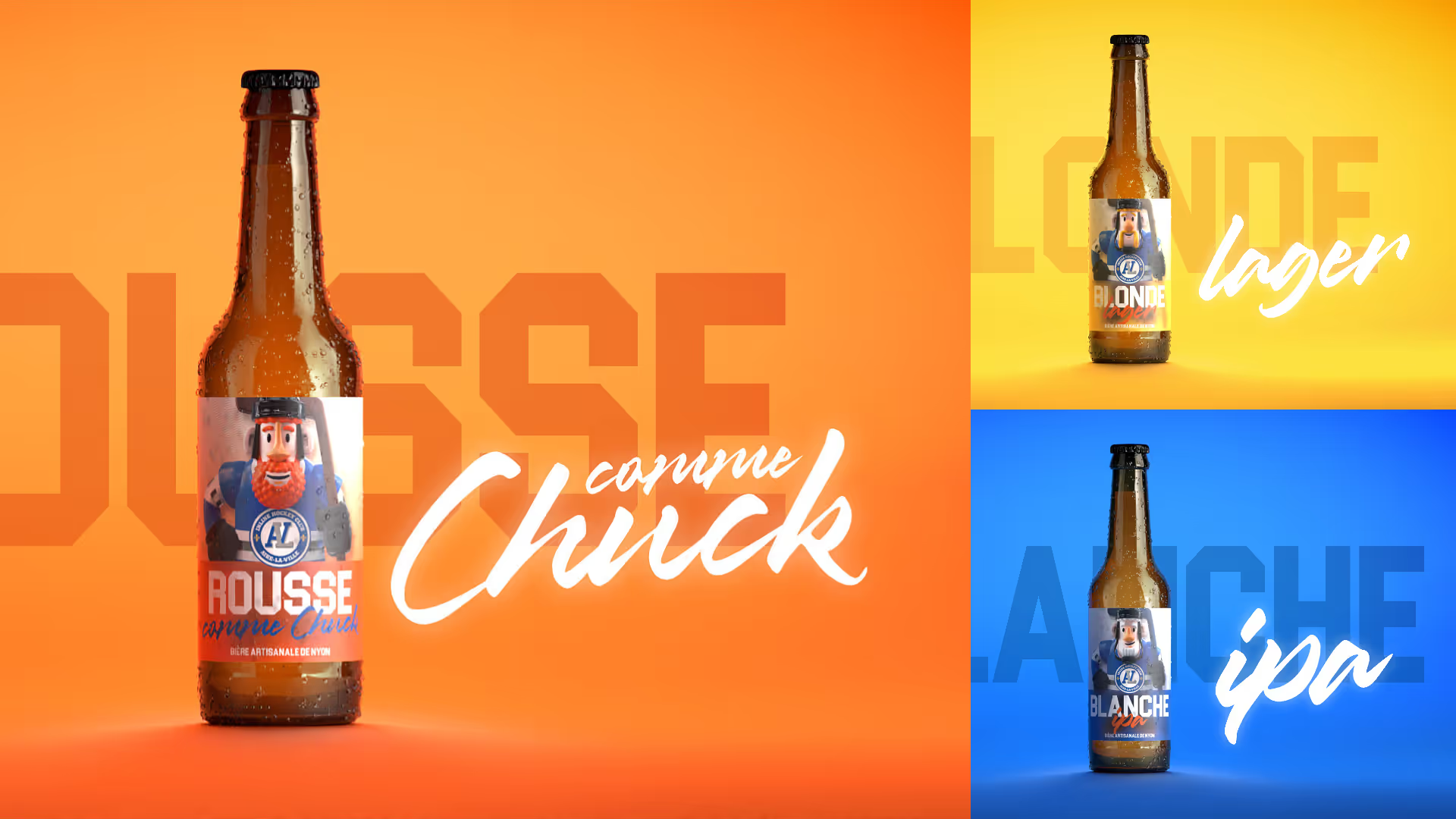
Label design, 3D bottle modeling, and promotional images for IHC Aire-la-Ville roller skating club’s own beer line.
Photorealistic product images
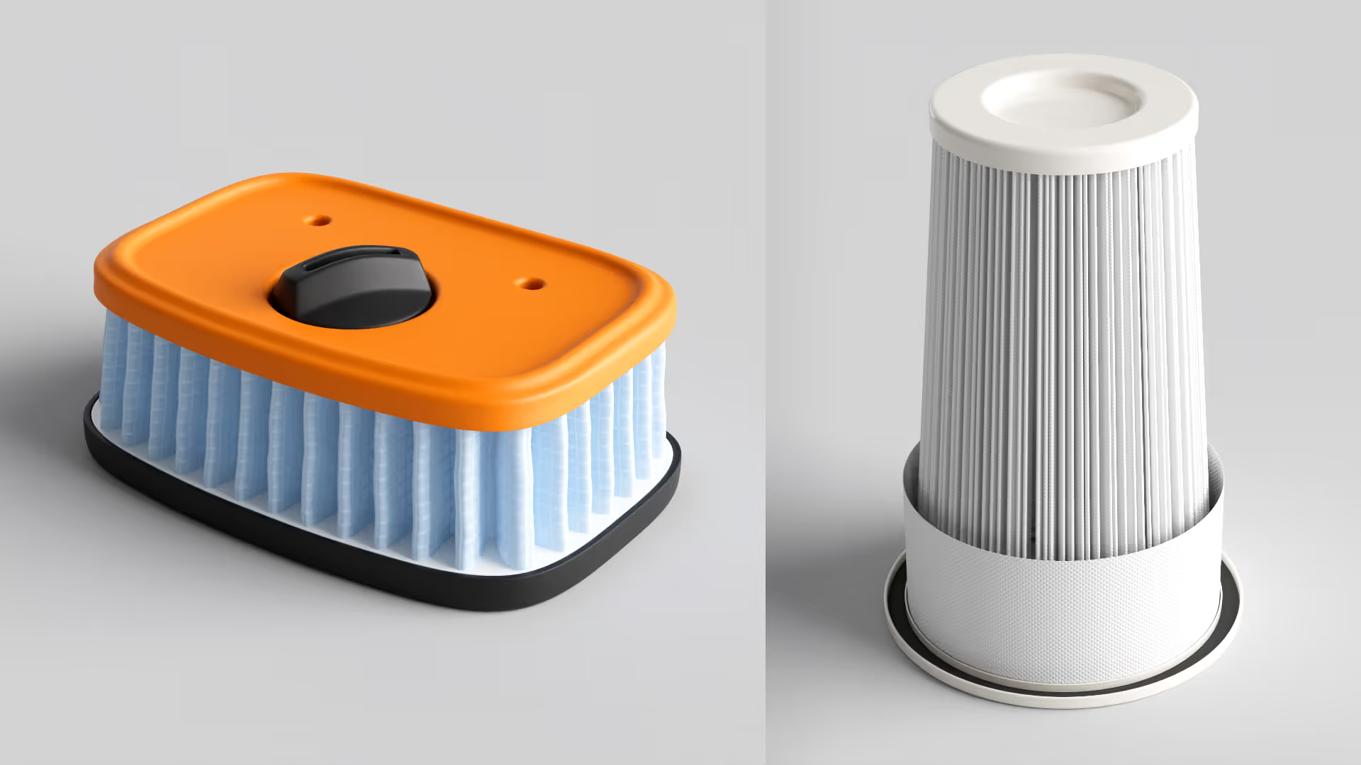
3D models for M-Filter.
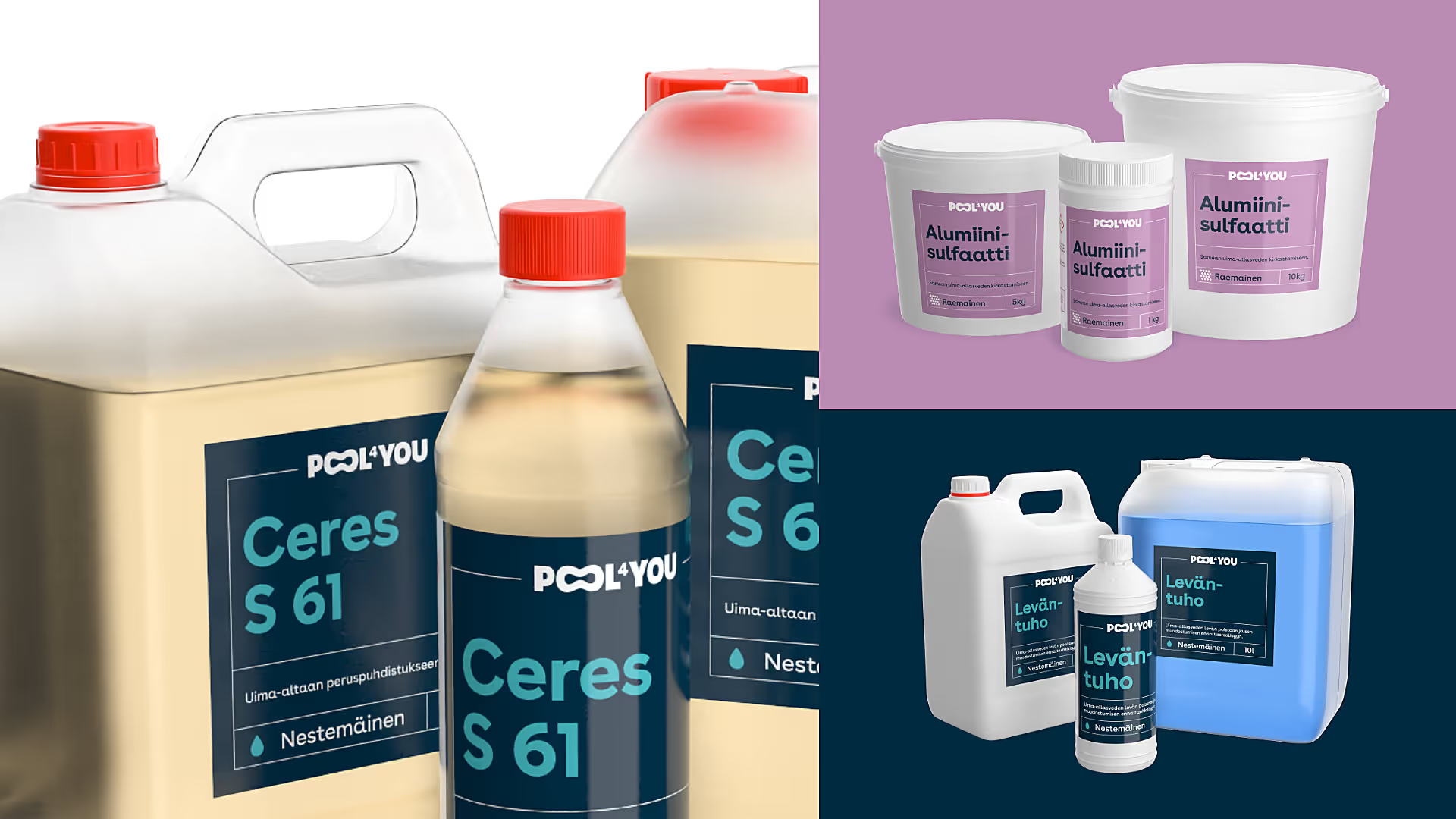
3D modeling and product images for Pool4You's entire product range.
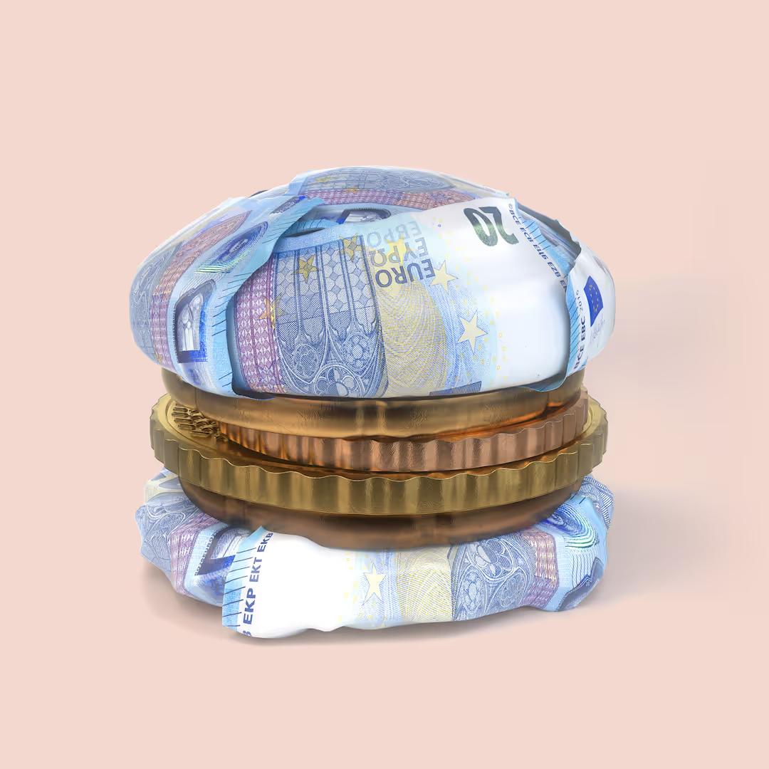
"Money burger" for Nordea. Concept: McCann.
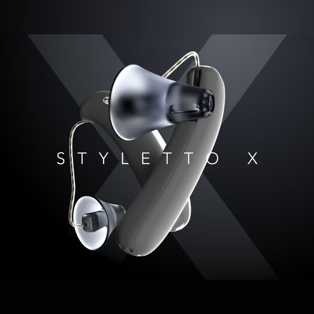
3D modelling and animation for Signia's Styletto X hearing aid.
Projects
Superfood & Berries

Starting point
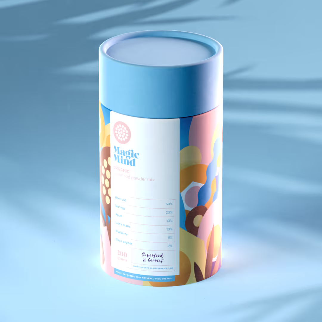
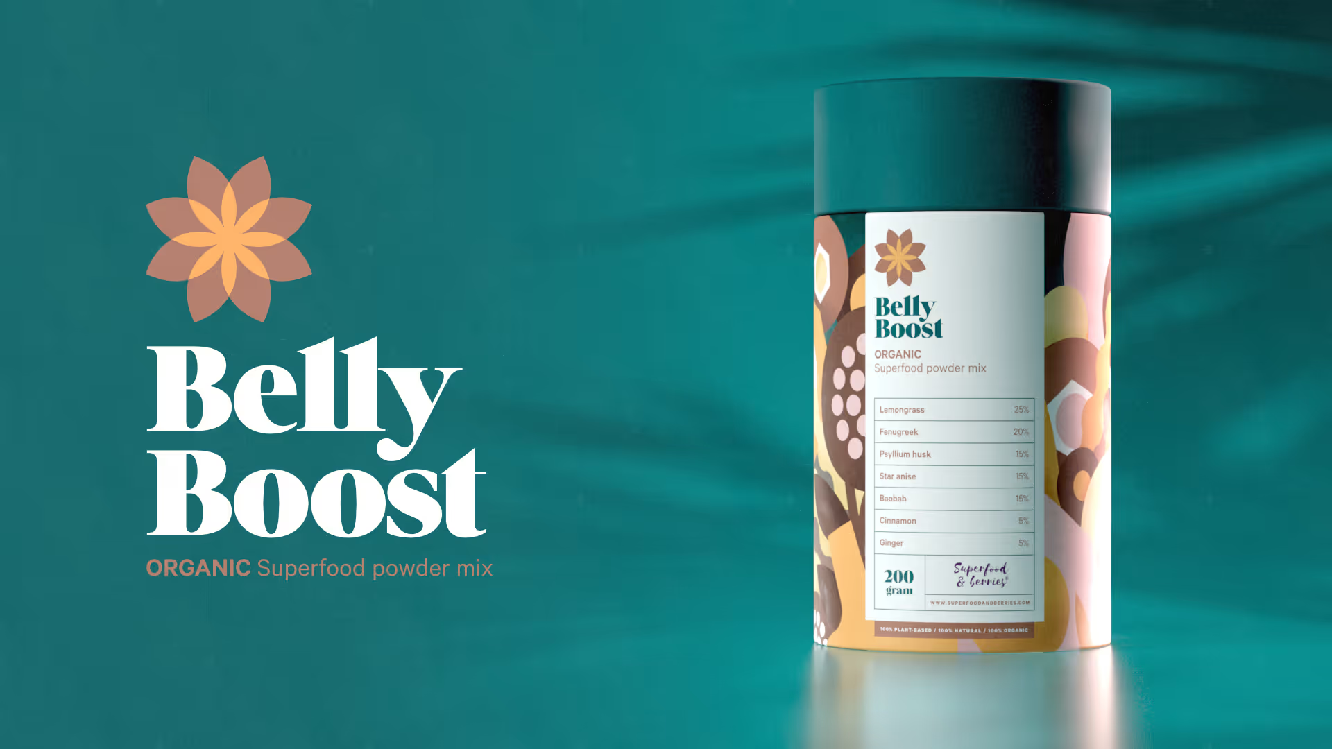
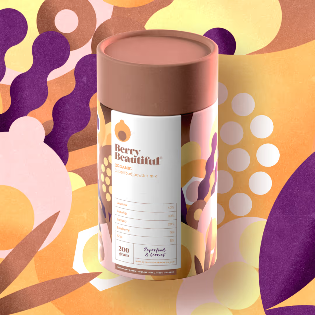
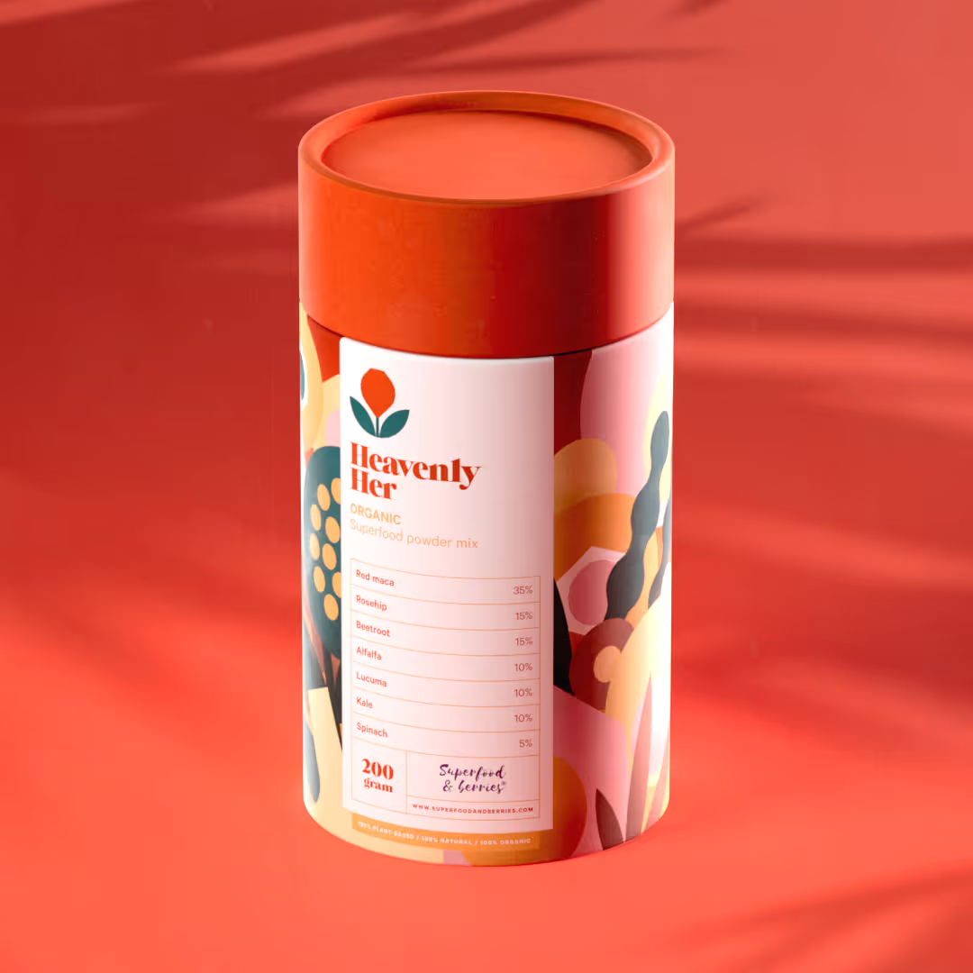
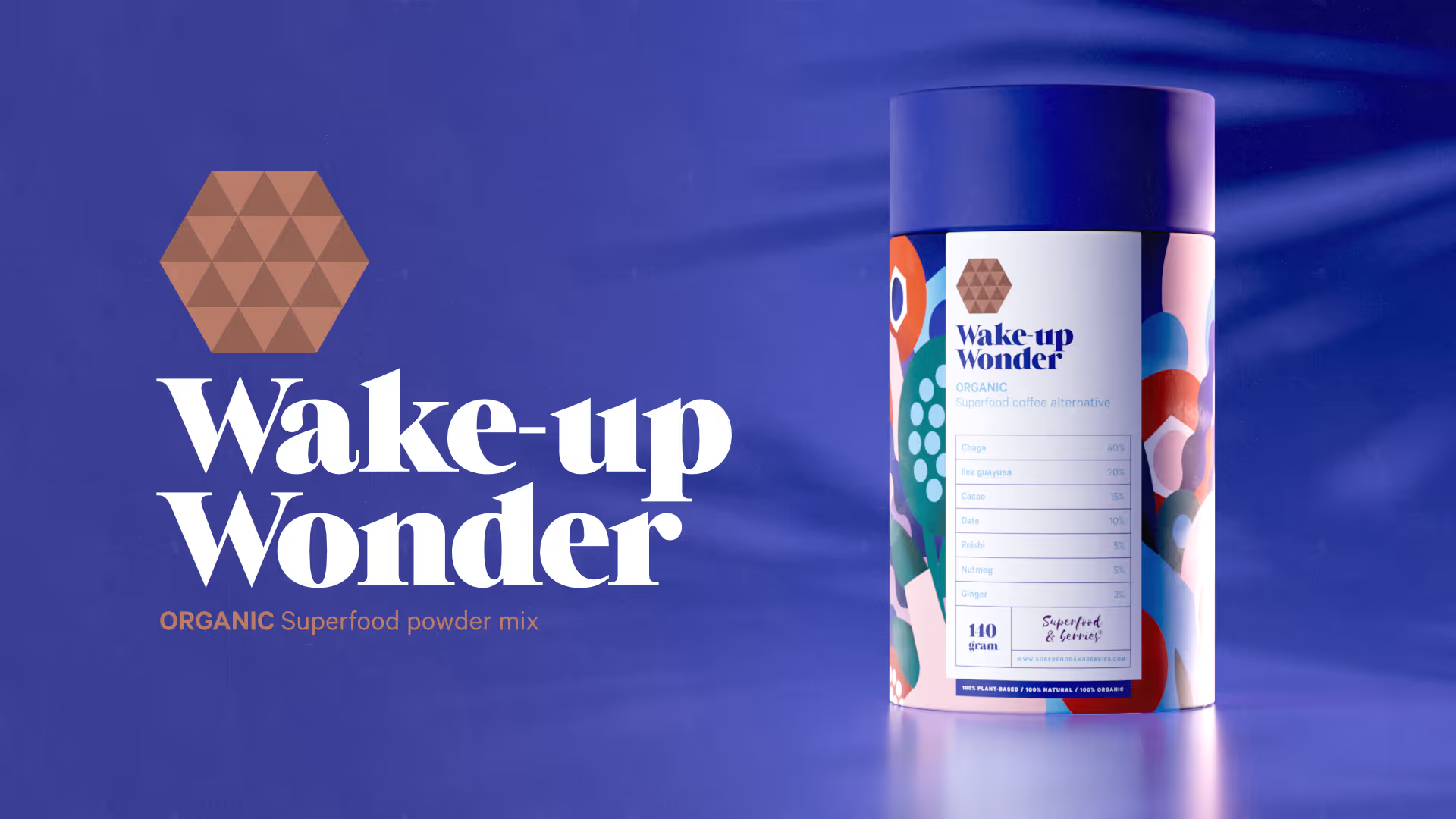
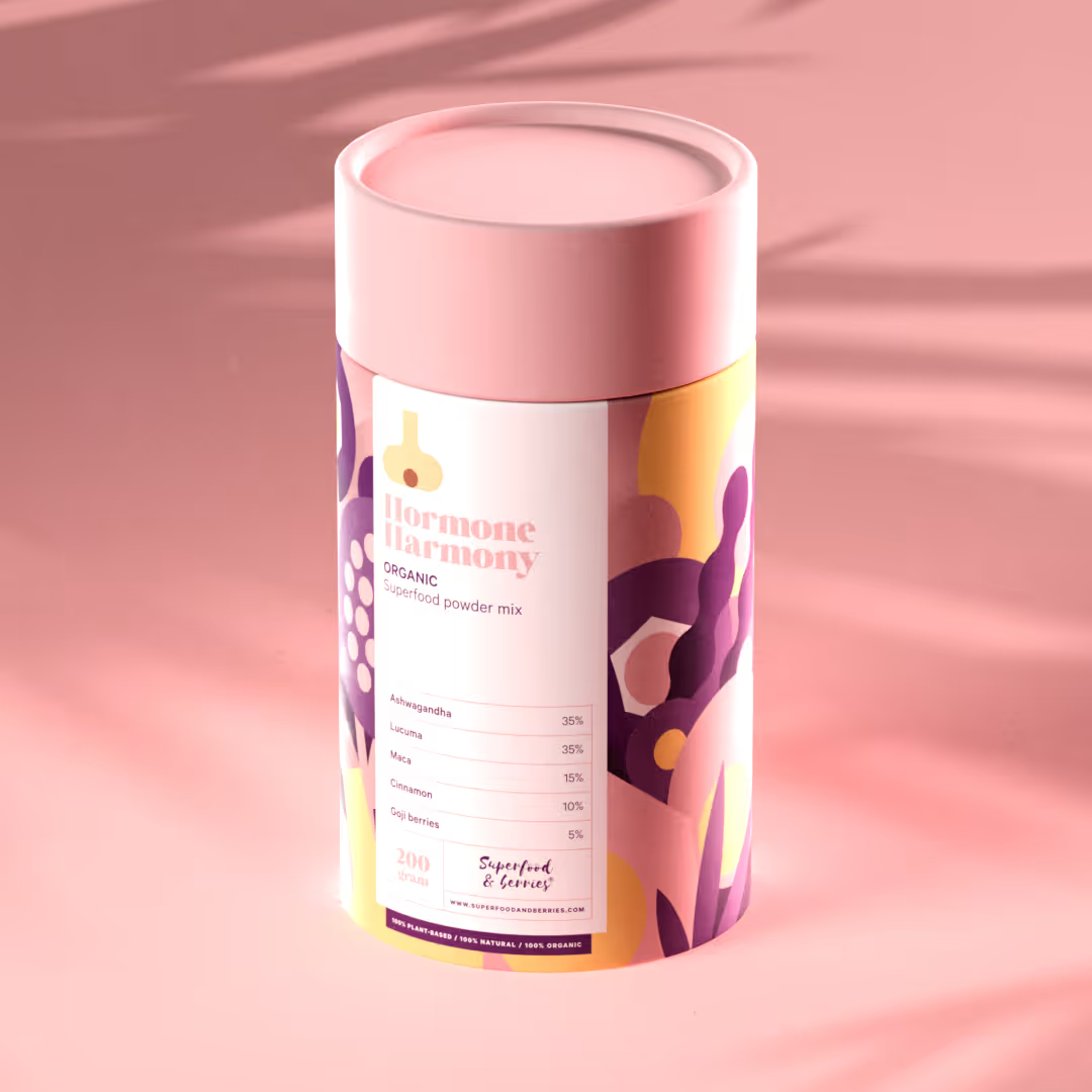
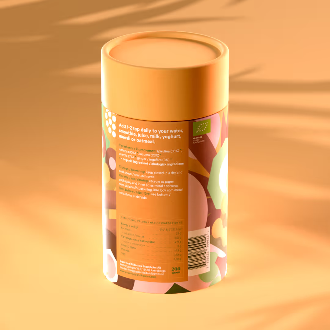
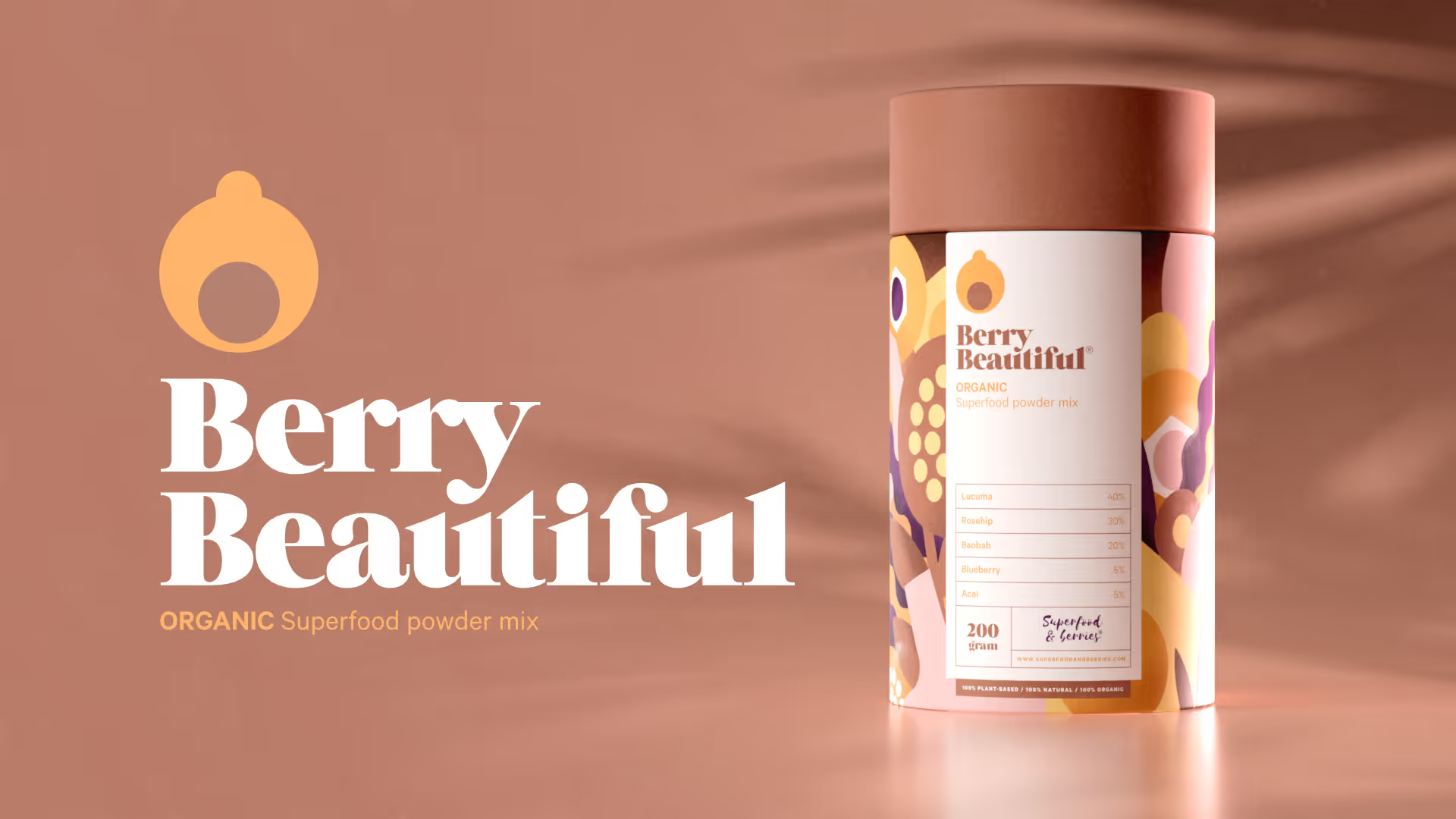
Riesen Design had the pleasure of designing the Superfood & Berries brand (excluding the logo), packaging, and product images. Superfood & Berries is a Swedish company that produces various healthy, additive-free organic nutritional supplements that can be mixed into smoothies or yogurts, for example. Each blend contains 5-7 ingredients, which served as inspiration for the packaging's visual identity.
Solution
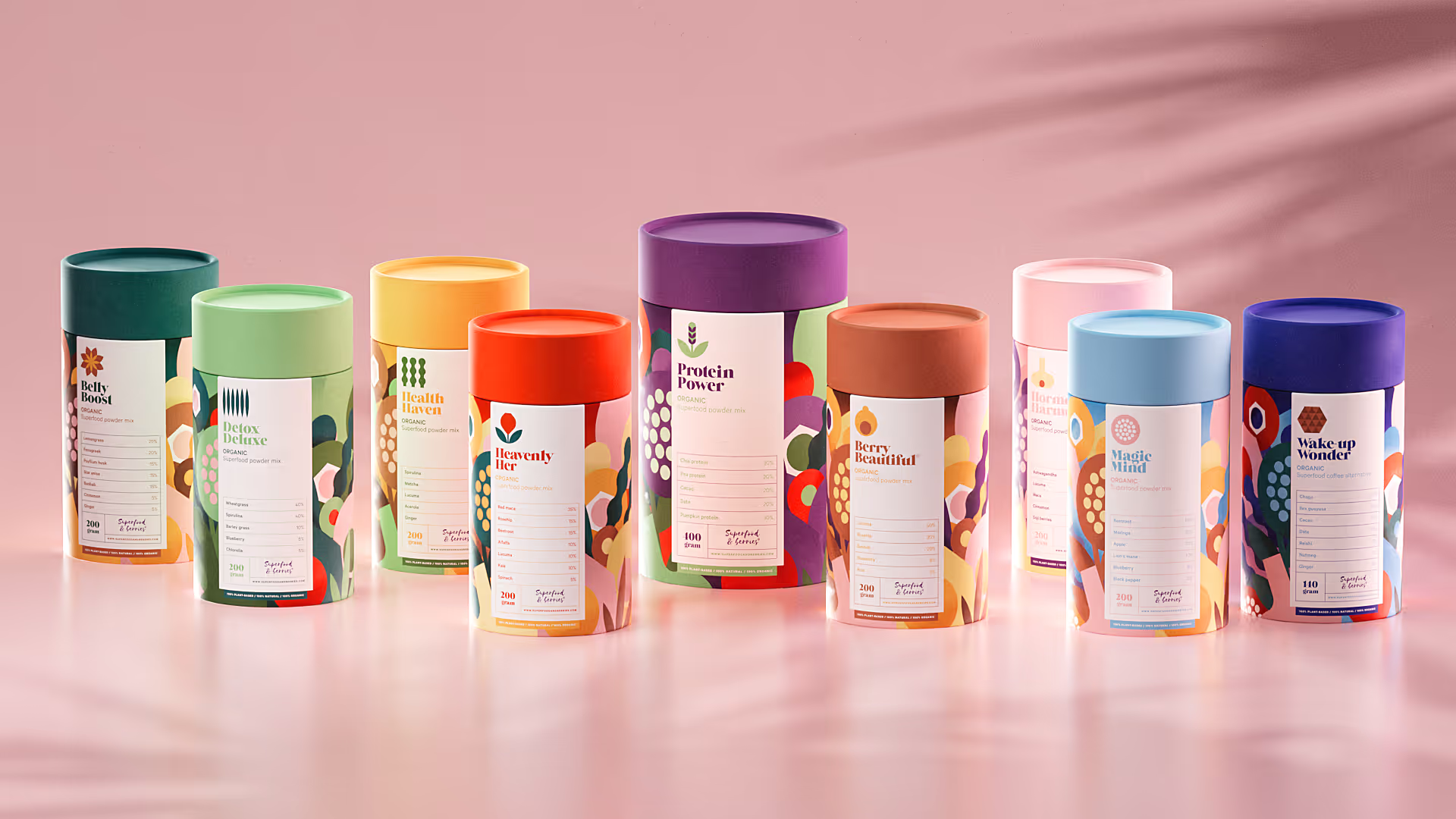
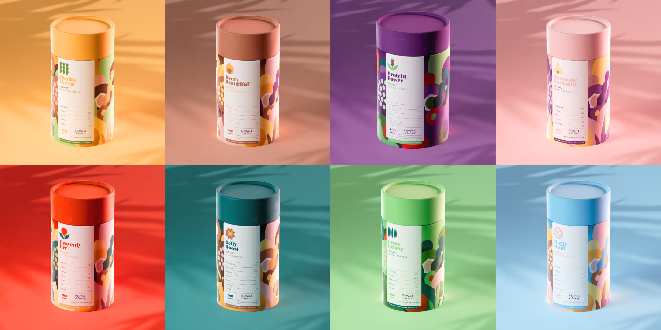
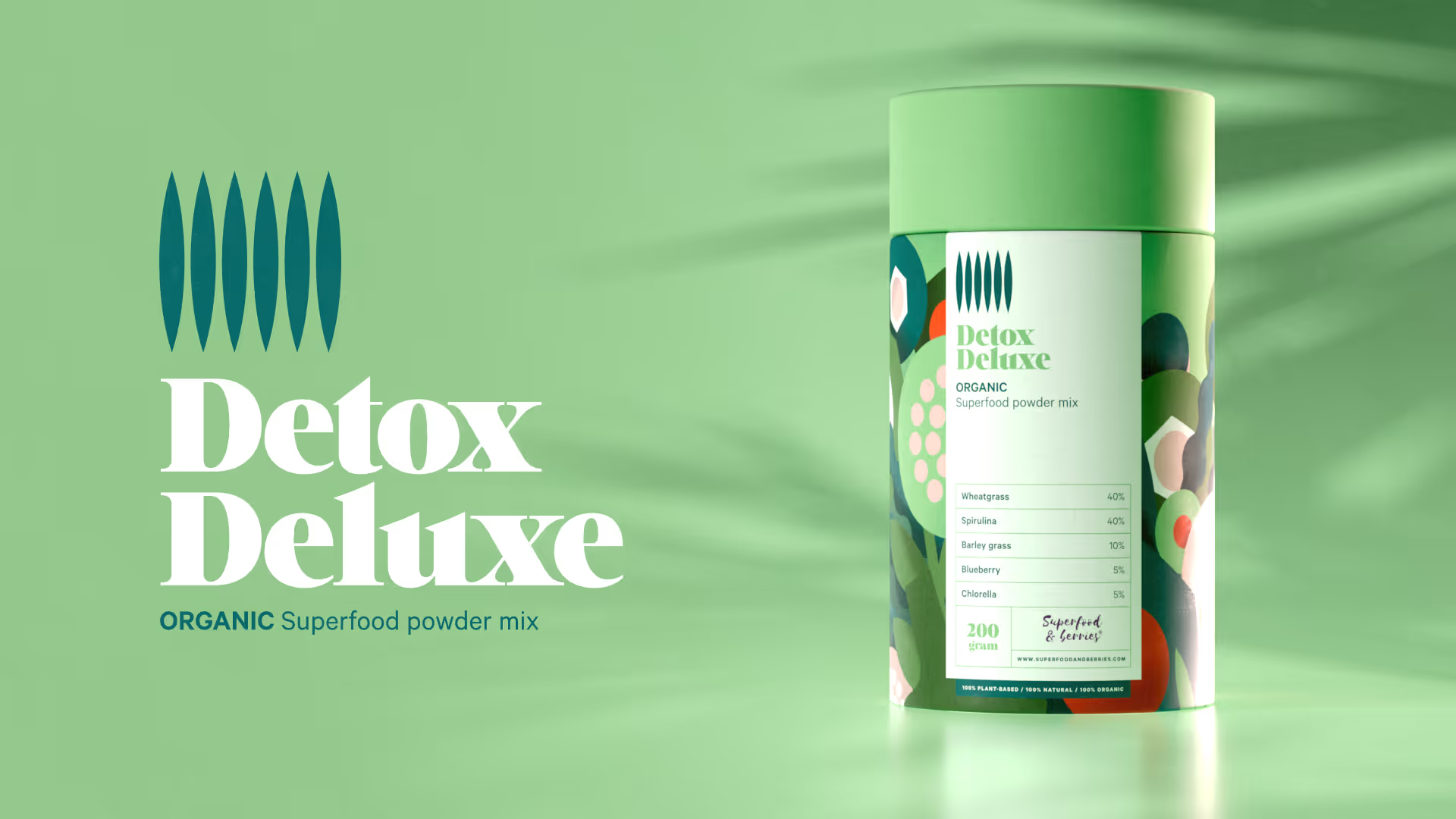
We designed a cheerful and healthy-looking product family that can grow over time. It was also important to present the ingredients clearly so that shoppers wouldn’t have to guess what the products contain. In addition to its own colour scheme, each product has its own icon, making it easy to identify. The product images were created in 3D instead of using photographs, making the composition process faster and more cost-effective.
Order your mixes from www.superfoodandberries.com!
Our part
- Visual identity
- Packaging design
- Illustration
- Product images
Logo: Superfood & Berries
Lorem ipsum dolor sit amet, consectetur adipiscing elit.
App concept
App concept
App concept
App concept

App concept
App concept
App concept
App concept
App concept
App concept
App concept
App concept
Symbols & colour palette
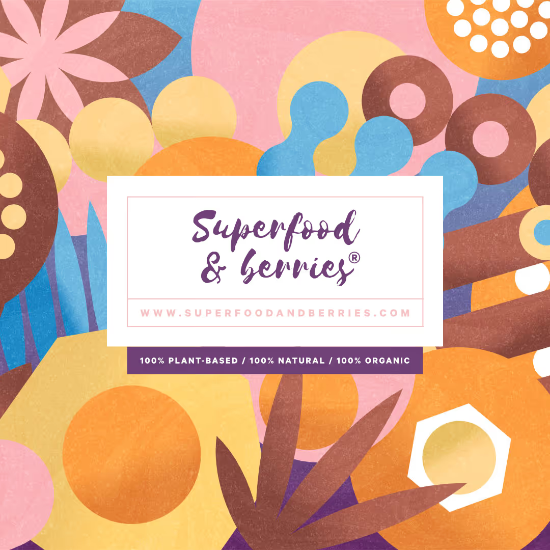
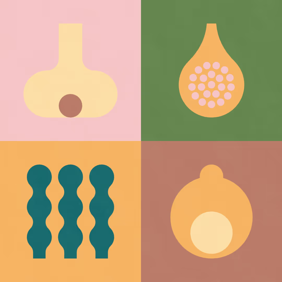
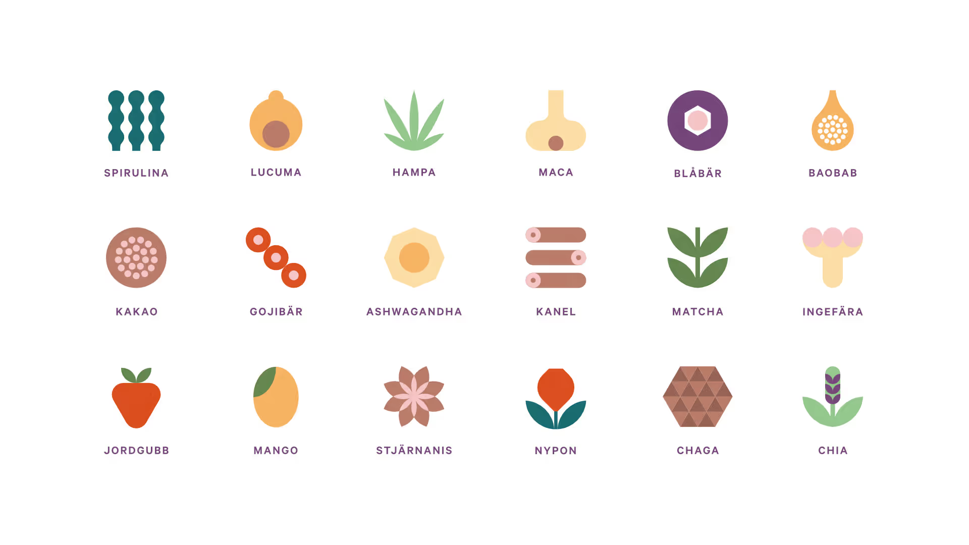
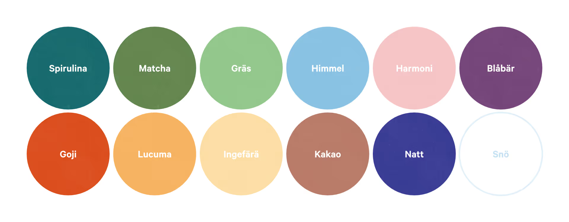
We designed stylised symbols for the main ingredients of the flours to help consumers recognise them at a glance. The symbols function as mini-logos alongside the product names and give the packaging a distinctive look. The broad colour palette we created was naturally inspired by the ingredients used by Superfood & Berries.
App concept
App concept
App concept
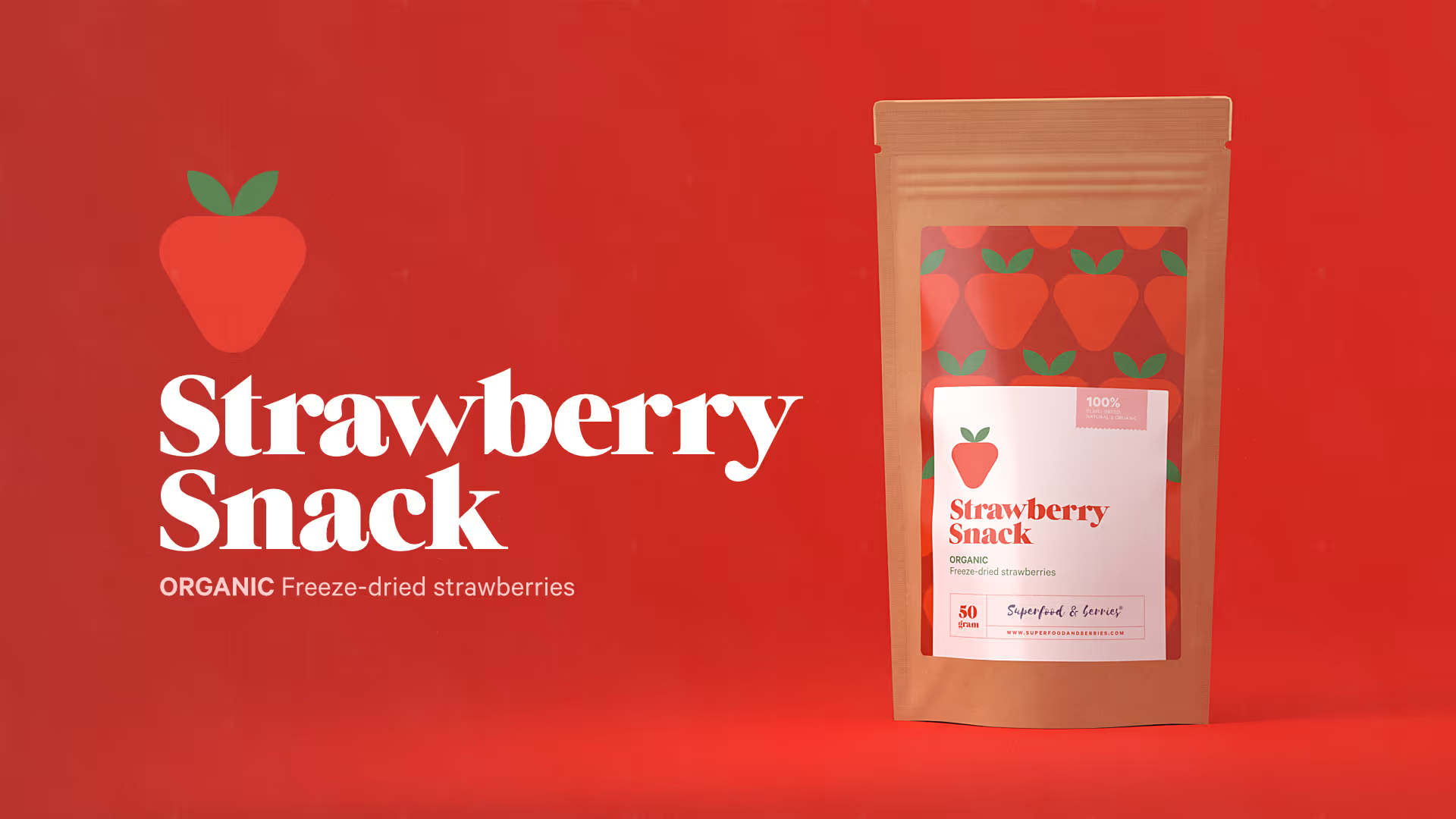
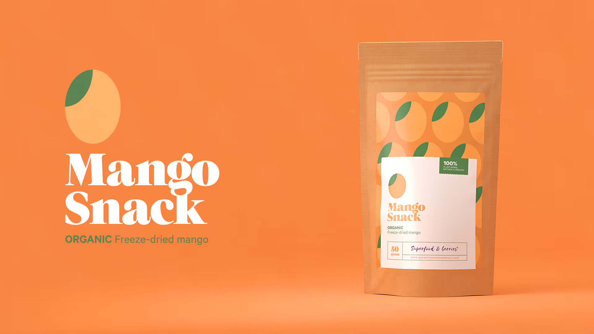
Mango & Strawberry Snacks
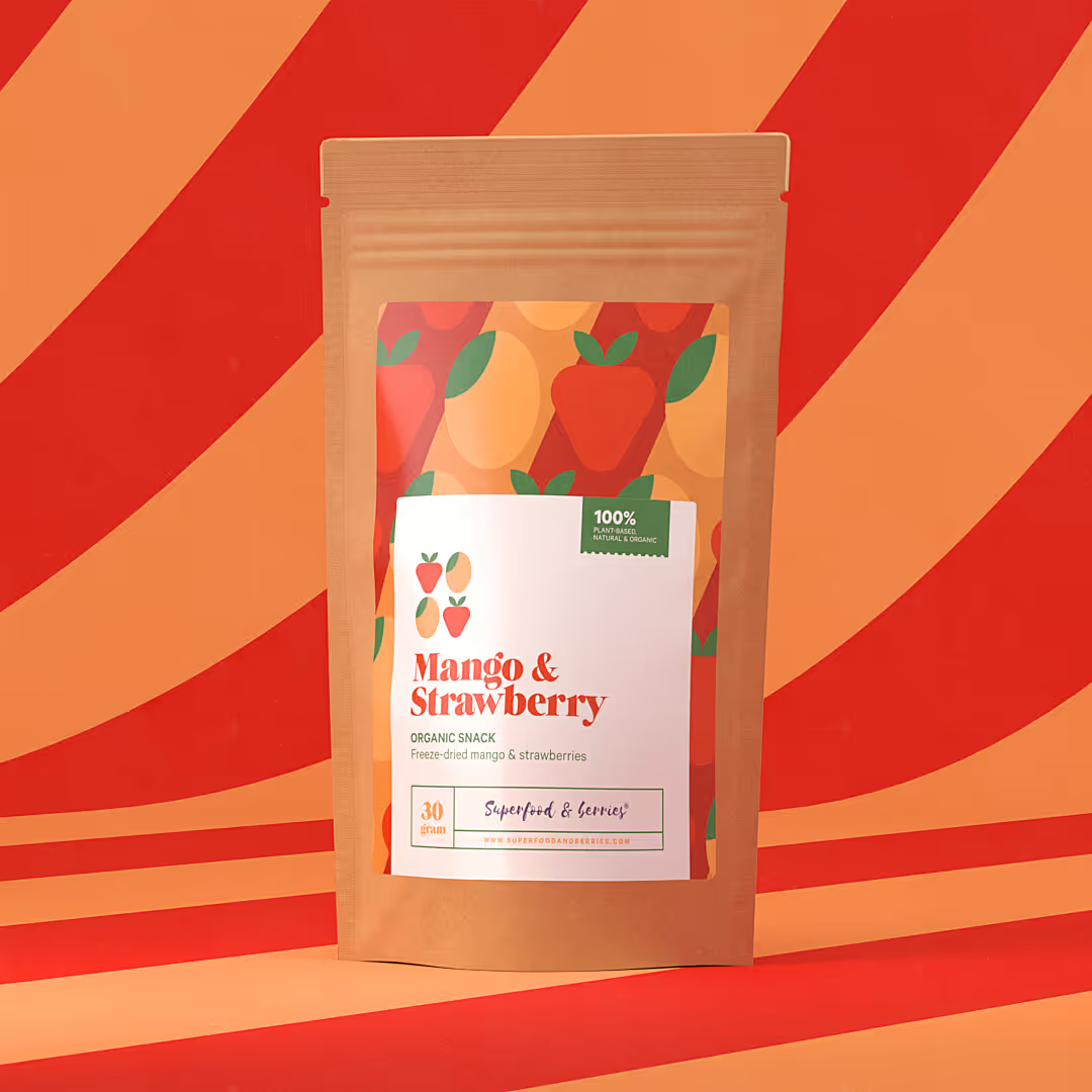
In addition to the main products, we also designed packaging for three delicious snacks: freeze-dried strawberry, mango, and a strawberry-mango mix.
App concept
App concept
App concept
"Beautiful and highly professional packaging design that customers instantly connect with. The jars stand out on the shelf, communicate quality and natural ingredients, and truly strengthen the overall brand experience. We are extremely happy with both the design and the collaboration."

Maria Segergren
Founder, Superfood & Berries
Walhalla playing cards
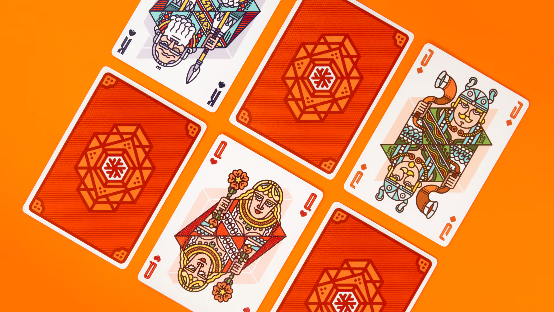
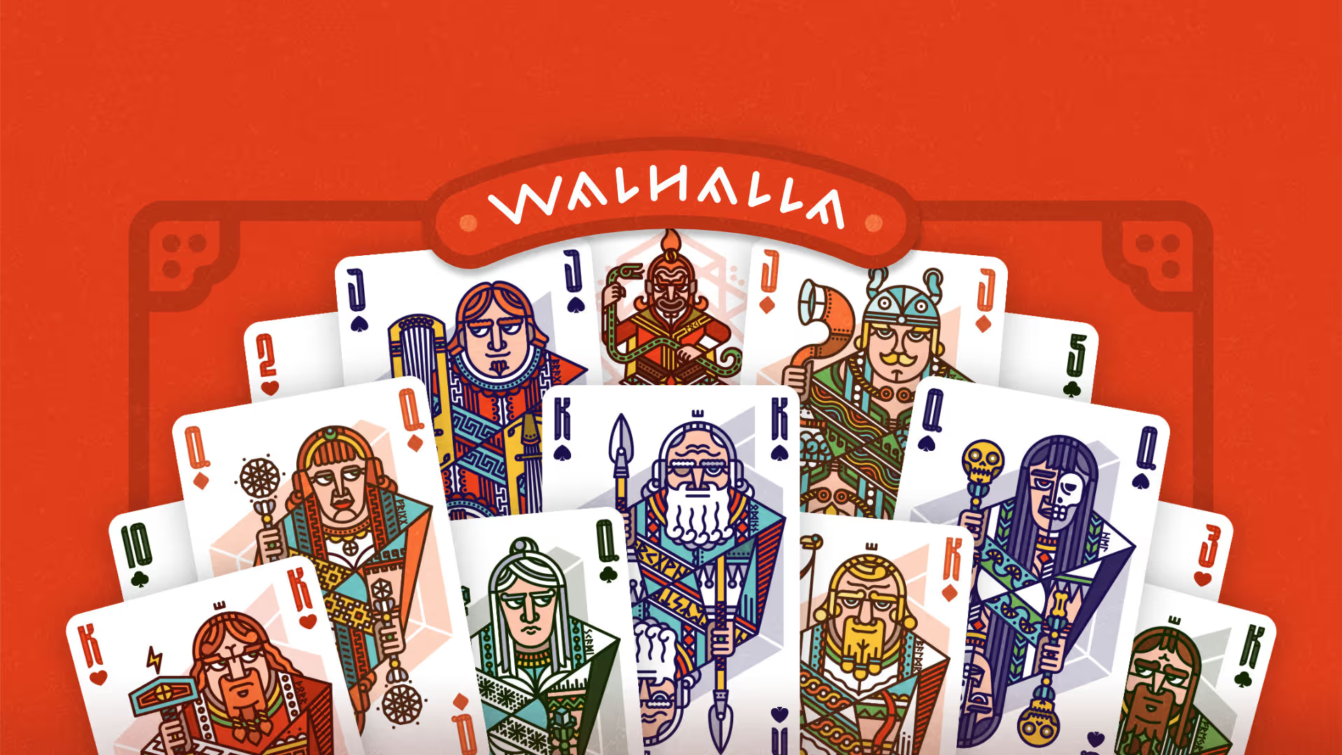
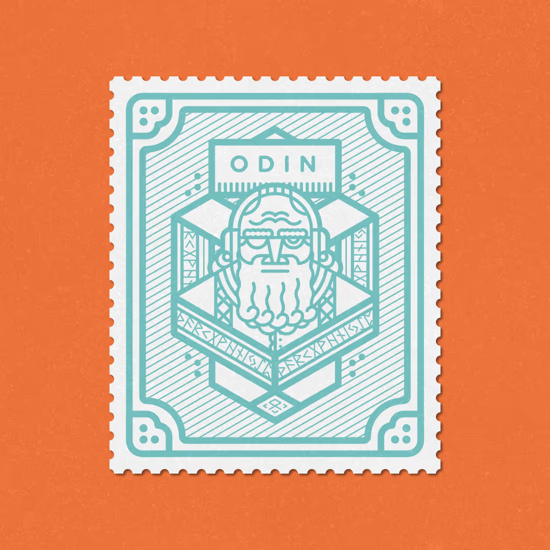
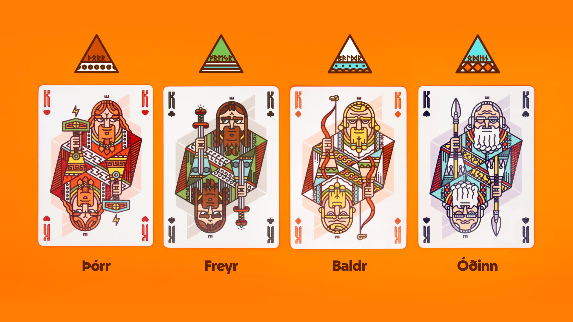
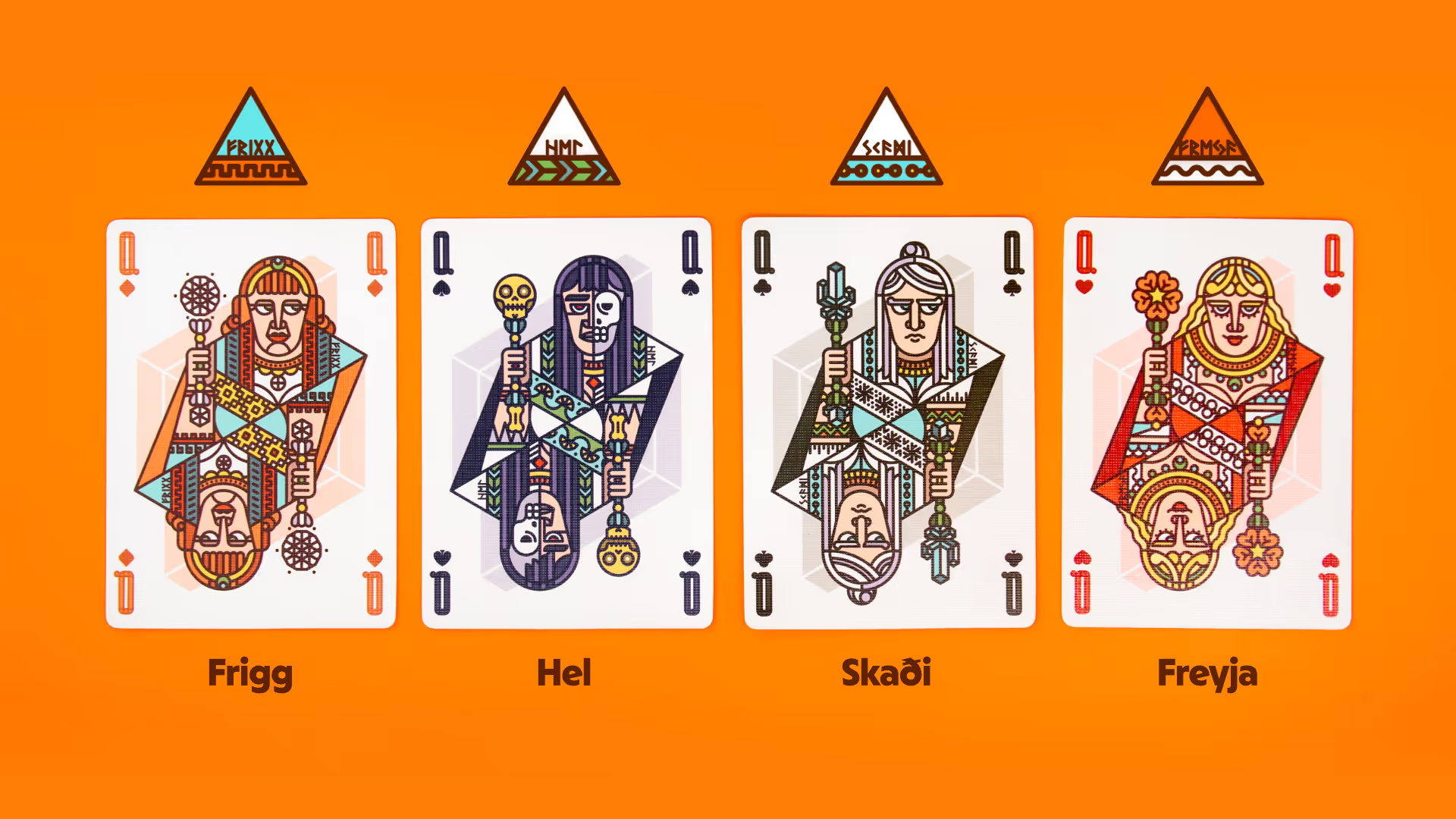
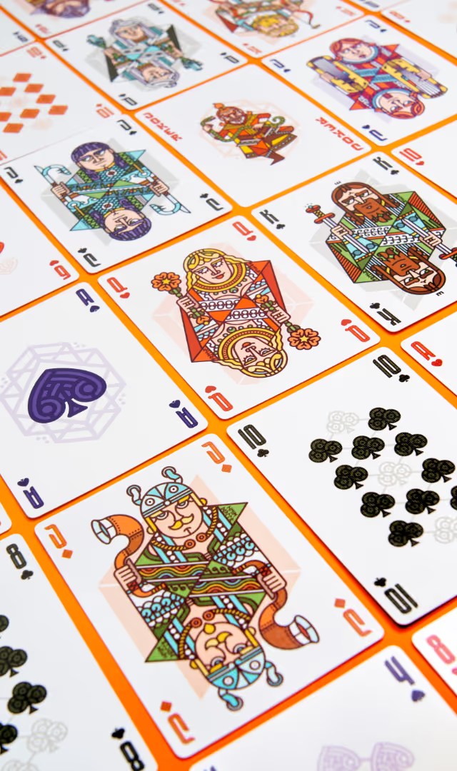
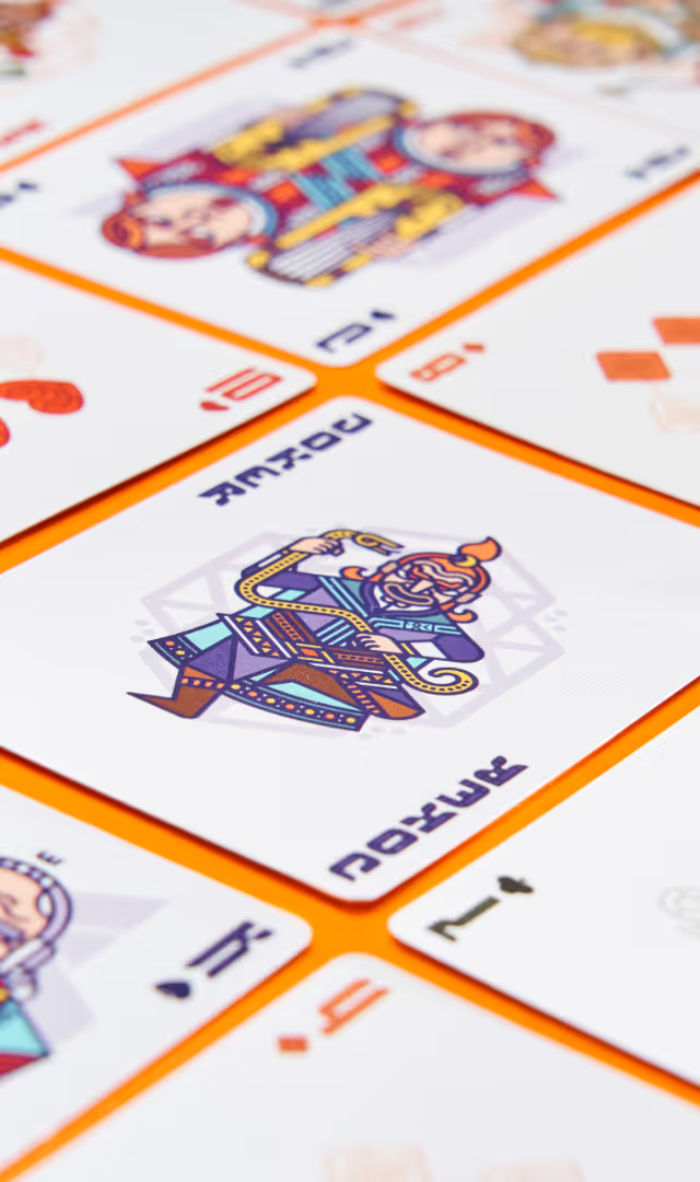
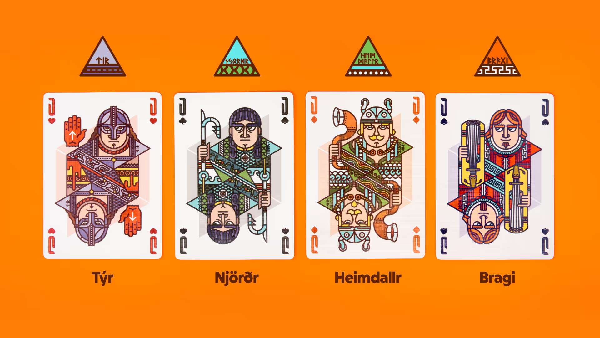
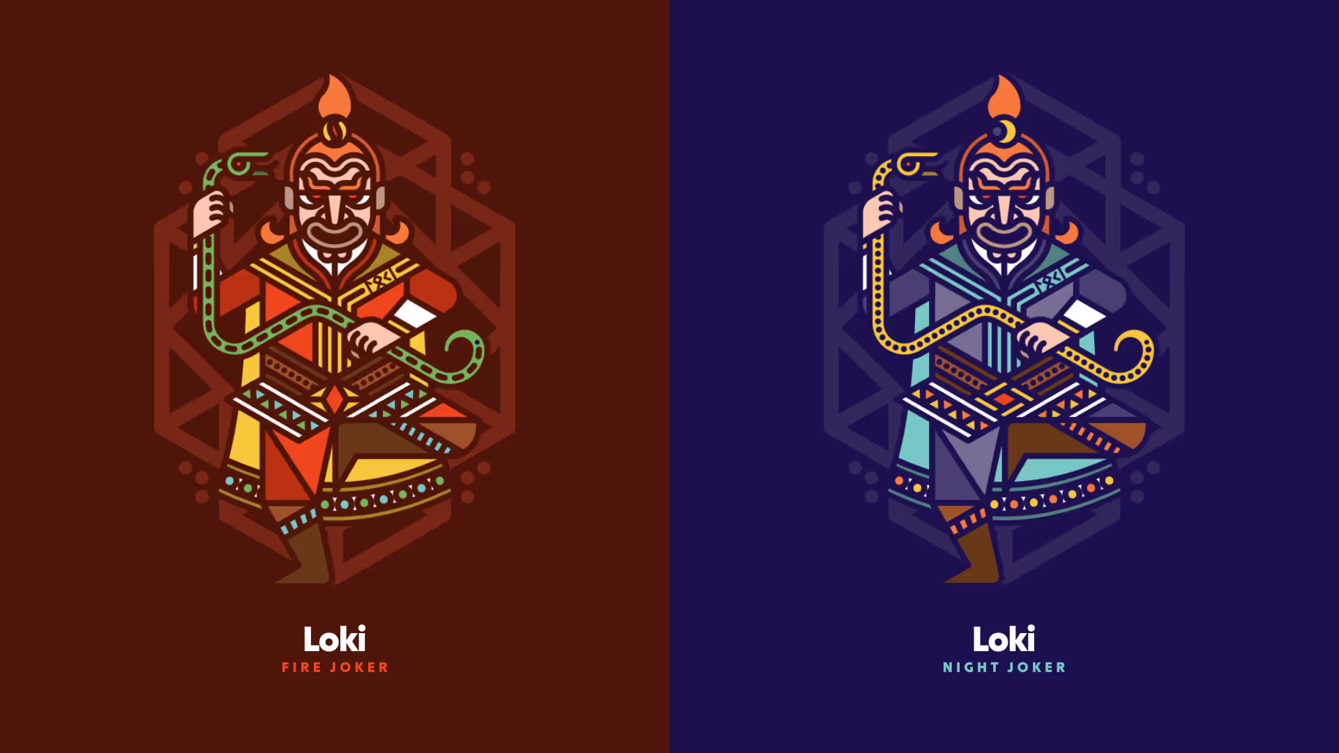
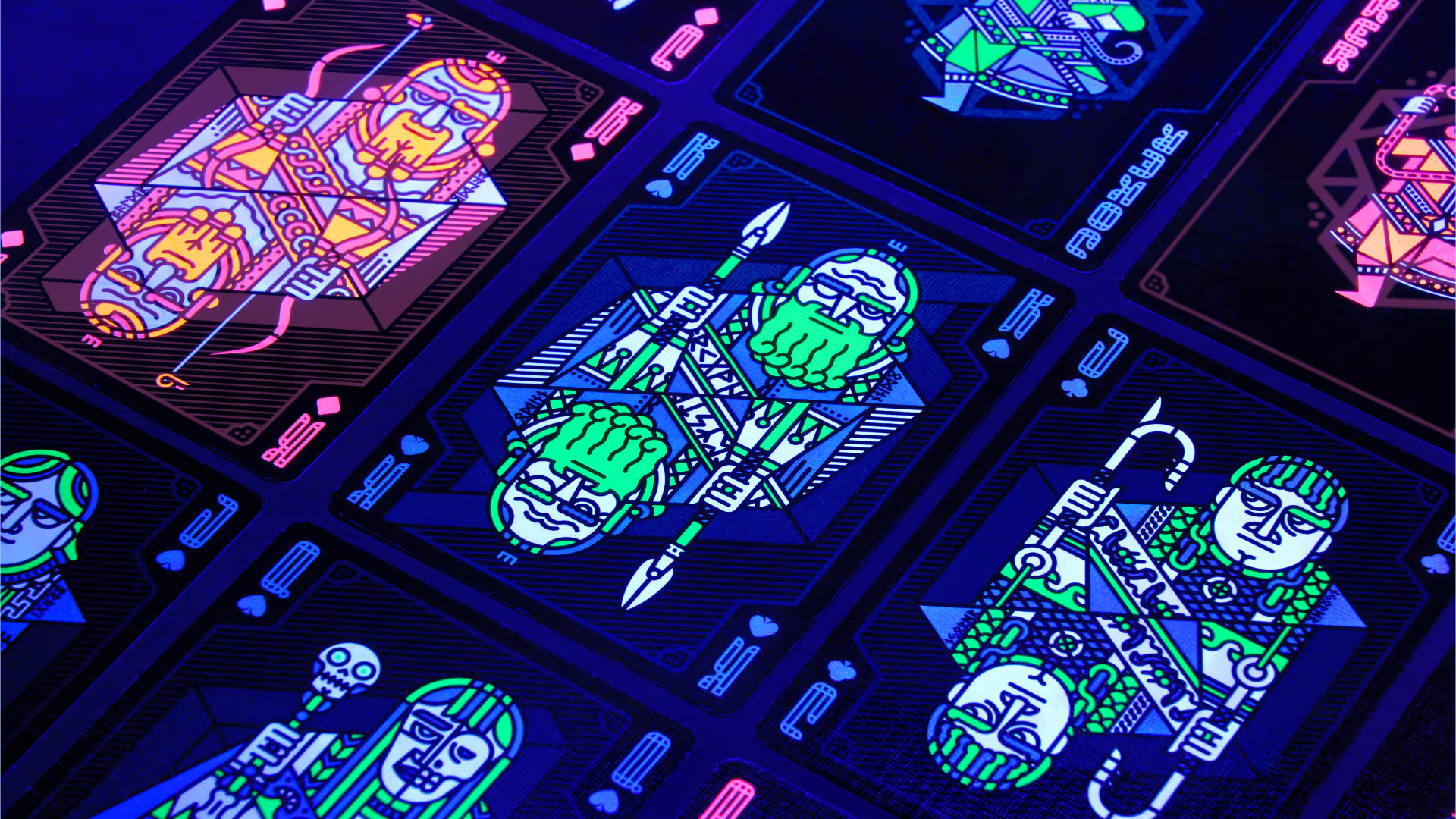
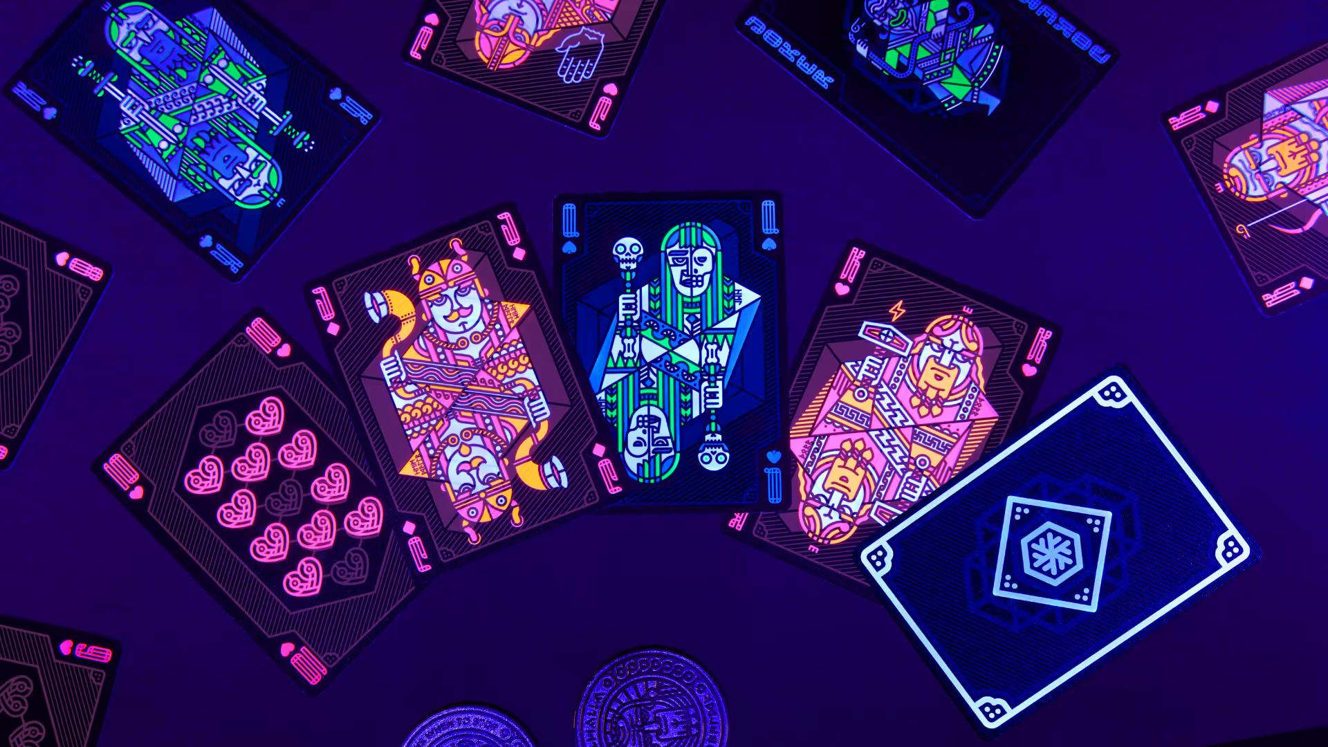
We wanted to create beautiful and practical cards that are fun to play with. We drew inspiration for the theme from European history and mythology: the usual kings, queens, and jacks have been replaced by gods and goddesses of Norse mythology. Can you recognise them? Their names are written in runic letters on their left shoulder. The images on the face cards aren’t perfect mirror images of each other – can you spot the differences?
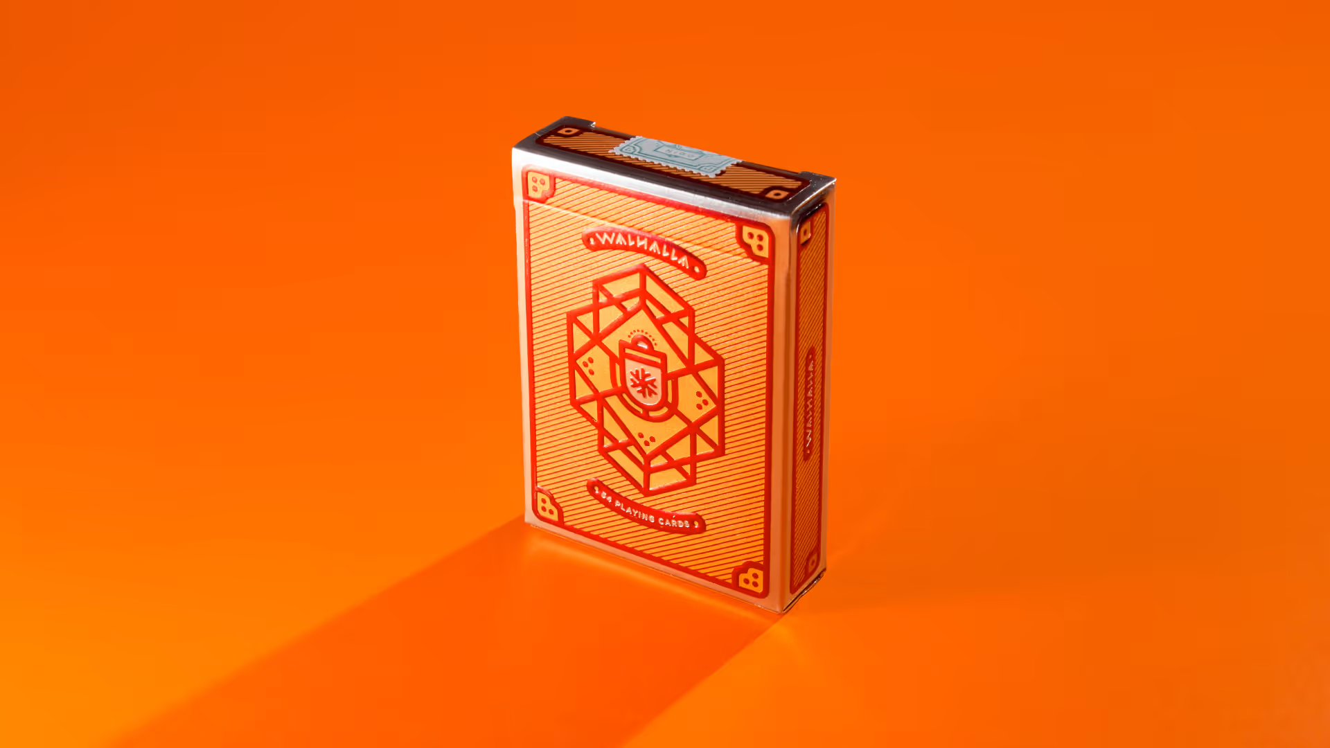
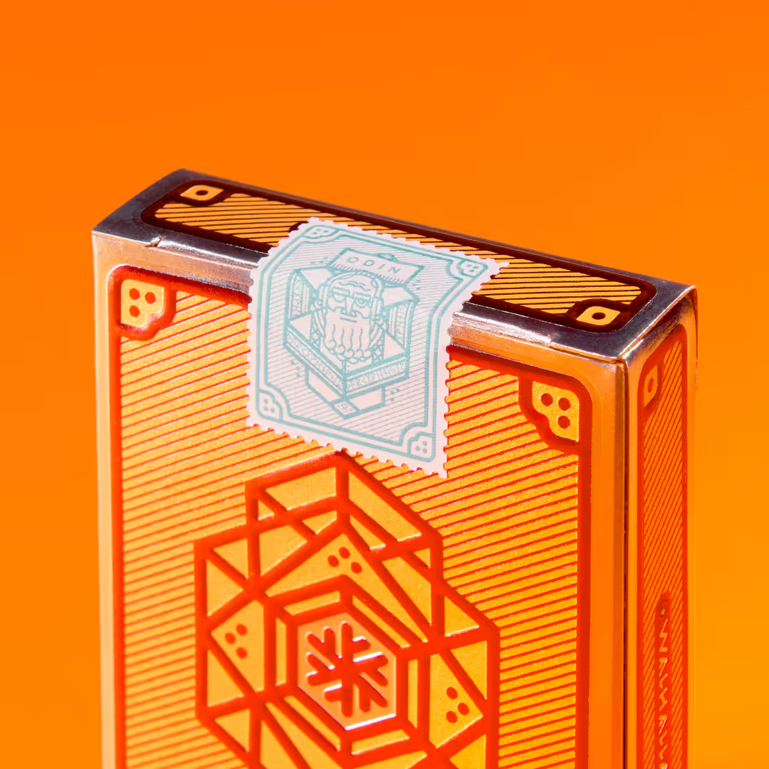
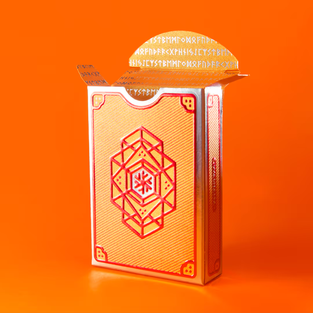
In 2019, Riesen Design signed an agreement with playing card producer and reseller Noir Arts. The Walhalla cards were launched in two different versions via Kickstarter. The first version, named Deck of Odin, featured stunning metallic inks and embossing.
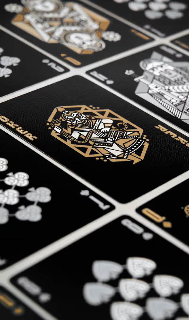
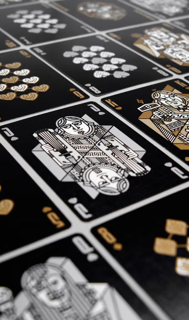
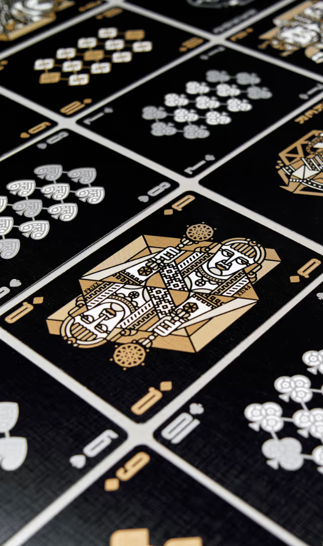
Another limited-edition version – the Deck of Freyja – was printed on black paper, with gold ink used for hearts and diamonds and silver for spades and clubs. This new design gave the playing cards a completely fresh look while still maintaining a clear family resemblance to the original cards.
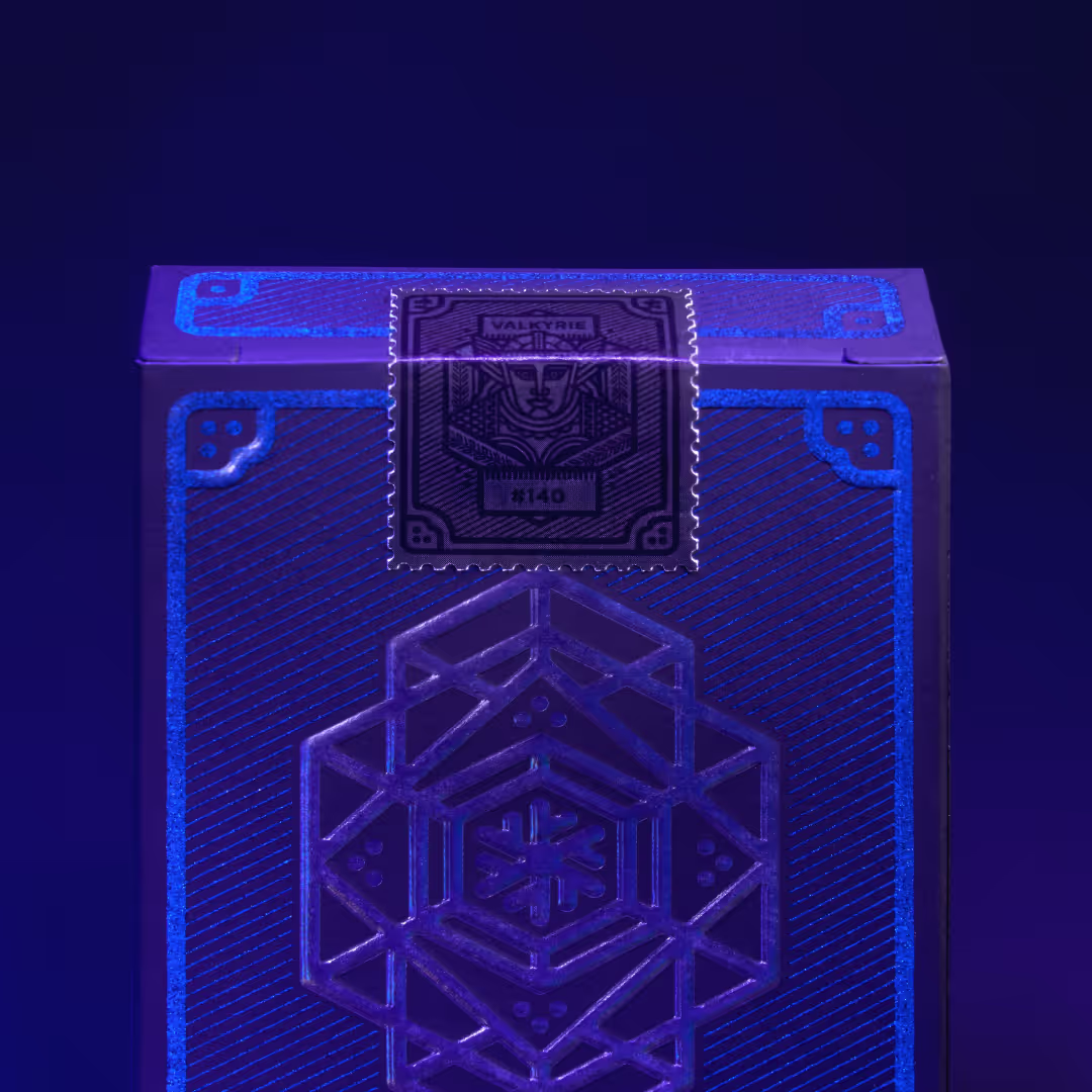
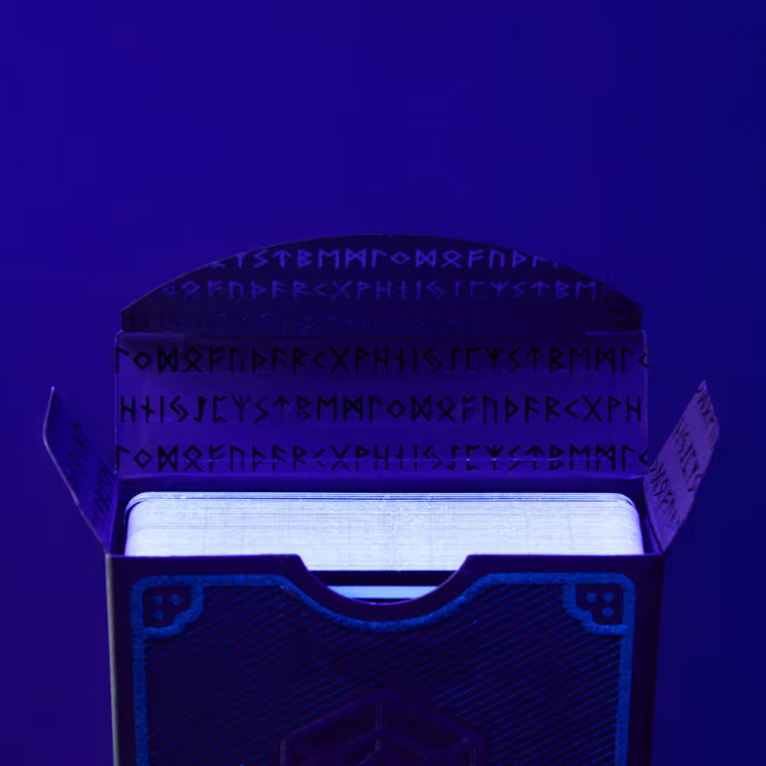
The campaign exceeded expectations so significantly (588 backers and $19,247 raised) that we launched a third limited edition: Deck of the Valkyries. It’s also printed on black paper, but this time we used partially transparent holographic foil, four different neon-coloured inks, and a special ink that’s only visible under UV light… The end result is truly unique and stunning. The campaign for the third version alone raised $17,482 from 483 backers.
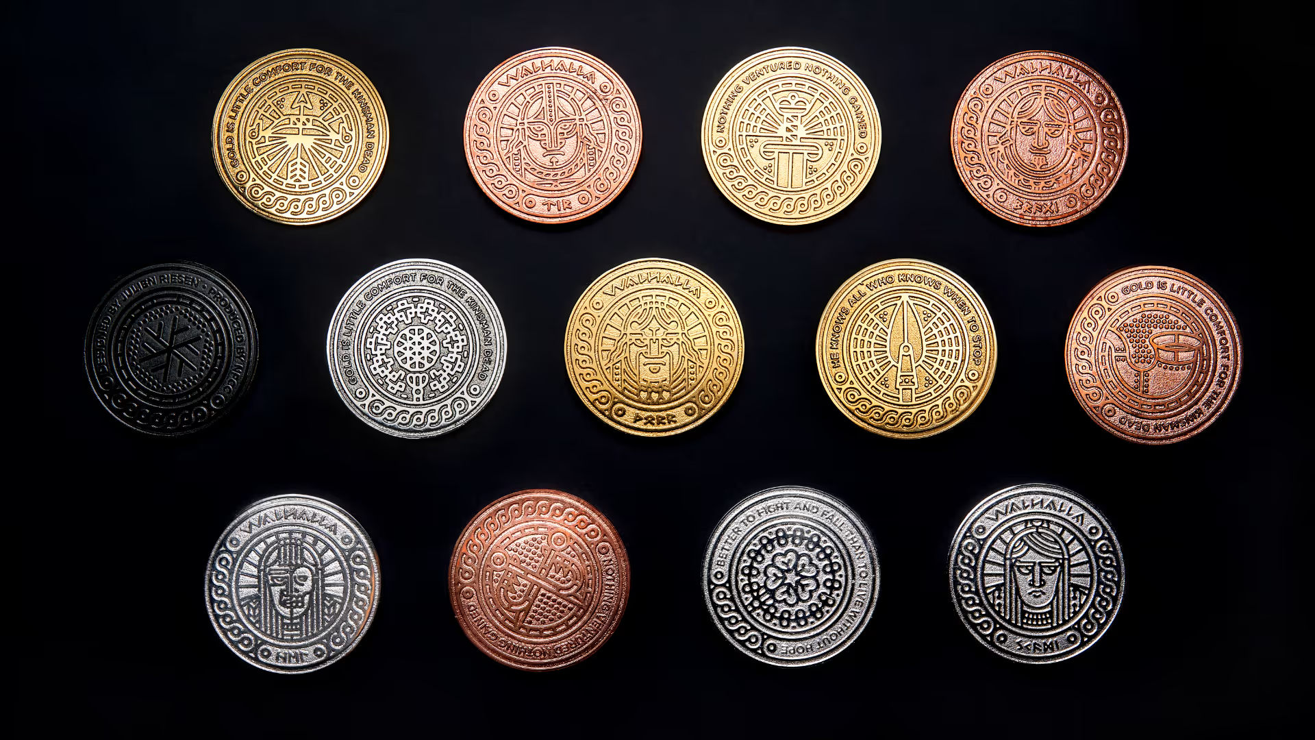
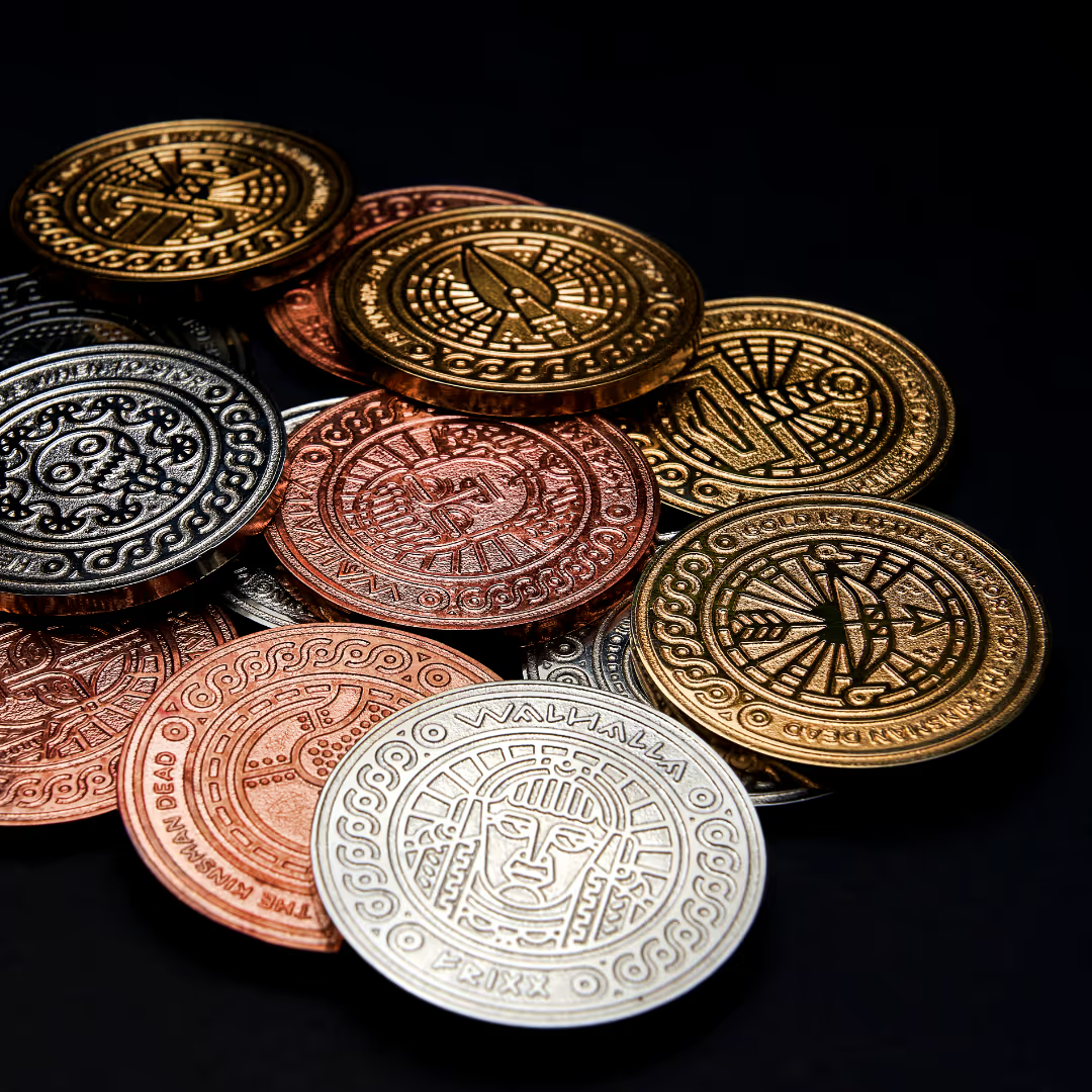
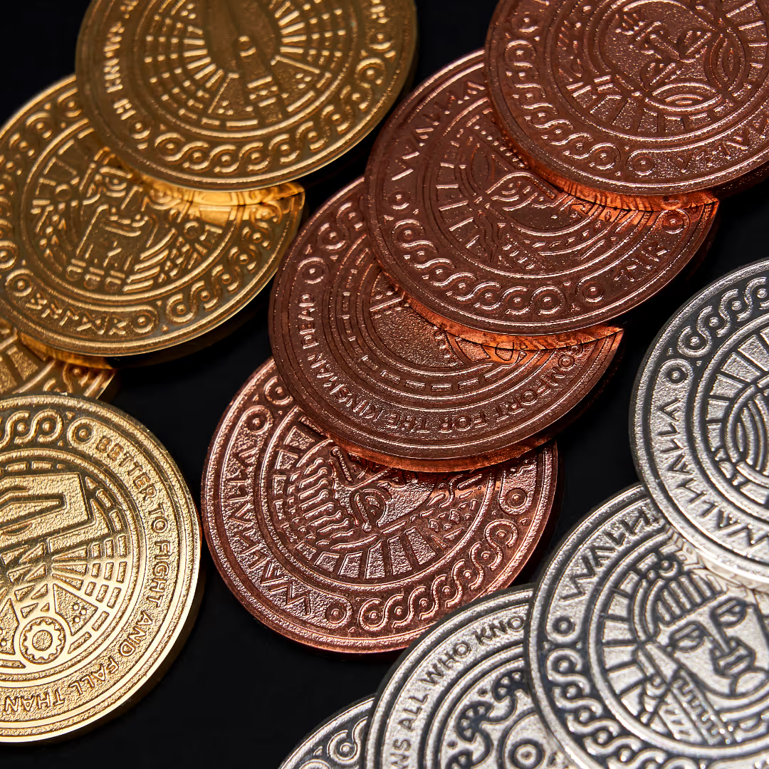
As an addition to the campaign, we also created twelve magnificent metallic coins. One side features the twelve gods, and the other side displays each god's attribute. Additional items included a special paper packaging for the two-deck set and a cadboard box for three-deck set.
Walhalla playing cards can currently be ordered directly from Riesen Design.
Our part
- Illustrations
- Packaging design
- Coins
- Stickers
Photography: Jani Saajanaho
Lorem ipsum dolor sit amet, consectetur adipiscing elit.
App concept
App concept
App concept
Deck of Odin
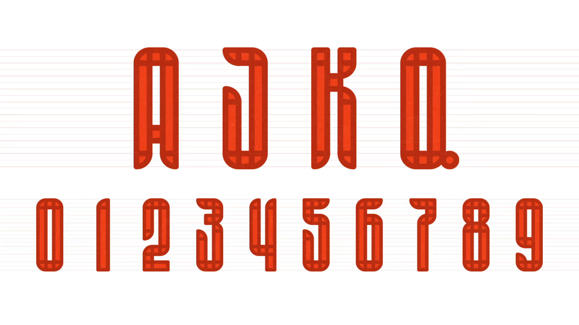
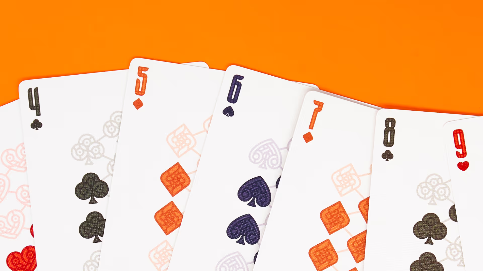
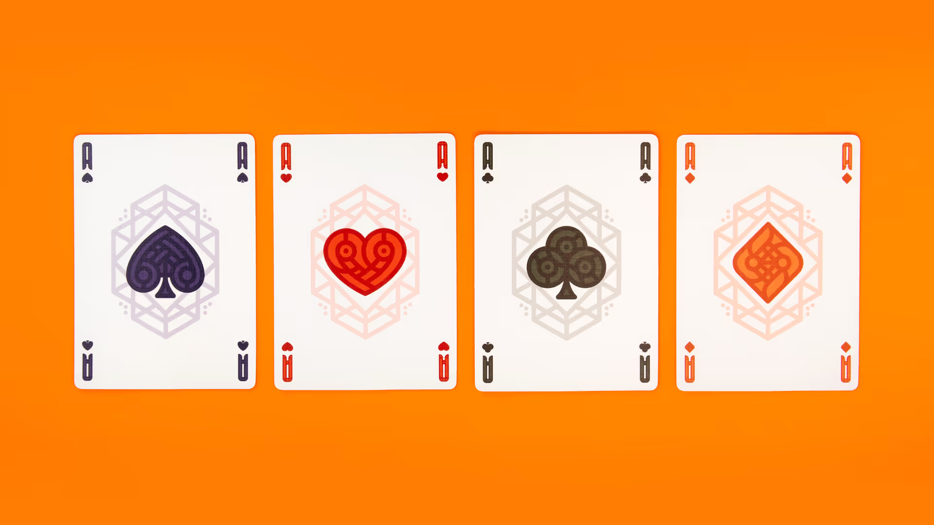
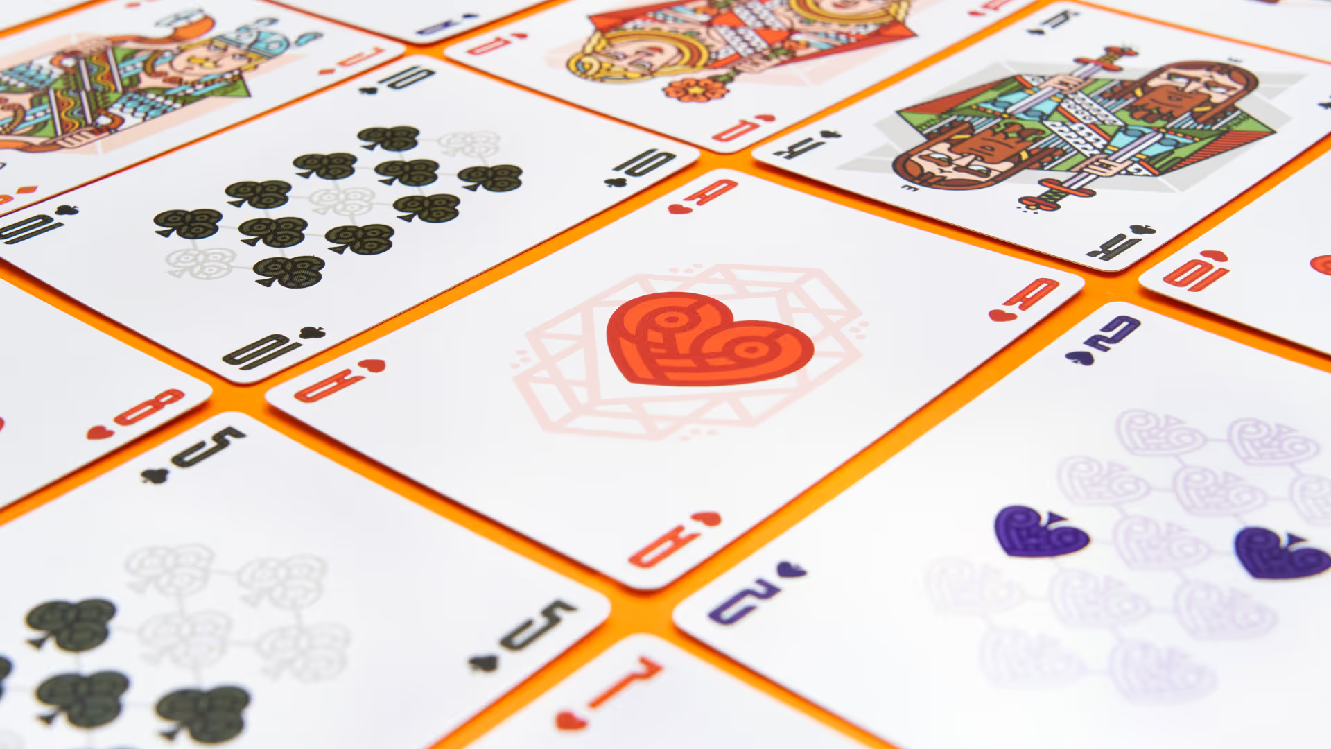
This is where the entire project began – this was the first deck we designed, which sparked the interest of the card manufacturer. The aim was to create distinctive and visually strong cards that are also practical. For this reason, among others, we designed very narrow numbers that are clearly visible even when holding many cards.
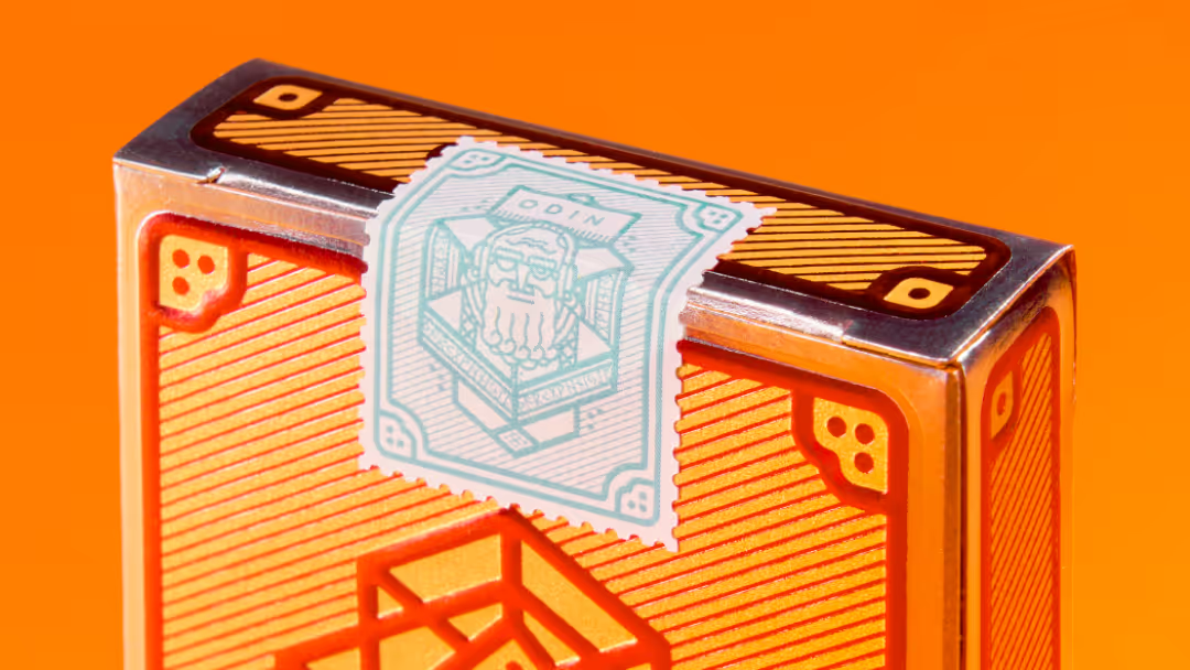
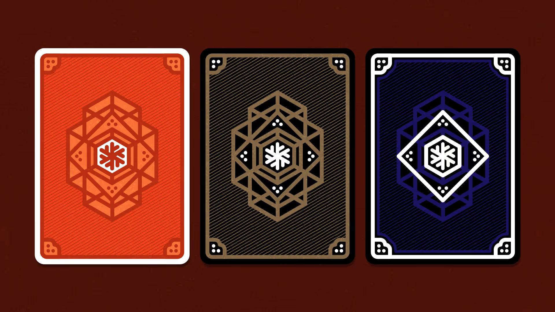
Unlike standard playing cards, each suit in this deck has its own distinctive colour. Each deck variation has its own seal: in this basic deck, it is, of course, the supreme god Odin, as the name suggests.
App concept
App concept
App concept
App concept
App concept
App concept
App concept
App concept
App concept
App concept
App concept
App concept
App concept
App concept
App concept
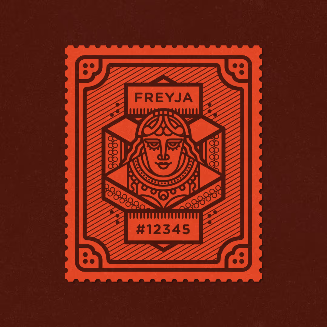
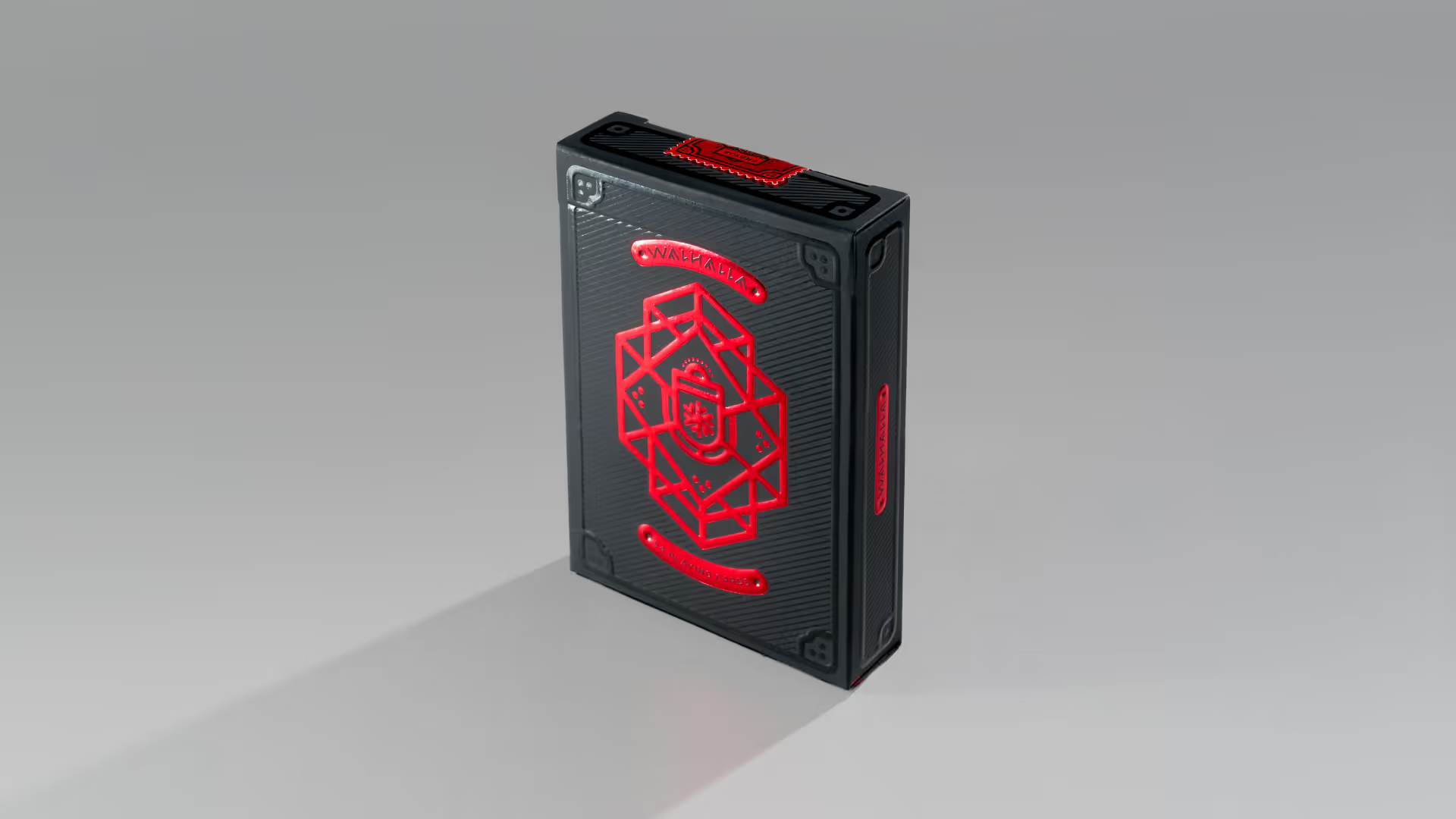
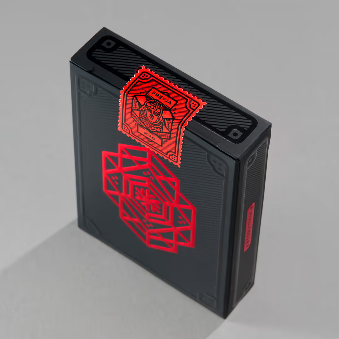
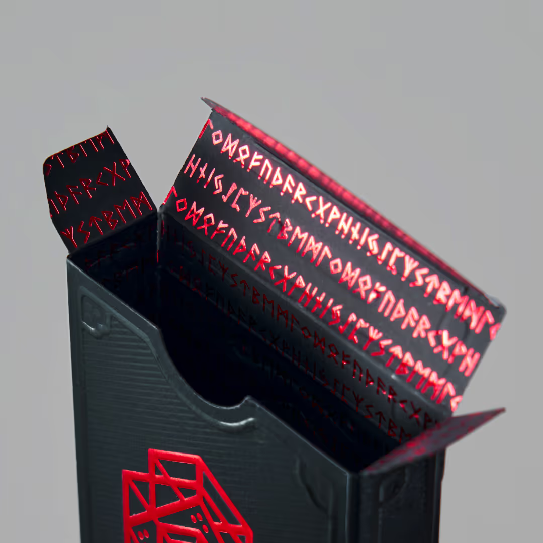
Deck of Freyja
From the very beginning, the card manufacturer wanted to produce several versions of the playing cards. Following the Deck of Odin, we created the Deck of Freyja – completely black cards printed exclusively in gold and silver inks. A numbered Freyja seal completes this deck.
App concept
App concept
App concept
App concept
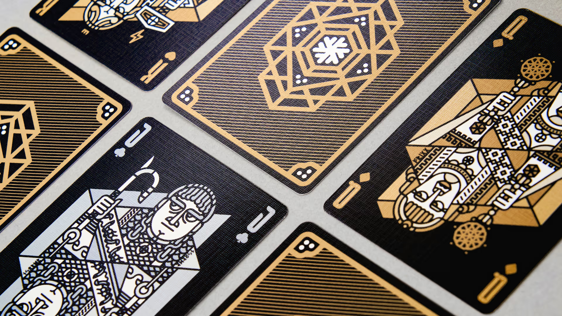
App concept
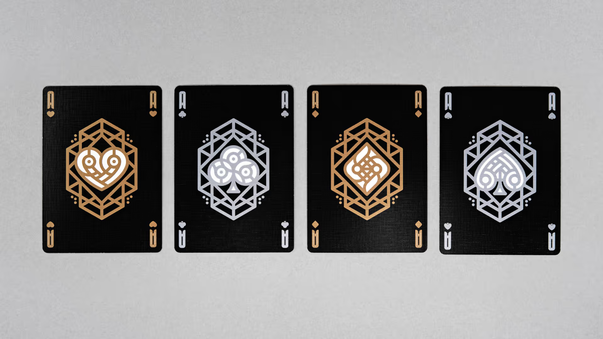
App concept
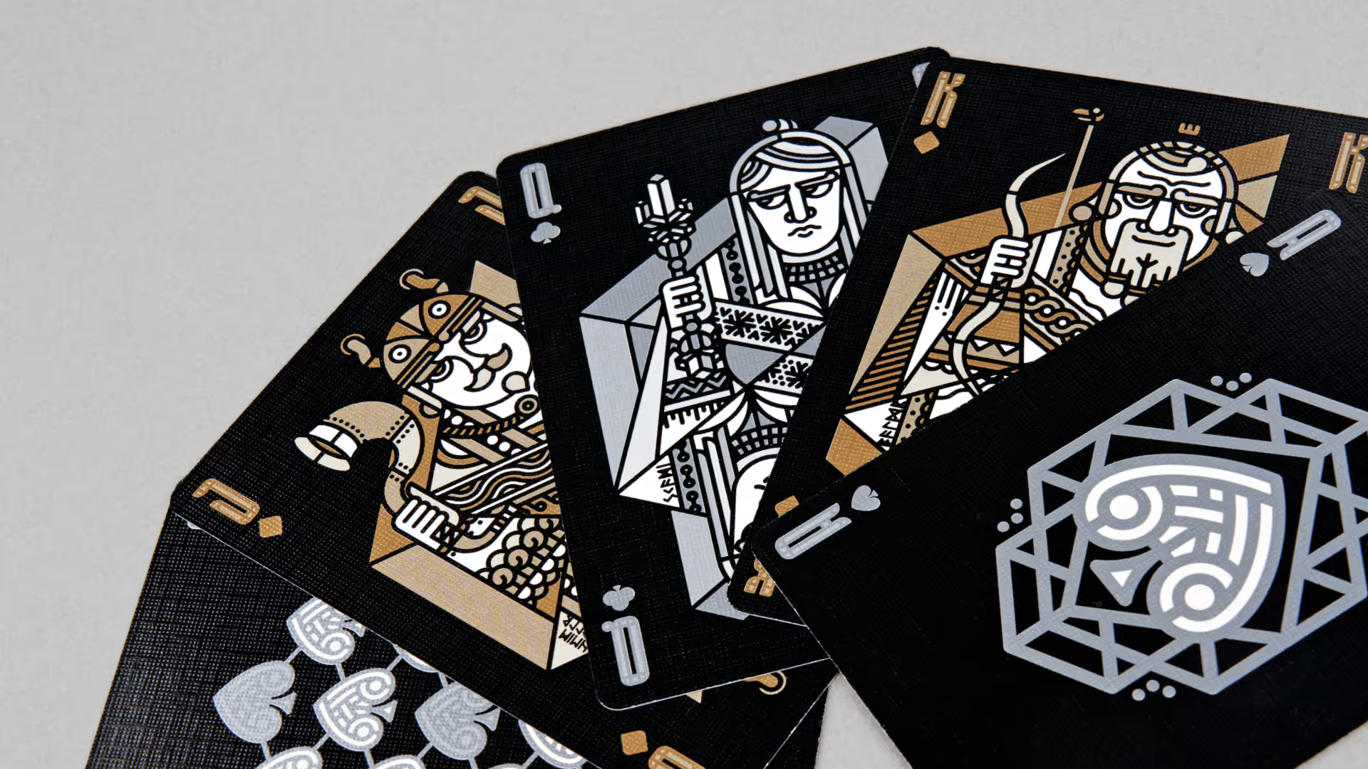
App concept
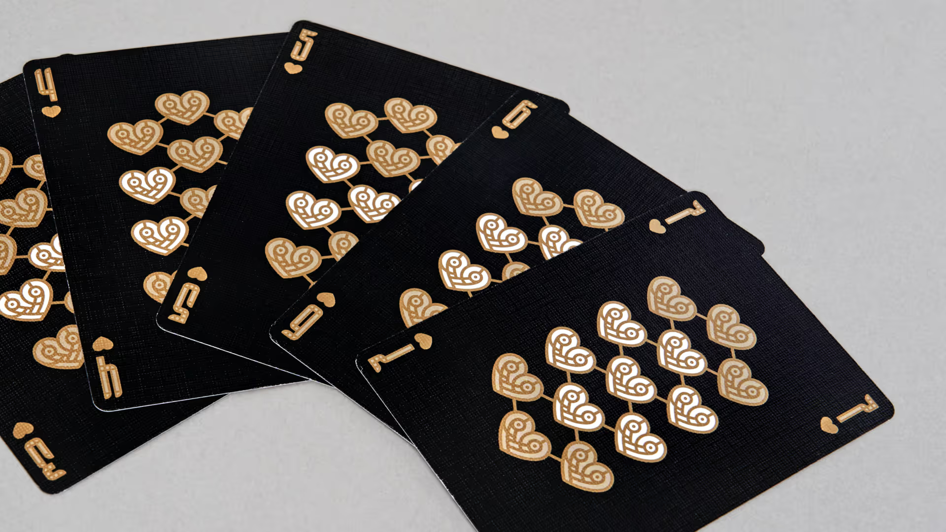
App concept
App concept
App concept
App concept
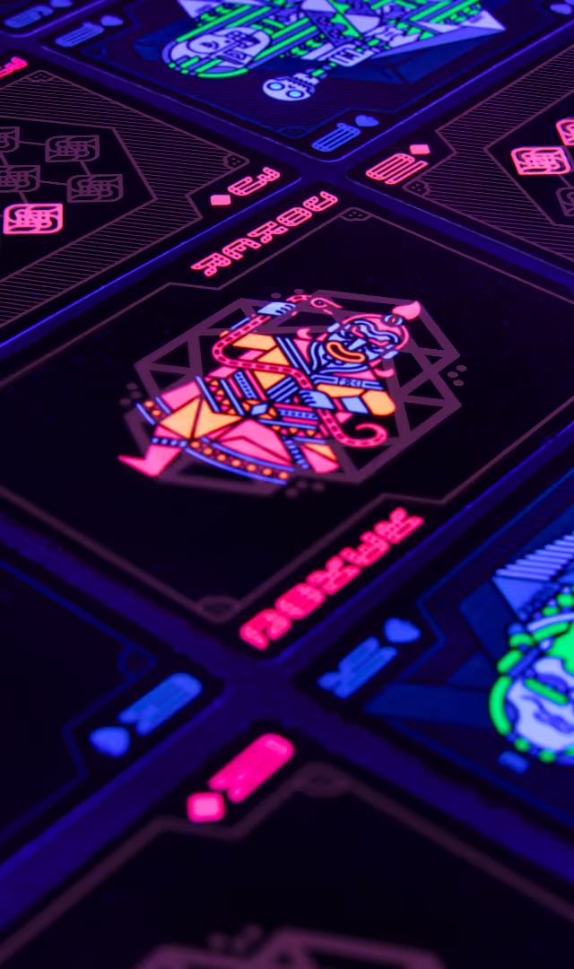
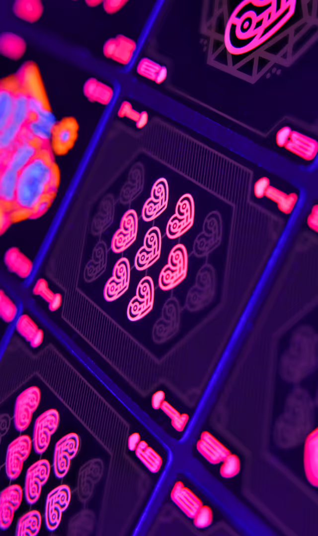
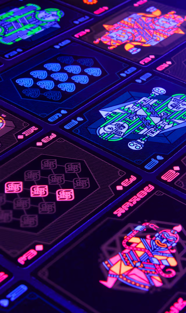
Deck of the Valkyries
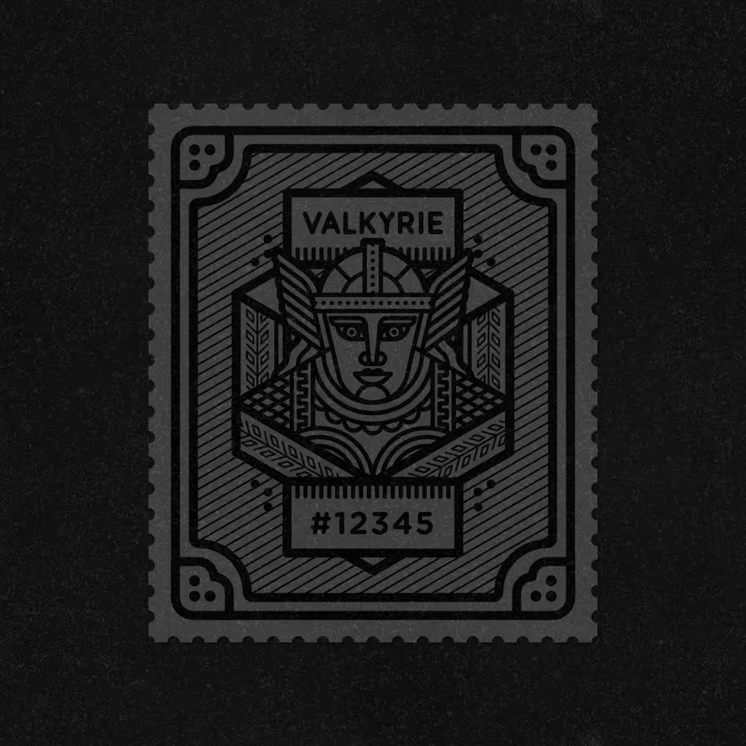
After the first two card decks, we decided, together with the manufacturer, to take the Walhalla playing cards to a new level: this time by using neon and UV inks. Under UV light, the card illustrations are enhanced with new patterns that are not visible under normal circumstances. In addition to these special inks, the packaging also used pearl-coloured ink, whose colour changes depending on the angle from which you view the cards. Overall, a magnificent luxury deck that takes printing technology to new spheres! This deck is crowned by the Valkyries' seal, which is also numbered.
App concept
App concept
App concept
App concept
App concept
App concept
App concept
App concept
App concept
App concept
Coins & stickers
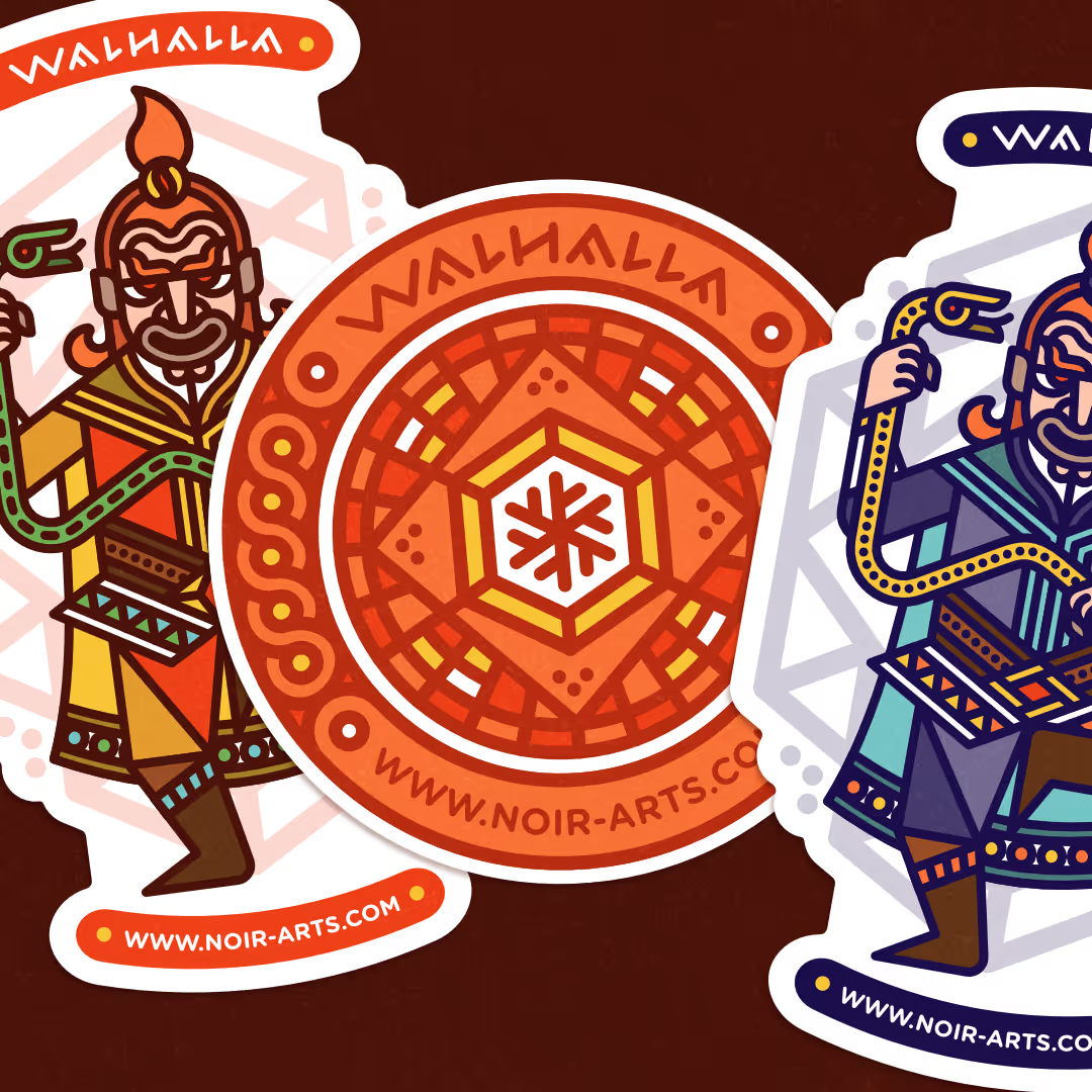
In addition to the decks, we also designed other materials, such as several stickers and a coin set. Each face card group has its own series of different coloured coins. The Joker also has its own black coin. The front of the coin features the face and name of each god, and the reverse side displays Nordic sayings related to gaming and money – genuine Viking wisdom!
App concept
App concept
App concept
App concept
We do that too
Logos & visual identities
Illustrations & characters
Animations
User interfaces